Re-branding Wax & Lash Salon Seeks Luxury Additions to Existing Sophisticated Logo
¿Quieres ganar un trabajo como este?
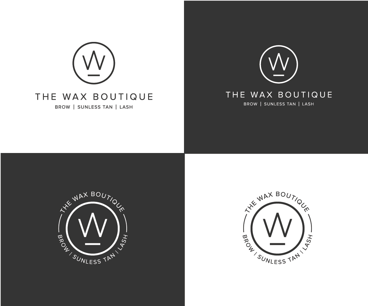
Este cliente recibió 181 diseños de logo de 82 diseñadores. Eligieron este diseño de logo de Designpool como el diseño ganador.
Únete gratis Encuentra trabajos de diseño- Garantía
-
 US$150
-
 181 diseños
-
 82 diseñadores
Resumen de Diseño de Logo
What I'd like to accomplish is a little bit of re-branding. I LOVE my logo, however, since my salon opened nearly three years ago, we've added more services. And I'd like to either have multiple logos that each feature one of our new services. But they all need to sort of look similar - or perhaps it's just the 'icon' that changes with each logo.
I would be looking for 2-3 additional versions
- one to feature Eyebrow Services
- another for Lash Services
(or the lash and eyebrow could be feature together)
- 3rd for Sunless (Spray) Tan services.
And since I'd primarily like to maintain the integrity of my existing logo because they all need to match aesthetically.
Again, I'm not sure if I should be changing the text at all or just changing the graphic part so that people recognize we offer more than just full body waxing services now. For example, maybe the circle with the 'W' in it - could change to an eye with lashes or eyebrows or both - but I don't want it to look cartoonish.
Another option would be adding to the existing logo - 'Lashes by' The Wax Boutique or 'Sunless by' The Wax Boutique.
I can't really change the entire name of my business so primarily I'm looking to find a way to incorporate our new specialties with my existing business.
Actualizaciones
The date is wrong, I just posted now so I think the date is supposed to be April 27, 2020??
Objetivo del mercado(s)
Men & Women who like to treat themselves, care about beauty/ skincare, etc.
Tipo de industria / entidad
Beauty Salon
Texto del logo
See description
Estilos de logo de interés
Logo pictórico / combinado
Un objeto del mundo real (texto opcional)
Logo de marca de nombre
Logotipo basado en palabra o nombre (solo texto)
Logo con siglas
Acrónimo o logo tipográfico (solo texto)
Estilos de fuente para usar
Colores
Diseñador para elegir solo colores en escala de grises para usar en el diseño.
Mira y siente
Cada control deslizante ilustra las características de la marca del cliente y el estilo que debe comunicar el diseño de tu logotipo.
Elegante
Atrevido
Juguetón
Serio
Tradicional
Moderno
Atractivo
Profesional
Femenino
Masculino
Vistoso
Conservador
Económico
De Alta Gama
Requisitos
Debes tener
- What I love about my logo icon is that the W (which was originally intended to stand for Wax) also subtly looks like a crown. I like the vibe that this gives without the observer even realizing it - luxury, royal, sophisticated. Its important to me that the new logo maintains translating that same feeling.
No debería tener
- Please do not completely change my existing logo. I LOVE my logo and am only looking to enhance it since we now offer more than just waxing.