TRUCORE
¿Quieres ganar un trabajo como este?
Este cliente recibió 197 diseños de logo de 74 diseñadores. Eligieron este diseño de logo de Ovaz.Syd como el diseño ganador.
Únete gratis Encuentra trabajos de diseño- Garantía
-
 C$150
C$150
-
 197 diseños
-
 74 diseñadores
Resumen de Diseño de Logo
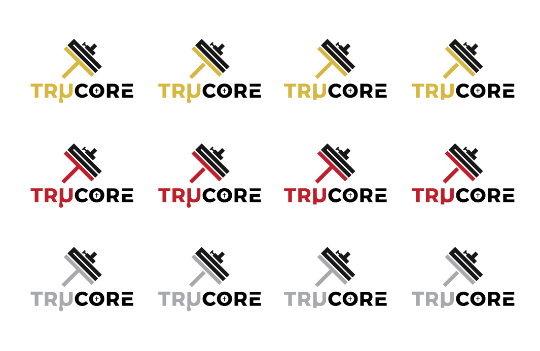
It is a gym brand. this is a logo that i will be putting on shirts and my gym and supplements. I have a drawn out version of my idea of the logo below.
The graphic portion of the logo is a barbell that is made up of a T and a C. That is important as it illustrates TRUCORE. But it's also made to look like a barbell. I want that message to stay consistent. Make it look 3D and so on and so forth and maybe fix it up so that it looks cleaner but I want the message to stay the same. If you could test out a different styles and designs with the same key factors (T,C and barbell) that would be greatly appreciated.
Font is undecided so I have a few font design styles that I will provide below that I like. I want the font to be unique, professional and sporty.
The 'U' In TRUCORE is represented by the greek letter 'μ'. This is a major part of the logo as it will illustrate sweat. I still want that μ to be the same size that a regular 'U' would be. I also would like to have a small, slim and stretched-out cross inside the 'O' in CORE. there will be examples provided in pictures attached. I would like the cross to fade at its tips. I would like versions with and without the cross
For colors, I want the graphing to be black and as for the logo text , I'd like 'TRμ' to be light grey (Kind of like the gym town logo image i attached) and 'CORE' will be Black
I would like a simplified version (just graphic) and a full version (graphic and text.
Texto del logo
TRμCORE