ARCHITECT / BUILDING DESIGN FIRM LOGO
¿Quieres ganar un trabajo como este?
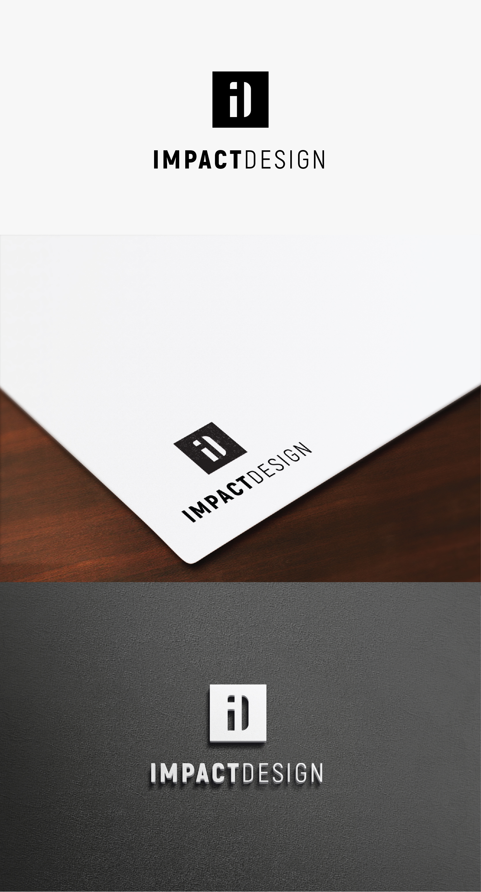
Este cliente recibió 90 diseños de logo de 41 diseñadores. Eligieron este diseño de logo de IMilenovic como el diseño ganador.
Únete gratis Encuentra trabajos de diseño-
 A$150
A$150
-
 90 diseños
-
 41 diseñadores
Resumen de Diseño de Logo
I am a building designer and soon to be Architect once registered, I have always wanted to go out on my own and create my own firm and have had the opportunity to do that now. I focus on residential homes on the Gold Coast Australia.
The purpose of Impact Design is the intention to do everything possible within design to create a positive impact on the experience throughout the journey and process of creating built form. The key purpose is to provide a service and do everything within the business objectives to achieve a positive experience and output . At the end of a project the intention is to tick another block of land, helping another happy family in the quest to continually having a great impact on their lives long after the design process and build has taken place.
The visual concept is an aerial view as if you were looking on google earth down on all the blocks of land on the Gold Coast, and highlighting the ones that I have affected by following the process through and getting their renovation, new home or duplex built.
I don't mind the logo that i have attached, however I think the font style is pretty standard, and i am not a fan of how the text does not form a simple shape in the logo. It feels like the text has been forgotten and just added on underneath. I would prefer if my logo had a minimalist appearance as minimalism is an architectural style that I prefer.
For context of the design and company I have started putting together the website / facebook / instagram and I really do prefer the monochromatic scheme black / greys / whites.
I feel as if the word IMPACT needs to have some weight over design, to be a little bit more eye catching, however I do think the shape of the blocks of land are more important than the word impact. The hierarchy would be the following:
1) Logo Shape / Blocks of Land
2) Text - IMPACT
3) Design
Again if we can create an overall minimal shape that would be ideal. Can't wait to see the outcome.
www.impactdesign.net.au
Objetivo del mercado(s)
Residential Home Owners
Tipo de industria / entidad
Architecture
Texto del logo
IMPACT DESIGN
Estilos de logo de interés
Logo pictórico / combinado
Un objeto del mundo real (texto opcional)
Logo abstracto
Conceptual / simbólico (texto opcional)
Estilos de fuente para usar
Colores
Diseñador para elegir solo colores en escala de grises para usar en el diseño.
Mira y siente
Cada control deslizante ilustra las características de la marca del cliente y el estilo que debe comunicar el diseño de tu logotipo.
Elegante
Atrevido
Juguetón
Serio
Tradicional
Moderno
Atractivo
Profesional
Femenino
Masculino
Vistoso
Conservador
Económico
De Alta Gama
Requisitos
Debes tener
- Black White and Grey Colours preferably same as logo attached
Agradable de tener
- One simple shape, rectangular would be ideal for use on construction drawings