Logo, typo and graphic palette for startup in cafe
¿Quieres ganar un trabajo como este?
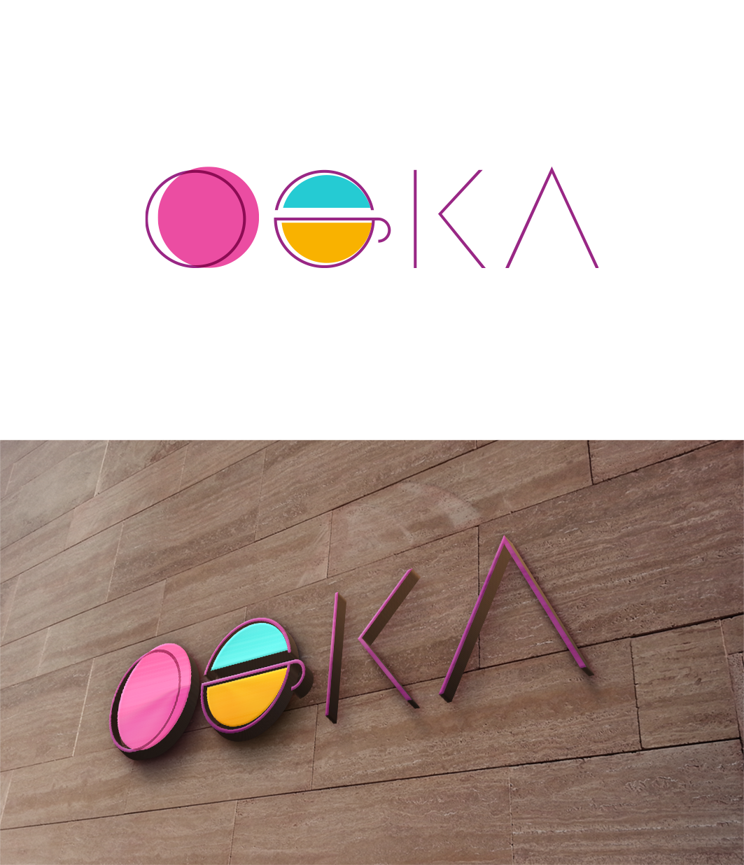
Este cliente recibió 121 diseños de logo de 51 diseñadores. Eligieron este diseño de logo de trufya como el diseño ganador.
Únete gratis Encuentra trabajos de diseño- Garantía
-
 €190
€190
-
 121 diseños
-
 51 diseñadores
Resumen de Diseño de Logo
1 / Context:
We are 2 childhood friends who have just launched a startup to revolutionize the coffee break in business!
- One is an expert in coffee and sustainable development after 7 years spent in India
- the other and a geek fan of BigData, IoT and new technologies.
We therefore wish to combine these two universes to bring superior quality coffee to companies while
embracing the values of sustainable development.
We are therefore on a B2B market but with the employee in the company as end user. Our solution
must both help businesses be more responsible
but also to bring well-being to employees and make the coffee break more fun and engaging.
2 / Our values:
- Local (roasting and short circuit delivery)
- Sustainable development on its 3 pillars: economic, environmental, social
- Quality and pleasure
- Simplicity and user-oriented
- Young and technological
3 / Other keywords:
French, innovation, organic, fair trade, biological transition, circular, social and solidarity economy, 0 waste
4 / Our Catch line:
And if we told you that it is possible to offer your employees coffee:
● Responsible
● Quality
● Locally roasted ....
● And unlimited?
5 / Our color universe
We want to get out of the traditional codes of coffee (black, brown) and organic (the too peasant, hippie side)
We thought of using a triptych based on the colors of Indian festivals:
● magenta, turquoise blue, flashy green.
● magenta, yellow / ocher, dark purple
● We find these colors in the Pasaana festival in Star wars 9:
https://www.youtube.com/watch?v=Ca2SlCjDxUA
Another not-so-distant inspiration is the “flavor wheel”, used for coffee tasting. In the one provided
in attachment to this document we find in particular a straw yellow and a very nice magenta.
We are also quite a fan
6 / The logo
The brand being B2B, we are not necessarily attached to the presence of a logo we want above all a logo based on a font highlighting the name OOKA. If there is logo it should be in pictorial / minimalist logo mode at the FireFox, The 2 “o” could represent the infinite logo.
We are obviously open to any proposals
7 / Our inspirations:
A list of competing companies that inspire us and / or are close to our values:
● https: // eat. naked -> we love the simplicity, the pep's side
● https://thetotem.co -> we love the very graphic part, the strong identity, the product design.
● https://atelierbraam.com -> we love the message, the story and the concept.
● https://javry.com -> we love the concept and the positioning. We like the design a little cheap
● https://business.kawa.coffee/ -> we love the concept and the positioning, the clear explanations and the
listed value propositions. By cons there is not a big brand identity and not a big
graphic research
● https://www.misterbean.fr -> we love the concept and the positioning, the simplicity of the site. But the same
que kawa: there is not a big brand identity and not a big graphic research
8 / The expected result
We want 2 proposals: one with our recommendation and one from your imagination;)
Above all, we want to find a designer who understands our spirit and with whom we will be able to work over the long term (website, packaging, etc.)
Good luck
Aymeric and Clement
Objetivo del mercado(s)
Companies, startup, design office, employees
Texto del logo
OOKA
Estilos de logo de interés
Logo abstracto
Conceptual / simbólico (texto opcional)
Logo de marca de nombre
Logotipo basado en palabra o nombre (solo texto)
Logo con siglas
Acrónimo o logo tipográfico (solo texto)
Estilos de fuente para usar
Colores
Colores seleccionados por el cliente para ser utilizados en el diseño del logotipo:
Mira y siente
Cada control deslizante ilustra las características de la marca del cliente y el estilo que debe comunicar el diseño de tu logotipo.
Elegante
Atrevido
Juguetón
Serio
Tradicional
Moderno
Atractivo
Profesional
Femenino
Masculino
Vistoso
Conservador
Económico
De Alta Gama
Requisitos
Debes tener
- Modern, dynamic, bright, tangy
No debería tener
- Too oldschool, too traditional coffee, too hip / organic