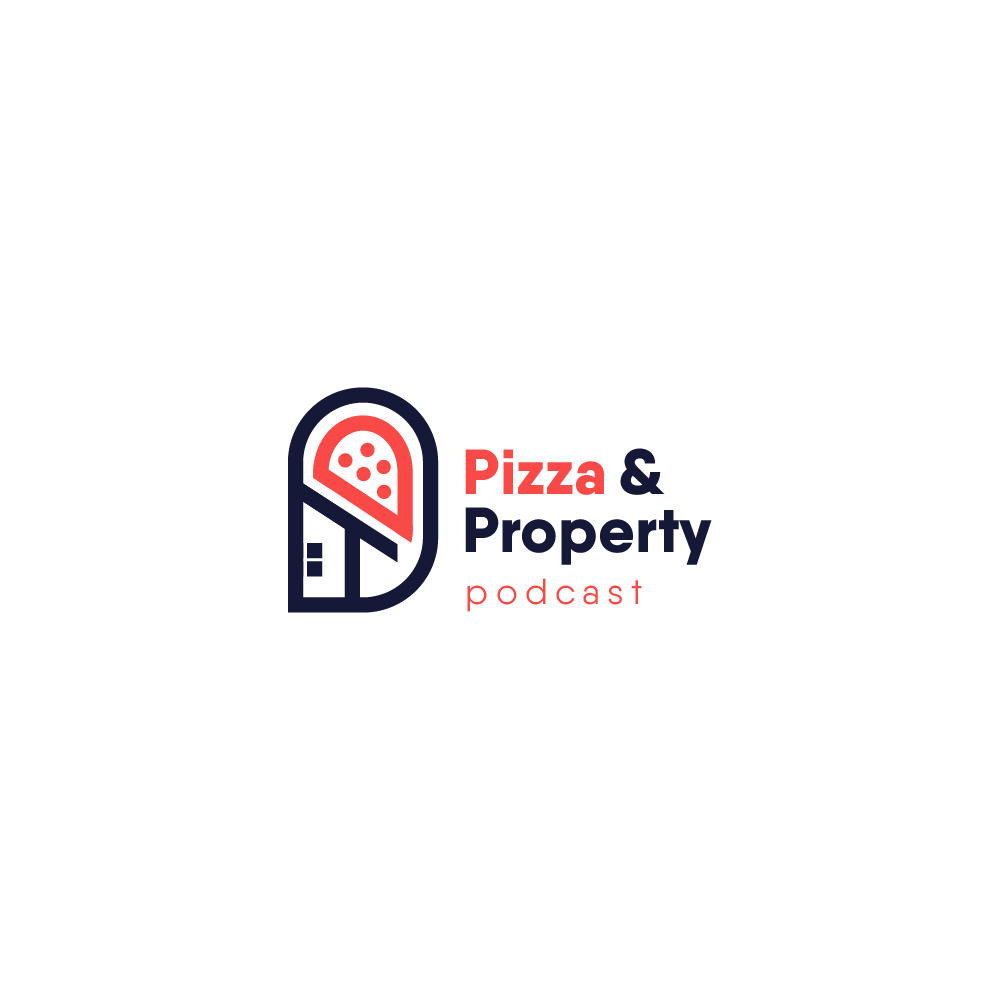
Pizza & Property logo re design
¿Quieres ganar un trabajo como este?
Este cliente recibió 96 diseños de logo de 39 diseñadores. Eligieron este diseño de logo de :) Zoya como el diseño ganador.
Únete gratis Encuentra trabajos de diseño- Garantía
-
 A$150
A$150
-
 96 diseños
-
 39 diseñadores
Resumen de Diseño de Logo
I would like a logo re designed for my existing pod cast
We are a youtube channel as well that we make a few different videos such as:
-short animations of the podcast ( links provided )
-renovation videos
-how to video
-general explainer videos
- I will soon be doing a vlog documenting my journey of building a
property portfolio
I want to make it clear that the Pizza is a foot note in the podcast our main focus is being a property investing podcast
OUR FEEL
The goal of pizza and property is to educate inform and entertain, we want to make sure people feel comfortable and confident about investing in, selling and renovating property.
This topic can be intimating at times, so there is a very clear goal to bring some almost school boy humour to the feel of the company mixed together with the truth and solid facts about property and the real estate market
COLOURS
I would like the logo to use softer almost cartoonish fun and approachable type colours. i am thinking of staying with the orange colour but think it might be a better idea to get rid of the red and use a yellow instead. I would prefer the colours to be more unique to this brand... I mean in the way that Cadbury Chocolates purple is clearly Cadbury even before you see the logo, when you see that colour you think Cadbury
I might be open to a blue and yellow combination but I don't know...
links below to colours i think will work in the pictures names colours
it is also important that this logo can be used as a simple white or simple black logo on a T-Shirt
FONT
I need the logo to say fun and sturdy, I'm not sure how to describe fonts without knowing all of their names so i have attached a few font pictures of some that i would like you to play with and incorporate.
THE SYMBOL
The current logo symbol is half house and half a square pizza, I would like to keep something along these lines but am very open to ideas about how els this could too. I can picture maybe a small bit of cheese melting off the pizza onto one of the letters... just some how getting the symbol involved with the lettering.
While the pizza is an important part the main focus of the podcast is property investing I feel the symbol should reflect that and not look like a pizza shop logo.
VIDEO LINKS
kitchen reno
https://www.youtube.com/watch?v=RxzRuDsaP2o
Podcast animation
https://www.youtube.com/watch?v=ZfmsOzMLhWo&t=1s
website
https://www.pizzaandproperty.com/
pod cast screen card
https://www.youtube.com/watch?v=y82oGqTXrCc&t=513s
explainer video
https://www.youtube.com/watch?v=F4oJUOh8qbs&t=1s
Objetivo del mercado(s)
Property investors aged between 18 and 45
Texto del logo
Pizza & Property podcast
Estilos de logo de interés
Logo pictórico / combinado
Un objeto del mundo real (texto opcional)
Estilos de fuente para usar
Gustan otros estilos de fuente:
- Spencerian
Colores
Colores seleccionados por el cliente para ser utilizados en el diseño del logotipo:
Mira y siente
Cada control deslizante ilustra las características de la marca del cliente y el estilo que debe comunicar el diseño de tu logotipo.
Elegante
Atrevido
Juguetón
Serio
Tradicional
Moderno
Atractivo
Profesional
Femenino
Masculino
Vistoso
Conservador
Económico
De Alta Gama
Requisitos
Debes tener
- the picture elemant at the top
Pizza & Property Text needs to be in large writing
podcast text to be in smaller writing
Agradable de tener
- Something that looks like a cool logo i would feel proud to wear on a T-Shirt
No debería tener
- an image that is very busy
lots of diferent colours
a stock image