New Instant Bingo / Pull-tab company
¿Quieres ganar un trabajo como este?
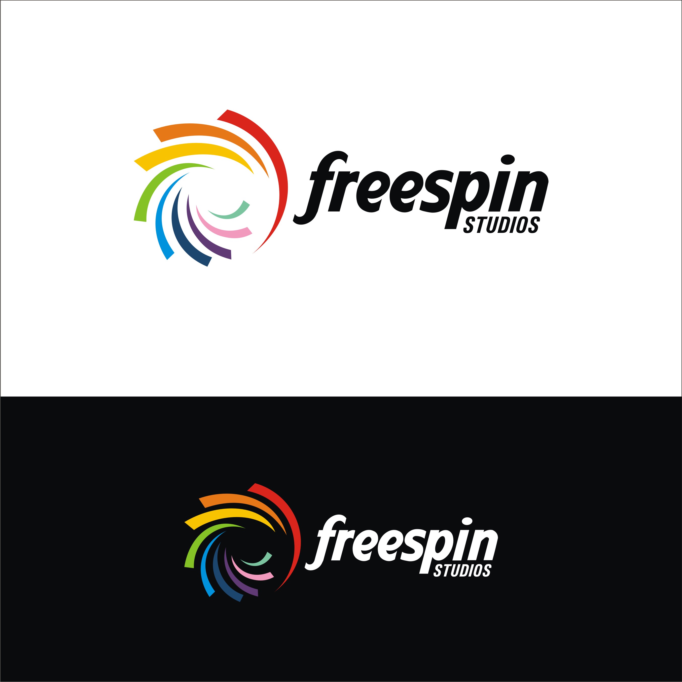
Este cliente recibió 153 diseños de logo de 67 diseñadores. Eligieron este diseño de logo de warkaddarshan 2 como el diseño ganador.
Únete gratis Encuentra trabajos de diseño- Garantía
-
 US$200
-
 153 diseños
-
 67 diseñadores
Resumen de Diseño de Logo
We are a gaming company that has decided, in light of recent events - ahem global pandemic - to diversify our business. We are getting into class III gaming and will be transitioning that brand to the class III business (www.baddoggames.com) b/c it just fits. I encourage you to look at our current brand and keep in mind the people behind it are the same with the new company. That said - the new company must be completely different. These are VERY separate markets and overlap must be kept to a minimum.
So now our 'old' Instant Bingo / Pull-tab business needs a new brand. We have acquired and locked the new name - Freespin Studios. It encompasses a number of good ideas representative of what people love out gaming while being fun.
We have built a logo in house based on a licensable design - but want to see what real designers can do to take it to the next level - or come up with something completely different.
BTW - we made a list of things that spin and focused on atoms, spheres, tops, windmills, wheels etc. We settled on two ideas but are heavily leaning toward the abstract pinwheel. It's fun, colorful, not complicated - and who didn't have fun as a kid making that pinwheel spin like crazy? The atomic wheel however does better represent the technology side of our business - but it's not as clean or easy to grasp. Honestly, It's confused ... there I said it.
Objetivo del mercado(s)
Regulated and charitable gaming segments
Tipo de industria / entidad
Computer Software
Texto del logo
Freespin Studios
Estilos de logo de interés
Logo con emblema
Logo contenido dentro una forma / figura
Logo pictórico / combinado
Un objeto del mundo real (texto opcional)
Logo abstracto
Conceptual / simbólico (texto opcional)
Estilos de fuente para usar
Gustan otros estilos de fuente:
- Southwest Sans Bold
Mira y siente
Cada control deslizante ilustra las características de la marca del cliente y el estilo que debe comunicar el diseño de tu logotipo.
Elegante
Atrevido
Juguetón
Serio
Tradicional
Moderno
Atractivo
Profesional
Femenino
Masculino
Vistoso
Conservador
Económico
De Alta Gama
Requisitos
Debes tener
- More than two colors - we want to be able to access as much color as makes sense. This is a colorful, bold, fun industry and we don't want to be too stuffy.
I'll balance the above by saying a full rainbow isn't necessary either.
Agradable de tener
- A core theme that ties to our company. Something clever that marries of the idea behind freespin while incorporating some of the why a client would be interested in us - those reasons are making money off of people while entertaining them.
No debería tener
- We are a technology company but not a bunch of lawyers or total free spirits. We are serious about our company and our plans but have fun doing what we do.
Please don't dry us out with something too 'mono' like in form or feel. Our client base ranges from 18 - 80 so if it's too topical or millennial it will miss with a significant portion of our target audience. That said, too far back and we'll be the 'ok boomer' company.