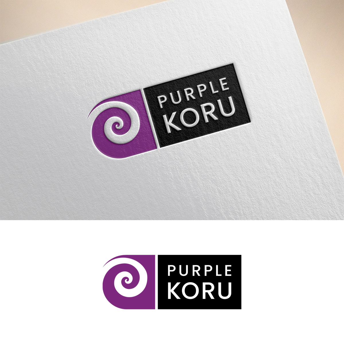
Purple Koru Logo Refinement

¿Quieres ganar un trabajo como este?
Este cliente recibió 165 diseños de logo de 83 diseñadores. Eligieron este diseño de logo de Gridline Concepts como el diseño ganador.
Únete gratis Encuentra trabajos de diseño- Garantía
Resumen de Diseño de Logo
The project is focused on refining a logo for Purple Koru. We are a strategic advisory and execution consulting firm located in North America, doing business around the world. Conceptually we have created the elements of what we are looking for.
The Koru icon sits on the left side of the logo and creates a visual ‘pull’ into the koru that is foundational against the Purple Koru text. The two examples attached provide direction, however, we’d like the twirl to be a little tighter to ensure the icon does not look like a wave. The thickness of the koru shape should be more uniform in thickness, like the lower icon, versus the upper icon. The otter vector lines of the koru need to be clean and not appear to be hand-drawn. Please ensure the vector lines to not create any artifacts that need to be smoothed at a later date.
The purple hex is #800080 or 7D287E. The font is Poppins. The primary logo text will be stacked (as shown), however, we will also create a horizontal version of the logo based on the stacked version.
The Koru is a spiral shape based on the appearance of a new unfurling silver fern frond. It is an integral symbol in Māori art, carving and tattooing, where it symbolizes new life, growth, strength, and peace
Texto del logo
Purple Koru