

 Refresh
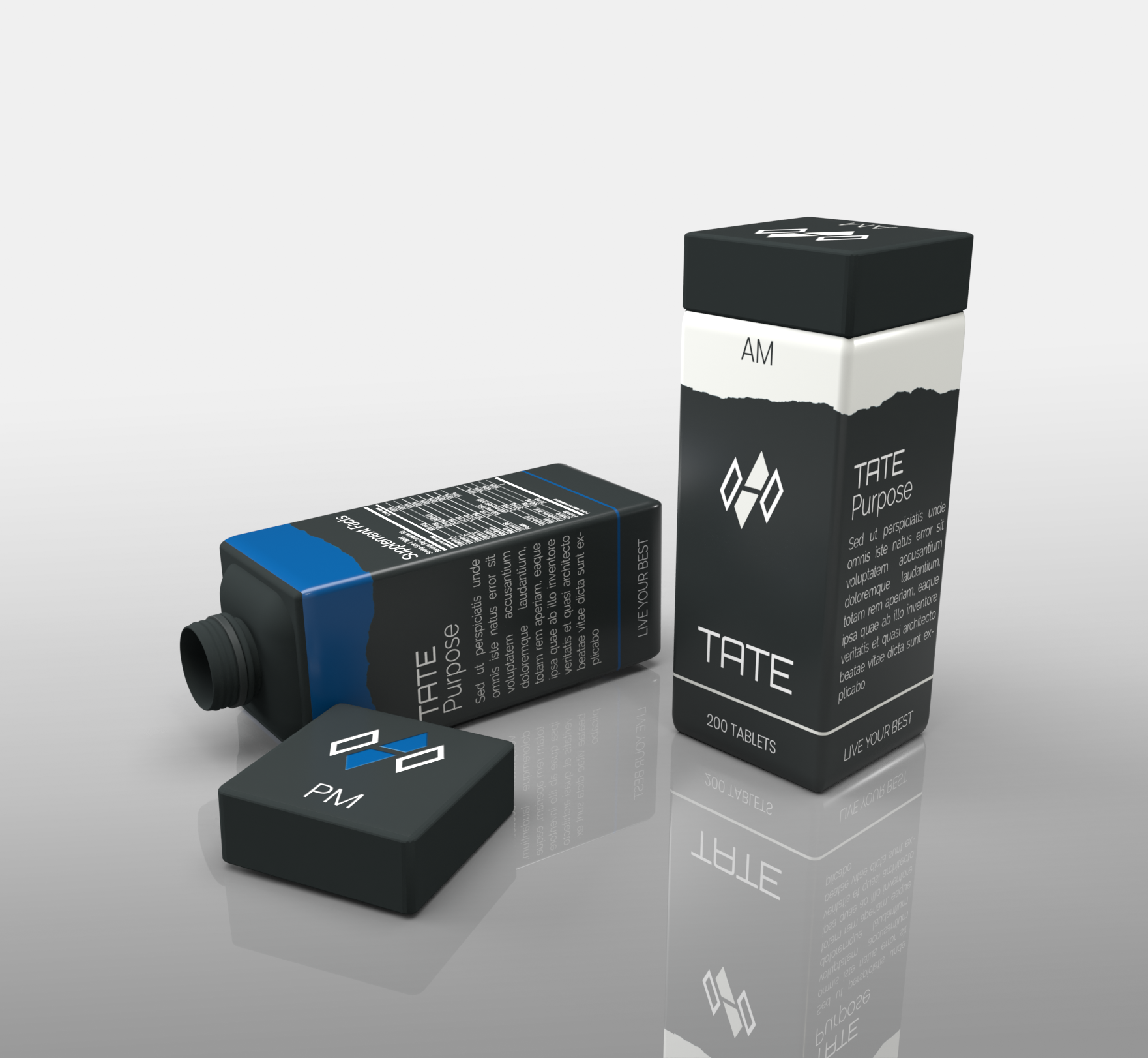
Distinctinctive and nordic inspired container design for a new started health and active brand.
¿Quieres ganar un trabajo como este?
Este cliente recibió 16 diseños de empaque de 8 diseñadores. Eligieron este diseño de empaque de SimonWhitaker como el diseño ganador.
Únete gratis Encuentra trabajos de diseño
-
 €170
€170
-
 16 diseños
-
 8 diseñadores
Resumen de Diseño de Empaque
Our company name is TATE and stands for "Take action, To Elevate". Our goal is to provide a no BS approach to Supplementation and specific problem solving products.
As a Danish based brand our key words is: "Minimalism", "clear lines", "Nordic colours i.eg. and as seen in canvas", "Purity", "simplicity", "design", "Functionality", "health", "clarity" and "calm".
This design is aimed at a two container product (AM) for "night" and (PM) for "day".
Design is focused on a rectangular shape with a rectangular shape lid that screws on to a uniform and harmonious design.
Colour wise we are most into matte "earth colors that can also be seen in canvas.
These can be singular or a mix in the design but we kindly ask to stay away from "bright and shiny" colours.
Logos and scriptures will be added as a 2D effect, with exception for the lid logo which we would to see retracted into the lid itself.
In a rendering design we would like two containers next to each other seen from different angles where one lid is screwed off and one is screwed on.
In addition we would like a single container rendering showing only PM and only AM.
Happy designing
Claus & Dannie - TATE
Objetivo del mercado(s)
European and North american markets.
Target: Male and Female age group 18-50.
Tipo de industria / entidad
Health Product
Estilos de fuente para usar


Mira y siente
Cada control deslizante ilustra las características de la marca del cliente y el estilo que debe comunicar el diseño de tu logotipo.
Elegante
Atrevido
Juguetón
Serio
Tradicional
Moderno
Atractivo
Profesional
Femenino
Masculino
Vistoso
Conservador
Económico
De Alta Gama
Requisitos
Debes tener
- Clear and distinctive profile
Matte colours
uniform and harmonious shape (rectangular base)
inspired by earth minerals colours and contours.
Agradable de tener
- 3D visual effect in rendering to better get a feel of the product
No debería tener
- Shiny colours or material indicators.