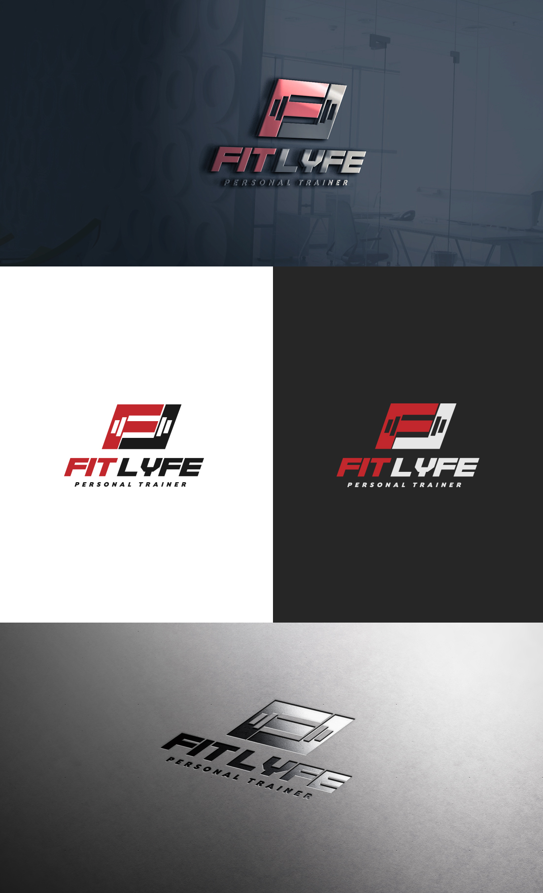
My personal Training Business (1-on-1 & Online service) needs an edgy/motivating logo design.

¿Quieres ganar un trabajo como este?
Este cliente recibió 55 diseños de logo de 28 diseñadores. Eligieron este diseño de logo de GLDesigns como el diseño ganador.
Únete gratis Encuentra trabajos de diseñoResumen de Diseño de Logo
I need a design for my personal (health/fitness) training business called "Fit Lyfe." I work with everyday people aiming to improve their health (physically/mentally), reconstructing their life-habits, and unlocking their true potential. I would like the design to be Black (primary)/Red (secondary).....OR Black (primary)/White(secondary).
I'd like the final design to relay the "power to overcome."
I think I want the "F" and the "L" of "Fit Lyfe" to stand out more than the rest of the word. The design can be somewhat edgy, but bold/motivational to the eye. Open to other ideas though!
Someone created this logo about a month back (attached file below), but it just doesn't do it for me. I think the barbell to the right of the text is too plain and looks like something that was created off Paint on windows '98.
The "F" & "L" stand out, but that's about it.... the remaining font of the words don't match the first letters either.
I want this to be something that I can place on shirts/merchandise too :)
Objetivo del mercado(s)
-Male & female
-All ages
-anyone looking to Improve their quality of life through fitness
Tipo de industria / entidad
Personal Trainer
Texto del logo
Fit Lyfe
Estilos de logo de interés
Logo con emblema
Logo contenido dentro una forma / figura
Logo de marca de nombre
Logotipo basado en palabra o nombre (solo texto)
Mira y siente
Cada control deslizante ilustra las características de la marca del cliente y el estilo que debe comunicar el diseño de tu logotipo.
Elegante
Atrevido
Juguetón
Serio
Tradicional
Moderno
Atractivo
Profesional
Femenino
Masculino
Vistoso
Conservador
Económico
De Alta Gama
Requisitos
Debes tener
- Black + Red
OR
Black + White
Agradable de tener
- The "F" & "L" of FitLyfe to stand out more than the rest. They can be merged together or apart. Making sure that it has that edgy (but easy to read) motivational look.
(updated...)
I'm liking the designs so far that place the "F" & "L" together in some sort of a shape (box, triangle, etc) with some sort of emblem through or in it (weight, fitness oriented shape, etc)