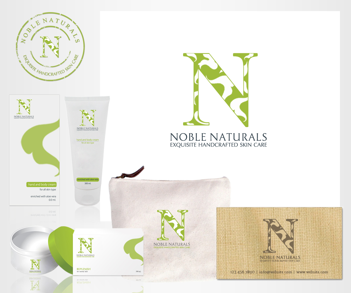
Noble Naturals/ Exquisite Handcrafted Skin Care
¿Quieres ganar un trabajo como este?
Este cliente recibió 72 diseños de logo de 18 diseñadores. Eligieron este diseño de logo de m_designs como el diseño ganador.
Únete gratis Encuentra trabajos de diseño-
 US$200
-
 72 diseños
-
 18 diseñadores
Resumen de Diseño de Logo
I am launching my fine hand crafted skin care line under a new name (formerly Life in Lavender) which includes my last name. I am interested in having a non gender logo. I have worked with two designers on this project already, and they keep missing it! I am attaching the logo I now have. I think the green/black is too masculine...maybe a charcoal "N" with a smaller serif? The tagline should be in serif but condensed so that it fits better underneath. And the leaves are too crowded and should look less like clip art, or add more leaves and reverse the "N" out?
Those are my thoughts but I am not a designer.
Actualizaciones
Project Deadline Extended
Reason: There are a couple of designs I really like. I will send separate messages to you.
Added Saturday, February 01, 2014
Project Deadline Extended
Added Monday, February 03, 2014
Objetivo del mercado(s)
Age 45-75, Income bracket of $100,000 up
Texto del logo
Noble Naturals/Exquisite Handcrafted Skin Care
Estilos de logo de interés
Logo pictórico / combinado
Un objeto del mundo real (texto opcional)
Logo abstracto
Conceptual / simbólico (texto opcional)
Mira y siente
Cada control deslizante ilustra las características de la marca del cliente y el estilo que debe comunicar el diseño de tu logotipo.
Elegante
Atrevido
Juguetón
Serio
Tradicional
Moderno
Atractivo
Profesional
Femenino
Masculino
Vistoso
Conservador
Económico
De Alta Gama
Requisitos
Debes tener
- I think the green/black is too masculine...maybe a charcoal "N" with a smaller serif? The tagline should be in serif but condensed so that it fits better underneath. And the leaves are too crowded and should look less like clip art, or add more leaves and reverse the "N" out?
Agradable de tener
- I think the green/black is too masculine...maybe a charcoal "N" with a smaller serif? The tagline should be in serif but condensed so that it fits better underneath. And the leaves are too crowded and should look less like clip art, or add more leaves and reverse the "N" out?
- Those are my thoughts but I am not a designer.