

 Refresh
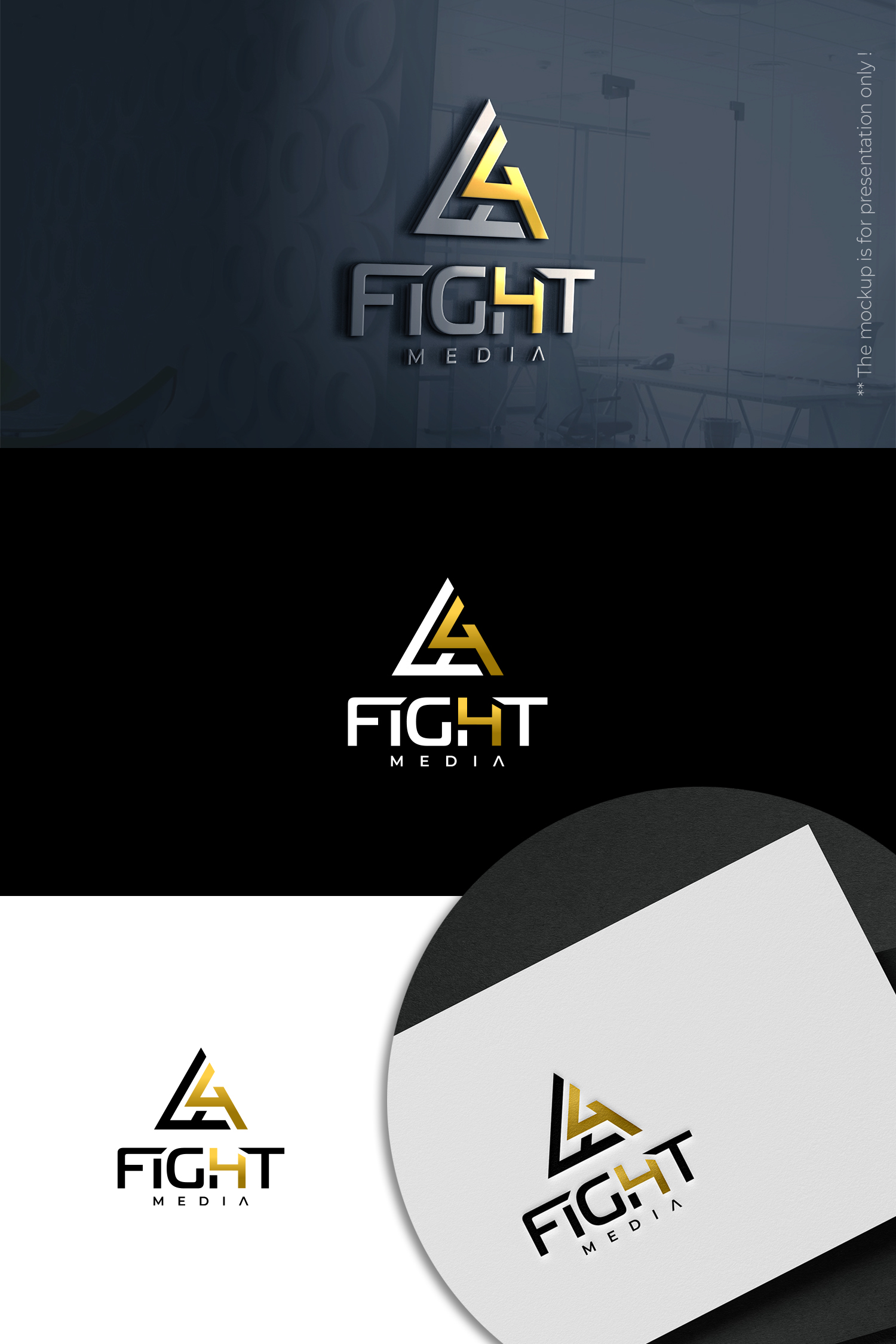
Combination Mark Logo for Media company with focus on athletic and financial industry.
¿Quieres ganar un trabajo como este?
Este cliente recibió 269 diseños de logo de 69 diseñadores. Eligieron este diseño de logo de designbysy como el diseño ganador.
Únete gratis Encuentra trabajos de diseño
-
 US$180
-
 269 diseños
-
 69 diseñadores
Resumen de Diseño de Logo
We need a logo design for a new media company based in New Jersey called Fight4 Media. We film and create documentary style content to help individuals and brands tell their stories to the world. Our motive and goal is to tell impactful stories those of success and failure through brands to motive the world to fight for what they believe in. We would like to see designs that use the color gold. The final design should communicate success, achievement and triumph. Other possibly helpful info: The founders of the brand are boxers and investors looking to work mainly with athletes, sporting brands, and people within the financial industry. There will be merch alongside the brand so I was thinking a combination mark for versatility, but I am open to all idea. You all are the professionals. Thank you in advance.

Actualizaciones
Need extra days to review
Objetivo del mercado(s)
Athletic and Financial Brands
Tipo de industria / entidad
Media
Texto del logo
Fight4
Estilos de logo de interés
Logo pictórico / combinado
Un objeto del mundo real (texto opcional)



Mira y siente
Cada control deslizante ilustra las características de la marca del cliente y el estilo que debe comunicar el diseño de tu logotipo.
Elegante
Atrevido
Juguetón
Serio
Tradicional
Moderno
Atractivo
Profesional
Femenino
Masculino
Vistoso
Conservador
Económico
De Alta Gama
Requisitos
Agradable de tener
- After seeing a good amount of the logos I received so far one thing that stood out to me as an eye sore has been the number 4 being seperate from the word FIGHT. I was thinking of combining the letter H and Number 4 to eliminate the standalone 4.
Also when the word FIGHT is in all caps the size of the letters G and H overpower the rest of the letters in the word. Above i tried to sketch out a way to minimize how much space the letters G ang H take up.
If the word media it used, I would like it to be used in very minimal if it is used at all.
These are really bad sketches, but I wanted to help anyway that I can.
No debería tener
- I do not want a play button to be included in the logo design or name.


