App Icon - Many Sizes - iPhone, iTunes, Android + Market
¿Quieres ganar un trabajo como este?
Este cliente recibió 38 diseños de ícono de 5 diseñadores. Eligieron este diseño con ícono de Sergio Medina como el diseño ganador.
Únete gratis Encuentra trabajos de diseño- Garantía
-
 C$140
C$140
-
 38 diseños
-
 5 diseñadores
Resumen de Diseño Con Ícono
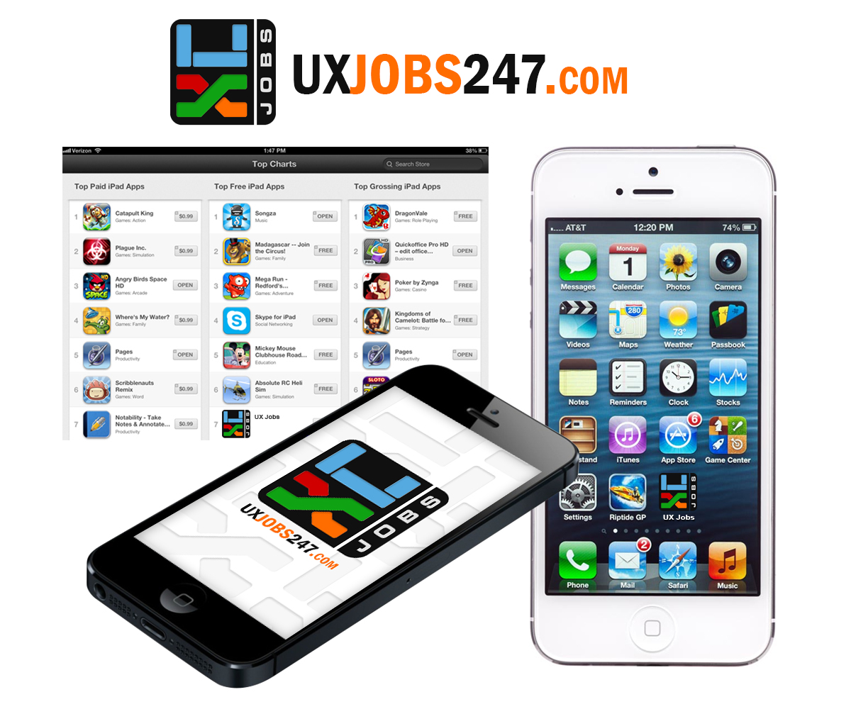
http://uxjobs247.com You can see the current logo we use. But I don't want to use that same icon unless you can make it look really cool. Use colours from corporate parent company logo, attached.
On larger versions I will probably want to add text. Like website address, email, tag line etc.
*** start with 80 x 80 version for submissions ***
- application logo [x2]:
* 330 x 59 px
- iPhone app icons (with NO transparent background):
* 29 x 29 px
* 57 x 57 px
* 58 x 58 px
* 80 x 80 px
* 114 x 114 px
* 120 x 120 px
- AppStore and iTunes icons:
* 512 x 512 px
* 1024 x 1024 px
- iPhone launch screens [x3]:
* 320 x 480 px
* 640 x 960 px
* 640 x 1136 px
- Android app icons (with NO transparent background):
* 48 x 48 px
* 72 x 72 px
* 96 x 96 px
- Android market icon:
* 512 x 512 px
Actualizaciones
The icon does not HAVE to match the website logo. I'm trying to use the corporate parent logo colours to make the app icon stand out.
Providing previous of how it might look in different settings will help. Wish list, app store details page, screenshot of how it might look like in a group of random apps.
Added Wednesday, January 29, 2014
Objetivo del mercado(s)
Young professionals in User Experience field. So your design has to take that into account.
Tipo de industria / entidad
It Company
Mira y siente
Cada control deslizante ilustra las características de la marca del cliente y el estilo que debe comunicar el diseño de tu logotipo.
Elegante
Atrevido
Juguetón
Serio
Tradicional
Moderno
Atractivo
Profesional
Femenino
Masculino
Vistoso
Conservador
Económico
De Alta Gama
Requisitos
Debes tener
- Design and colours that make it stand out in a crowded screen.
- Clarity at most smaller resolutions.