Famous tv star needs exceptional logo designed - crossfit, heath/fitness theme
¿Quieres ganar un trabajo como este?
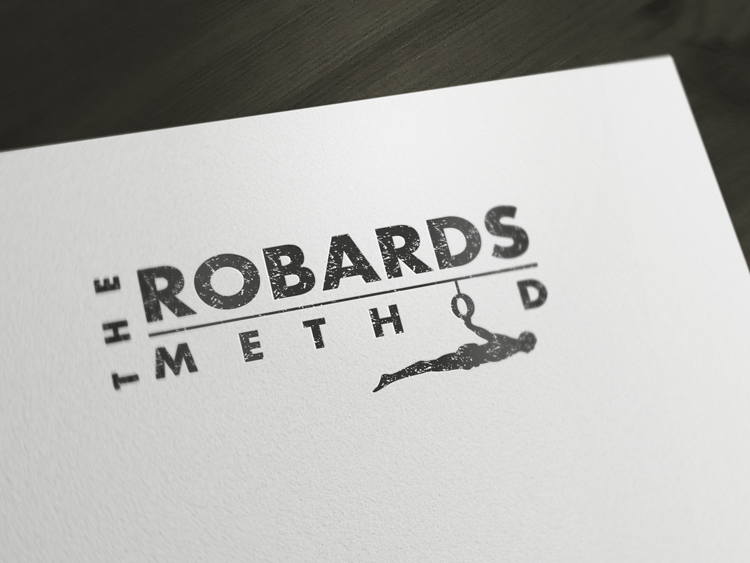
Este cliente recibió 64 diseños de logo de 18 diseñadores. Eligieron este diseño de logo de Alex Martin como el diseño ganador.
Únete gratis Encuentra trabajos de diseño- Garantía
-
 A$200
A$200
-
 64 diseños
-
 18 diseñadores
Resumen de Diseño de Logo
Hi everyone,
Very excited to offer this project to some of the best logo designers out there. We need a new logo for a crossfit and health/fitness themed business, owned by a famous tv star!
The logo will represent the entire brand moving forward so we need high quality, 100% original design and a creative logo.
We like clean lines, simple and beautiful illustration for a graphic design/drawing incorporated with type. Needs to be tough as it's representing a crossfit business and high level of fitness promoting muscles and the perfect body!
Business Name: The Robards Method
Tagline: Less Is More
We would like a design to show something like the 'back lever' exercise as an illustration incorporated with the business name and tagline. You may want to link in some of the letters of the name of the business with some cross-fit rings or a bar to provide a 'base' for the lettering/graphic.
Alternatively, we could also accept something like TRM (first letters from 'The Robards Method' as the illustration/graphic above or beside the business name text.
Please see photo attached with the image of the back lever in action. I've also attached a screenshot of images that show the crossfit style of rings or a bar that the exercise is used on.
The illustration of the workout can be a silhouette, lines or part of the exercise - it can represent the 'less is more' concept.
Actualizaciones
Some great designs coming through! Thanks for everyones input. Looking forward to seeing many more and coming to a decision soon :)
Added Friday, January 31, 2014
Objetivo del mercado(s)
Men aged 25 &up - interested in crossfit, fitness, health, eating well and muscles. Strong fitness, modelling and body image.
Tipo de industria / entidad
Tv
Texto del logo
The Robards Method - Less Is More
Estilos de logo de interés
Logo con personaje
Logo con ilustración o personaje
Mira y siente
Cada control deslizante ilustra las características de la marca del cliente y el estilo que debe comunicar el diseño de tu logotipo.
Elegante
Atrevido
Juguetón
Serio
Tradicional
Moderno
Atractivo
Profesional
Femenino
Masculino
Vistoso
Conservador
Económico
De Alta Gama
Requisitos
Debes tener
- The wording 'The Robards Method'
- Tagline: Less Is More
- Must be male dominant, tough, very professional and modern contemporary look.
Agradable de tener
- Illustration of man doing 'back lever' working in with the type.
- Could have workout bar or crossfit rings to support type and man doing the exercise.
- Colours could be black - or white on black backgrounds. Otherwise use dominant colour with black (like yellow, red or blue).
- We could also accept something like TRM (first letters from 'The Robards Method' as the illustration/graphic above or beside the business name text.
No debería tener
- Needs to be 100% original. Do not want any cheap looking drawings/icons or clipart type images.