ENGVEST Logo Design update with eXp Commercial
¿Quieres ganar un trabajo como este?
Este cliente recibió 62 diseños de logo de 22 diseñadores. Eligieron este diseño de logo de BNdesigner como el diseño ganador.
Únete gratis Encuentra trabajos de diseño- Garantía
-
 US$200
-
 62 diseños
-
 22 diseñadores
Resumen de Diseño de Logo
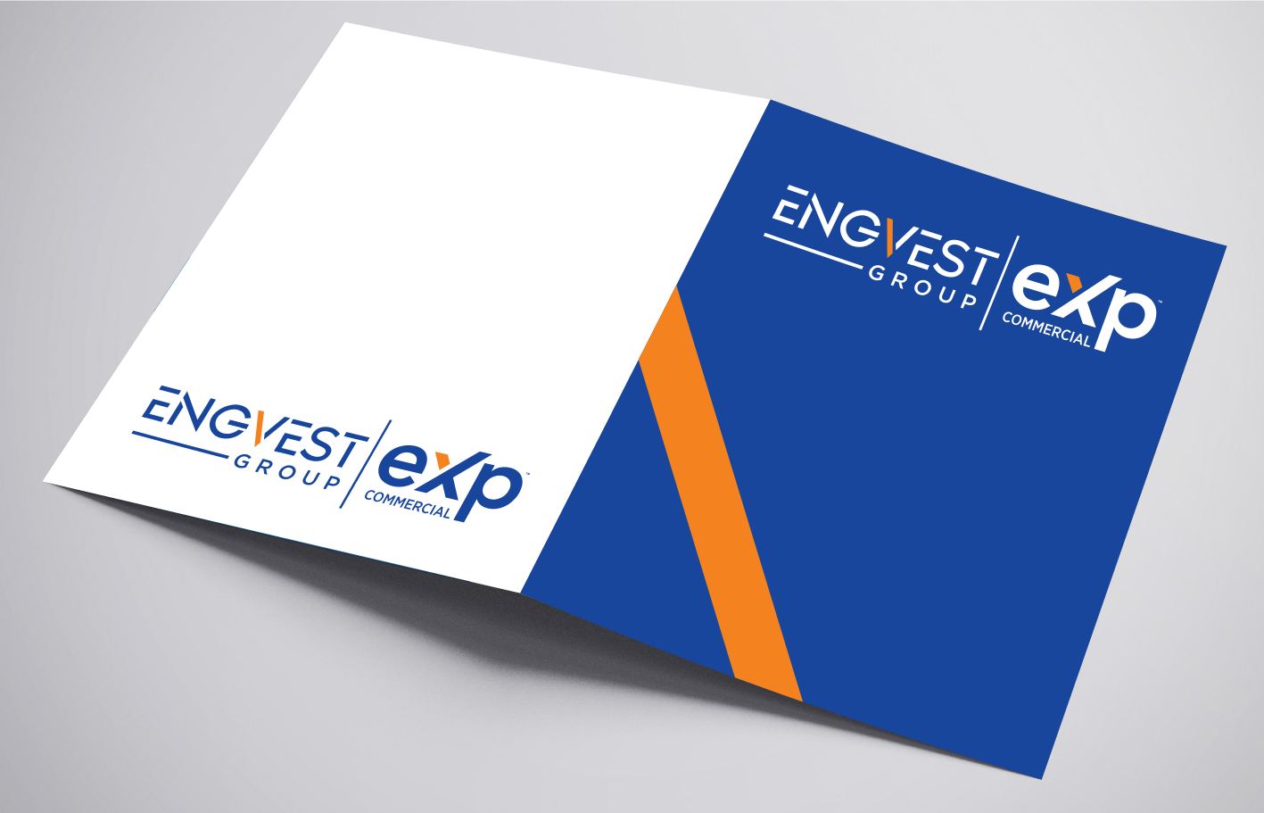
We affiliated with a new company eXp Commercial which we can not change their logo but we still have a branded Group name ENGVEST . I will attached some old engvest logos we had . I will use to Logo on my website and Marketing signs . I will need to fit this 2 logos together on a Real Estate 4' x8' Sign . So the Combined logos shouldn't be too wide. I would like a Horizontal Logo and a Square logo so it fits ion Social Media Profiles Circles . ENGVEST Group | eXp Commercial . I would like to add my website very small to the logo if possible engvest.com . Take at look at the files that I have. Thanks. - here are some brand guildlines https://join.exprealty.com/brand/
I added an updated logo design I was trying to make. I like the design I created. Please fix and see what other ideas you have . Thanks
Actualizaciones
I uploaded a new AI file of a design I was working on. Please help recreate and see if there is anything else you can add to it .
Added Monday, December 14, 2020
Objetivo del mercado(s)
Commercial Real Estate \ Investment Sales \ Leasing \ Tenant Rep\ Office | Retail \Industrial
Tipo de industria / entidad
Investment
Texto del logo
ENGVEST Group | eXp Commercial
Estilos de logo de interés
Logo de marca de nombre
Logotipo basado en palabra o nombre (solo texto)
Logo con siglas
Acrónimo o logo tipográfico (solo texto)
Estilos de fuente para usar
Mira y siente
Cada control deslizante ilustra las características de la marca del cliente y el estilo que debe comunicar el diseño de tu logotipo.
Elegante
Atrevido
Juguetón
Serio
Tradicional
Moderno
Atractivo
Profesional
Femenino
Masculino
Vistoso
Conservador
Económico
De Alta Gama
Requisitos
Debes tener
- I like the Blue - eXp Commercial has some orange color to it. I am trying to create a ENGVEST Group brand to work along eXp Commercial (eXp Commercial Logo can not be adjusted )
Agradable de tener
- ENGVEST - Would be cool to design the E with maybe 3 lines instead. Something that looks like investment or Commercial Retail/Office and etc
Or do a color variation to the V to stand out?
I am think the E (3 Lines) might be too aggressive depending on the design
No debería tener
- No added ICONS unless it is in the ENGVEST letters