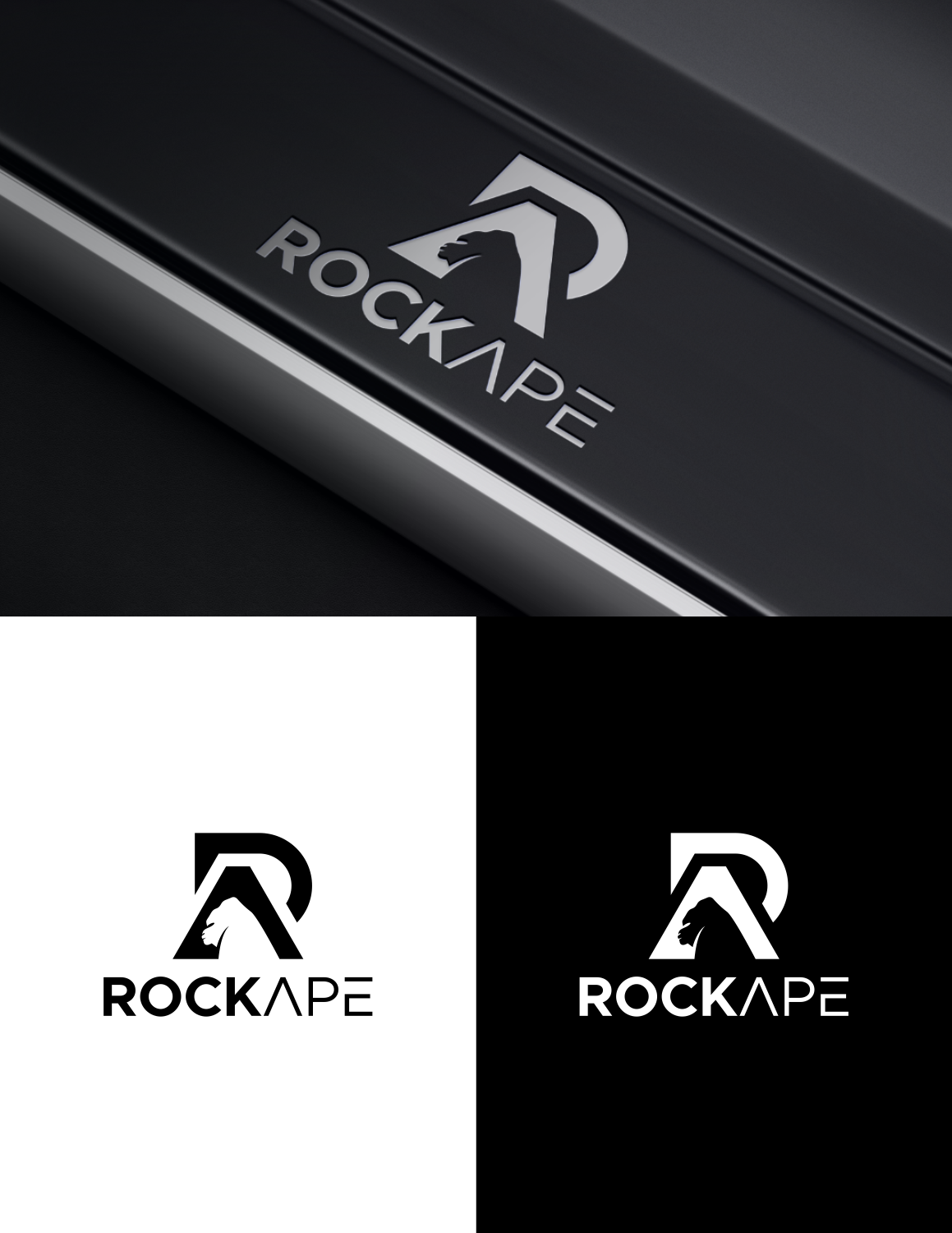
RockApe PC manufacturer and retailers logo
¿Quieres ganar un trabajo como este?
Este cliente recibió 90 diseños de logo de 56 diseñadores. Eligieron este diseño de logo de cahnub 2 como el diseño ganador.
Únete gratis Encuentra trabajos de diseño-
 £110
£110
-
 90 diseños
-
 56 diseñadores
Resumen de Diseño de Logo
Summary: We are looking to replace our existing brand logo (see attached) which we like, but don't have sufficient ownership rights for our intended usage.Please do not incorporate this current iteration into your design as it may contravene the current ownership rights. However, a design loosely based on it would be considered.
About RockApe: RockApe (www.rock-ape.com) is a recently launched online PC store which specialises in creating bespoke PCs for gaming, work and home entertainment, but also sells ancillary products such as keyboards, monitors etc. as well as standalone computing components, including hard drives, power supplies etc. Whilst we currently only sell other brand’s components, we endeavour to begin manufacturing our own branded products in the near future, as well as host gaming events.
Brand identity/positioning: RockApe is a modern IT/PC company; although we cater to all budgets, we consider ourselves a premium and aspirational brand.
Logo usage: We need a strong brand identity led by a potentially iconic brand logo which is broad enough to be used in multiple mediums: website, email signature, signage, uniforms etc, but importantly needs to stand out on manufactured products e.g. PC cases (potentially backlit), power packs, monitors etc.
Preferred logo style: In keeping with our brand identity and usage, we’re looking for something that looks/feels modern and ‘cool’ that appeals to our younger demographic (18-35), but ideally a relatively simplistic design which is distinct and easily identifiable against a back drop of competing brands, many of which are prose based logos e.g. InWin, Silverstone, NZXT. Whilst our demographic will be a generally young gaming audience, we are also targeting professionals. Therefore, the representation of the ape in the logo should not feel cartoonish, or immature, nor should it be screaming or roaring (too) aggressively as it would feel inappropriate on a PC used in a corporate office environment.
Although our logo thus far has been icon led (e.g. Apple), we’re not averse to the name of the company, RockApe, being included within the logo, but ideally would be easily removed / added as appropriate to its usage. When used in prose, RockApe is presented as one word, but with the A of ape capitalised to help distinguish the two words – please feel free to play with this in the logo design i.e. all lower case, all uppercase etc.
Objetivo del mercado(s)
Gamers approx 18-35, professionals (for work based PCs) and those looking for premium home entertainment units. The design needs to appeal to all - as much as to gamers, as it does for professionals in a corporate environment. It needs to feel more sophisticated / grown up than cartoonish or too targeted at a young audience.
Tipo de industria / entidad
It Company
Texto del logo
RockApe
Estilos de logo de interés
Logo pictórico / combinado
Un objeto del mundo real (texto opcional)
Logo con personaje
Logo con ilustración o personaje
Mira y siente
Cada control deslizante ilustra las características de la marca del cliente y el estilo que debe comunicar el diseño de tu logotipo.
Elegante
Atrevido
Juguetón
Serio
Tradicional
Moderno
Atractivo
Profesional
Femenino
Masculino
Vistoso
Conservador
Económico
De Alta Gama
Requisitos
Debes tener
- In keeping with our brand identity and usage, we’re looking for something that looks/feels modern and ‘cool’ that appeals to our younger demographic (18-35), but ideally a relatively simplistic design which is distinct and easily identifiable against a back drop of competing brands, many of which are prose based logos e.g. InWin, Silverstone, NZXT. Whilst our demographic will be a generally young gaming audience, we are also targeting professionals. Therefore, the representation of the ape in the logo should not feel cartoonish, or immature, nor should it be screaming or roaring (too) aggressively as it would feel inappropriate on a PC used in a corporate office environment.
No debería tener
- The representation of the ape in the logo should not feel cartoonish, or immature, nor should it be screaming or roaring (too) aggressively as it would feel inappropriate on a PC used in a corporate office environment.