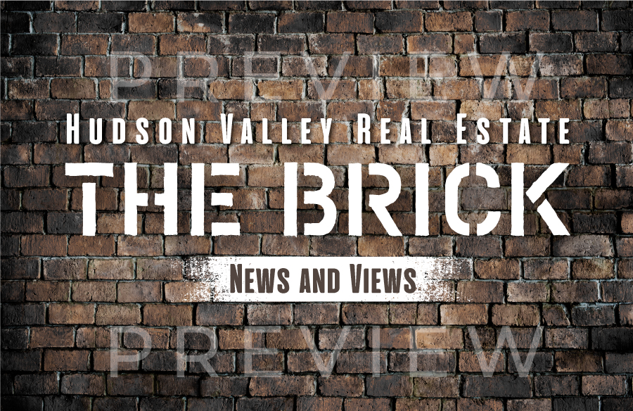
Graphic for The Brick newsletter - Graffiti style font
¿Quieres ganar un trabajo como este?
Este cliente recibió 31 diseños gráficos de 8 diseñadores. Eligieron este diseño gráfico de Alaya como el diseño ganador.
Únete gratis Encuentra trabajos de diseño-
 US$110
-
 31 diseños
-
 8 diseñadores
Resumen de Diseño Gráfico
I need a few different images that have different purposes but are all for an email newsletter I produce, The Brick. One is for social media posting and the other is for use in the newsletter itself as the banner (you can see the front page of the newsletter attached to get a feel for how it has existed to date) and on my website to take people to current and back issues of the newsletter. The Brick is a monthly newsletter with updates on the real estate market in Hudson Valley, New York. Social media postings will be to advertise the newsletter and organically grow with new subscribers. The Brick got its name due to the Hudson Valley being steeped in brickyard history as much of construction in yesteryear was of brick with the Hudson Valley being a center point of manufacture.
1). Image of bricks (like a brick wall) with the words "The Brick". My vision is the brick image would be of more vintage looking brick wall with the words "The Brick" in almost a hand written graffiti type of font potentially on a slant. I need this as a jpg file that is sized to post on Instagram, Facebook and LinkedIn. The purpose of this one is to catch eye and lead people to click to subscribe.
2) I also need a second banner image for the website and email newsletter that has the same feel but includes "Hudson Valley Real Estate News and Views". If "Hudson Valley Real Estate News and Views" can also fit on the one for social media posting, it would be ideal, but I would opt to exclude the extra words rather than clutter on social media if need be. For the newsletter banner version, I have attached a copy of the last Brick newsletter that went out. I'm looking to replace the current words "The Brick" with an actual image for the next newsletter.
I attached my logo so you can get a feel for the colors. It can contrast with the logo to stand out but it needs to be a complimentary contrast with the colors in the logo so it works in close proximity to it in the newsletter (as you'll see in attached). While it would be ideal to have consistency across platforms, the version for social media can utilize a different color theme if desired as that image will stand alone without proximity to my logo.
Objetivo del mercado(s)
35-65 male and female
Estilos de fuente para usar
Gustan otros estilos de fuente:
- more on the graffiti side
Mira y siente
Cada control deslizante ilustra las características de la marca del cliente y el estilo que debe comunicar el diseño de tu logotipo.
Elegante
Atrevido
Juguetón
Serio
Tradicional
Moderno
Atractivo
Profesional
Femenino
Masculino
Vistoso
Conservador
Económico
De Alta Gama
Requisitos
Debes tener
- Brick wall as backdrop and handwritten on the graffiti style font. For newsletter and website banner it can't clash with my logo as they would be in close proximity of each other. It can complimentary contrast though.
Agradable de tener
- "Hudson Valley Real Estate News and Views" included as a tagline and descriptor . Along the lines of the attached font, but not. More bold. Less whimsical and more on the graffiti side.