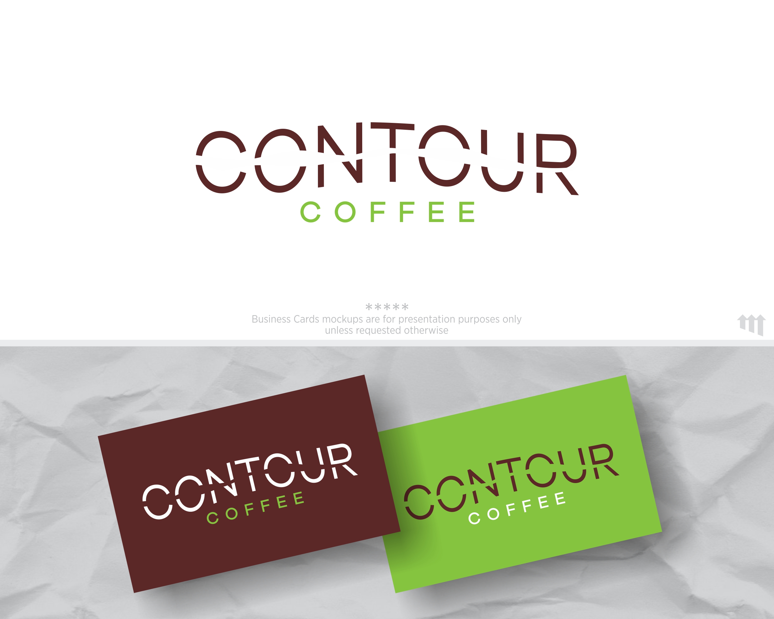
Contour Coffee: Colorado Coffee Roaster logo with Topographic Map Inspiration
¿Quieres ganar un trabajo como este?
Este cliente recibió 39 diseños de logo de 17 diseñadores. Eligieron este diseño de logo de MBARO como el diseño ganador.
Únete gratis Encuentra trabajos de diseño- Garantía
-
 US$150
-
 39 diseños
-
 17 diseñadores
Resumen de Diseño de Logo
We are a 42 year old coffee who is rebranding to reach a wider market. We roast a wide range of coffee from around the world and sell it to retail outlets, cafes, and restaurants.
Our logotype must standout on crowded shelves, window stickers "we proudly serve Contour Coffee" and coffee pot wraps.
Just like a topographic map, the challenge here is to present the name of our company that is instantly recognizable as the right way to go…to great coffee)
Objetivo del mercado(s)
Health, Educated, urban and suburban coffee drinkers who appreciate clean and modern design.
Texto del logo
Contour Coffee
Estilos de logo de interés
Logo pictórico / combinado
Un objeto del mundo real (texto opcional)
Logo de marca de nombre
Logotipo basado en palabra o nombre (solo texto)
Estilos de fuente para usar
Gustan otros estilos de fuente:
- font files attached
Mira y siente
Cada control deslizante ilustra las características de la marca del cliente y el estilo que debe comunicar el diseño de tu logotipo.
Elegante
Atrevido
Juguetón
Serio
Tradicional
Moderno
Atractivo
Profesional
Femenino
Masculino
Vistoso
Conservador
Económico
De Alta Gama
Requisitos
Debes tener
- The words Contour Coffee in it.
VERSION in BLACK, VERSION IN COLOR
We like typography and designs that use type in non-linear ways.
Inspired by topographic maps. See the pdf for image examples.
Colors drawn from mapping - browns, greens, etc.
This wonderful tension between the flowing organic lines of a map contour - and the bold clarity of the type. Don't feel like you need to keep the type on a horizontal line, but it really is a tension.
Agradable de tener
- The design fits inside a compact shape - square, circular, rectangle. Nothing too spread out. However, a variation that works on a website or banner ad would is good.
No debería tener
- Gradients. I hate logos with color gradients. This logo should work well in black and white as well as it does in colors.
Topo maps have gridlines - as shown in the screen shot. I don't want an actual map.
Also, the maps shown use ariel and trebuchet MS fonts - don't use those or any fonts used in the actual maps provided for inspiration.