The Bruce 97.9 - a new radio station for Bruce County
¿Quieres ganar un trabajo como este?
Este cliente recibió 52 diseños de logo de 20 diseñadores. Eligieron este diseño de logo de basukiraman como el diseño ganador.
Únete gratis Encuentra trabajos de diseño-
 C$150
C$150
-
 52 diseños
-
 20 diseñadores
Resumen de Diseño de Logo
"The Bruce" will be a rock-format radio station serving Bruce County, Ontario, Canada. Bruce County is an area known for its rugged and rocky, yet beautiful natural landscape. Our station will reflect the personality of the region and its people. We'll target classic rock and modern rock listeners, skewing male (60/40). "Bruce" will be a character on-air, with a personalty that is bold, independent, funny and self-deprecating yet confident. It will be a BIG sounding radio station. Modern radio station logos typically use thicker typeface, without substantial amounts of decoration. (See: https://www.bellmedia.ca/radio/ or https://www.corusent.com/media-centre/brands/?fwp_divisions=radio for examples). They sometimes (but not always) include some kind of token symbol. It needs to be versatile enough to apply to building signage, branded clothing, stickers, shared posters (along side many other logos), digital assets, and more.
We would like the logo to be in a similar style to another one of our radio stations 89.1 MAX FM, which is in turn inspired a bit by the "parental advisory explicit content" logo that can be found on music albums that have mature content (see attachments).
Actualizaciones
Need extra days to review
After some internal discussion, we've decided to go in a different direction than the designs we've received. We've updated the brief and hope one of the designers can help us to finalize the sketch we've come up with.
Objetivo del mercado(s)
Males 45-65, rural/suburban but sophisticated
Tipo de industria / entidad
Radio Station
Texto del logo
97.9 the BRUCE (tag line: "Respect the Rock")
Estilos de logo de interés
Logo con emblema
Logo contenido dentro una forma / figura
Logo pictórico / combinado
Un objeto del mundo real (texto opcional)
Logo de marca de nombre
Logotipo basado en palabra o nombre (solo texto)
Estilos de fuente para usar
Colores
Diseñador para elegir solo colores en escala de grises para usar en el diseño.
Mira y siente
Cada control deslizante ilustra las características de la marca del cliente y el estilo que debe comunicar el diseño de tu logotipo.
Elegante
Atrevido
Juguetón
Serio
Tradicional
Moderno
Atractivo
Profesional
Femenino
Masculino
Vistoso
Conservador
Económico
De Alta Gama
Requisitos
Debes tener
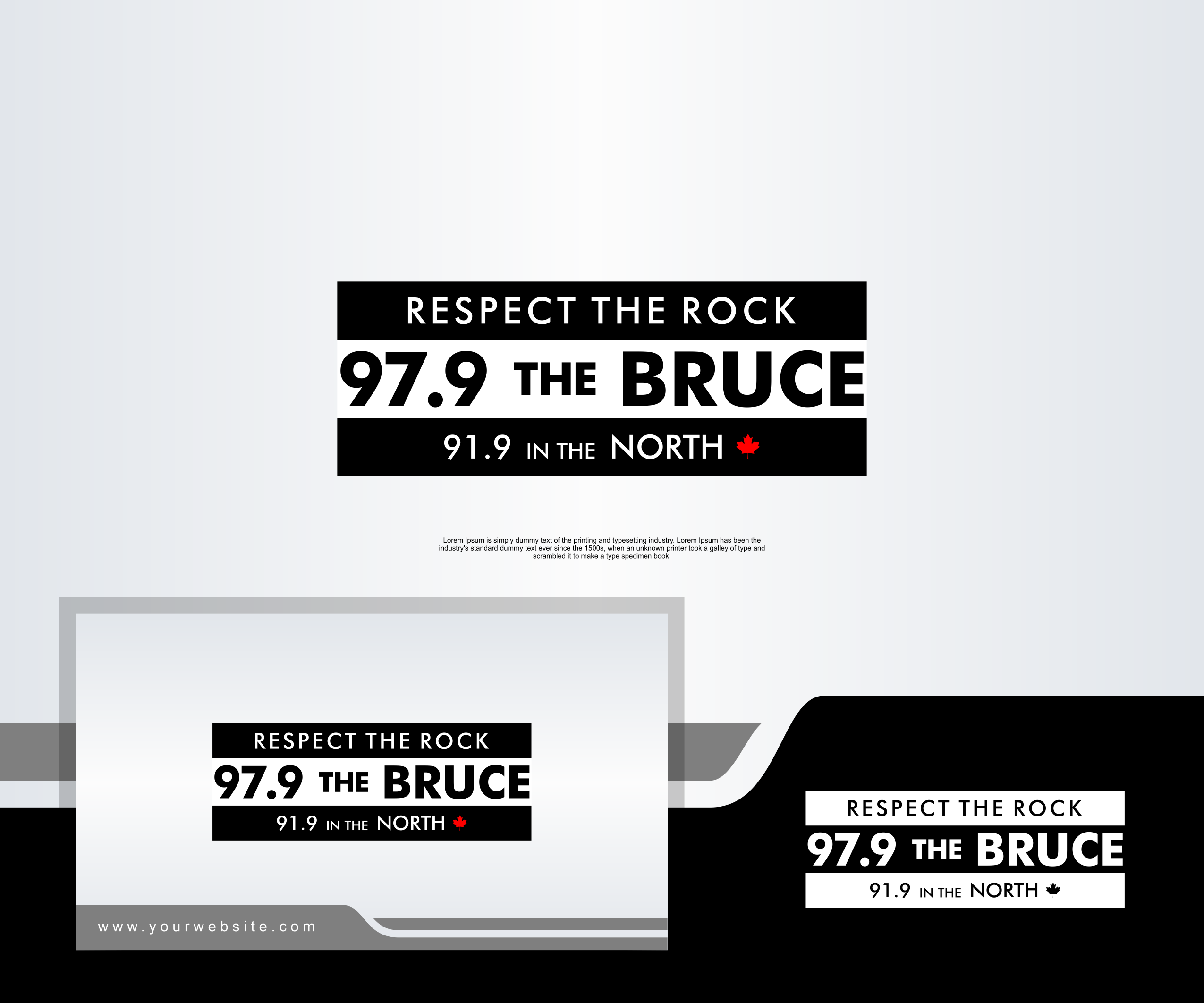
- The logo should be a very similar style to our existing 89.1 MAX FM radio station logo (which in turn is inspired by the "parental advisory explicit content" logo found on music albums that have mature content).
The top line (white text, black background) should be the tag line: "RESPECT THE ROCK"
The center line (black bold text, white background) should be the station name: "97.9 the BRUCE"
The bottom line (same style as top) should be the repeater frequency of the station: "91.9 in the NORTH"
The font used for the top and bottom line of text should be Futura Medium BT. The centre line could also be Future Medium (bold) or similar.
Agradable de tener
- We'd like to try and integrate both a maple leaf symbol (representing Canada) and the geographical shape of the county, which is somewhat iconic and recognized in our area (see attached map). Or, possibly integrate a guitar or guitar pick.
These symbols can be included on the bottom line, probably, and help fill the space by the shorter line there.
No debería tener
- It should NOT include a record player adapter as a symbol (i.e. https://www.bluescentric.com/images/product/large/431.jpg) -- this is used by our competitors in their logo.