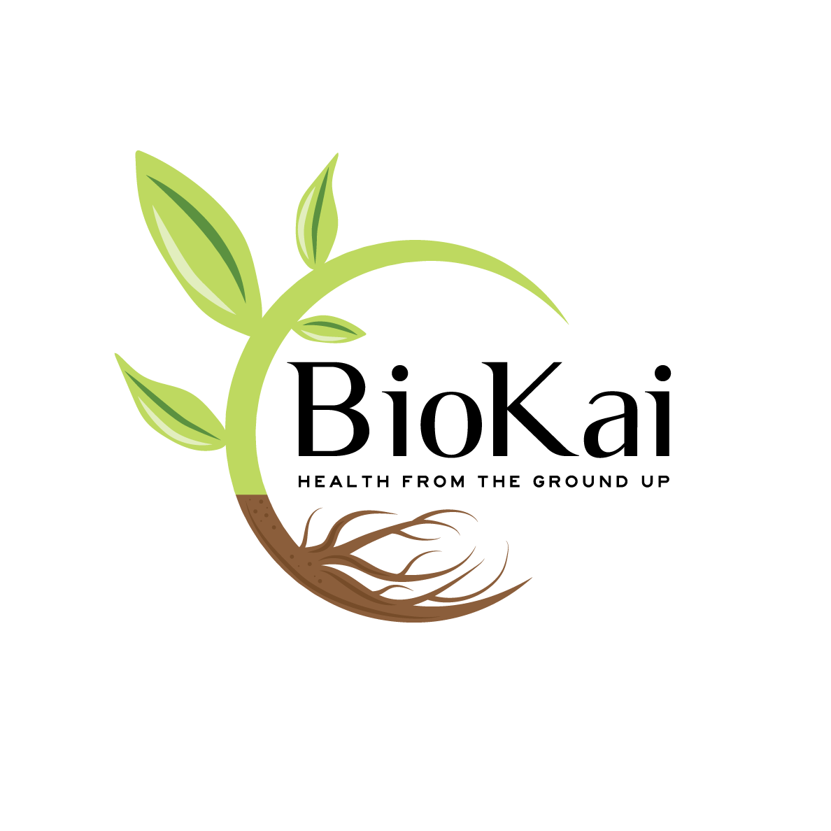
Soil Consultant and Composting Business needs a logo design

¿Quieres ganar un trabajo como este?
Este cliente recibió 101 diseños de logo de 51 diseñadores. Eligieron este diseño de logo de Kimh como el diseño ganador.
Únete gratis Encuentra trabajos de diseño- Garantía
Resumen de Diseño de Logo
We need a logo design for a new company based in New Zealand. It is called "BioKai - Health from the Ground Up".
It is a sister company from KoruKai Herb Farm (www.korukai.co.nz, thanks LogoPorn for the awesome logo).
We are wanting to educate people on the benefits of healthy soil to grow nutritious food filled with nutrient, antioxidants, phytochemicals to keep and make us healthy (health from the soil). The soil organisms and diversity play here a crucial role to foster our own human microbiome as well.
At the start we are offering education and consultancy for farmers, growers and people wanting to grow their own food - how to make compost, how to look after the soil microorganisms etc.
We want to extend this to supply compost innocultants and other products that help people and make their job easier.
We would like to see designs that are visually similar to KoruKai Herb Farm's design to visualize the connection of the two companies.
We would like to see the colour green.
The final design should communicate healthy plants/seedlings growing in healthy soil.
Objetivo del mercado(s)
Farmers, Growers, Gardeners
Tipo de industria / entidad
Gardening
Texto del logo
BioKai - Health from the Ground Up
Estilos de logo de interés
Logo pictórico / combinado
Un objeto del mundo real (texto opcional)
Estilos de fuente para usar
Gustan otros estilos de fuente:
- Luxia, Highway Gothic expanded
Mira y siente
Cada control deslizante ilustra las características de la marca del cliente y el estilo que debe comunicar el diseño de tu logotipo.
Elegante
Atrevido
Juguetón
Serio
Tradicional
Moderno
Atractivo
Profesional
Femenino
Masculino
Vistoso
Conservador
Económico
De Alta Gama
Requisitos
Debes tener
- A pictoral logo with green and maybe a seedling growing etc.
A brown earthy colour would be good to have.
Text: BioKai - Health from the Ground Up
BioKai should be spelled like that "BioKai"
We want people to see that BioKai is a sister company from KoruKai so the look should be similar but still different enough to be visually different at a glance. We want the pictoral to be unique and not similar or the same as the KoruKai one. The writing can be similar to KoruKai's logo.
Agradable de tener
- We like designs that are clean and clear and not overly playful. We like designs that concentrate on the important parts and not add any unnecessary things.
You can play with fonts or use Luxia and Highway Gothic Expanded.
No debería tener
- Unnecessary additions that are confusing or overly playful.
Do not add tillage lines from an agricultural field as this is not what we promote with BioKai.