Computer Consultant Looking to Have His Business Card Idea Perfected
¿Quieres ganar un trabajo como este?
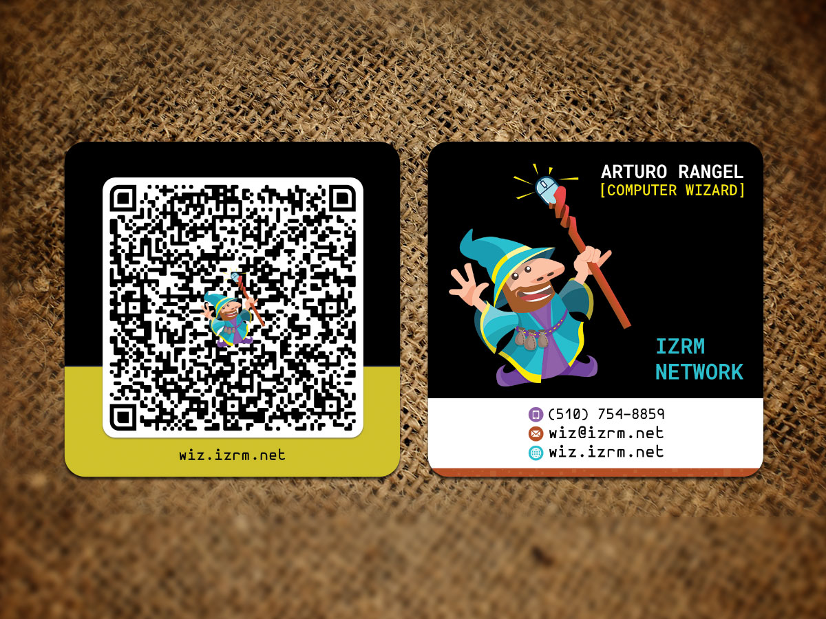
Este cliente recibió 45 diseños de tarjeta de presentación de 5 diseñadores. Eligieron este diseño de tarjeta de presentación de Sandaruwan como el diseño ganador.
Únete gratis Encuentra trabajos de diseño- Garantía
-
 US$50
US$50
-
 45 diseños
-
 5 diseñadores
Resumen de Diseño de Tarjeta de Presentación
Hi! My name is Arturo, and I am starting a computer consulting business. I have a mock-up of what I want my business card to look like, but I would like to have the real pros perfect it.
If you really want to submit a completely new design, you are welcome to. I am obviously biased, but I am also an amateur. If you have something that you think would work better, please don't be afraid to submit it.
Do let me know if I forgot to mention anything important. This is my first time hiring designers. It's exciting! I'm looking forward to working with you.
Objetivo del mercado(s)
Small businesses and families.
Tipo de industria / entidad
Consultant
Información de contacto para la tarjeta del negocio
See draft.
Estilos de fuente para usar
Gustan otros estilos de fuente:
- Hermit, monospace
Mira y siente
Cada control deslizante ilustra las características de la marca del cliente y el estilo que debe comunicar el diseño de tu logotipo.
Elegante
Atrevido
Juguetón
Serio
Tradicional
Moderno
Atractivo
Profesional
Femenino
Masculino
Vistoso
Conservador
Económico
De Alta Gama
Requisitos
Debes tener
- Pretty set on these, unless you have a very good reason why you'd change them:
- FontAwesome icons for contact info.
- Hermit font. I just love it too much. At least for the name/title/company name.
- Shape: Rounded square
- Document trim size: 2.51" x 2.51" (64 x 64 mm)
- Full bleed size 2.63" x 2.63" (67 x 67 mm)
Definitely need help with:
- Colors. I just have no idea what would look good. I would like to see different combinations.
- Improvements to layout/spacing. For example: I'm not crazy about the top line, above the phone number. The phone number itself looks crooked, because I didn't like the big space between the closing parenthesis and the following number. Stuff like that.
- Other font combinations. Again, I want Hermit for the name/title/company, but if you think the contact info would be better in another (hopefully monospace) font, I am open to that.
- Logo placement - Instead of being a small icon on the QR code, would you recommend I place it somewhere else?
- QR code size/placement - Instead of taking the whole back, what else would you put there?
Agradable de tener
- Want ideas about:
- Logo. Would you change anything? For example, someone told me the mouse style doesn't match the rest of the logo. Don't worry, I am not asking to redesign it, just wondering if you have any ideas to improve it.
- QR code data - Do you recommend a plain URL vs a vCard? Something else? Why?
No debería tener
- Out of the question:
- A serious/professional look. I don't know if it's obvious, but I don't take myself too seriously. Might seem counterintuitive for a *business* card to be causal, but that's just my personality.
- A generic look. I know there's only so much under the sun, that's why I wanted to come up with something different.