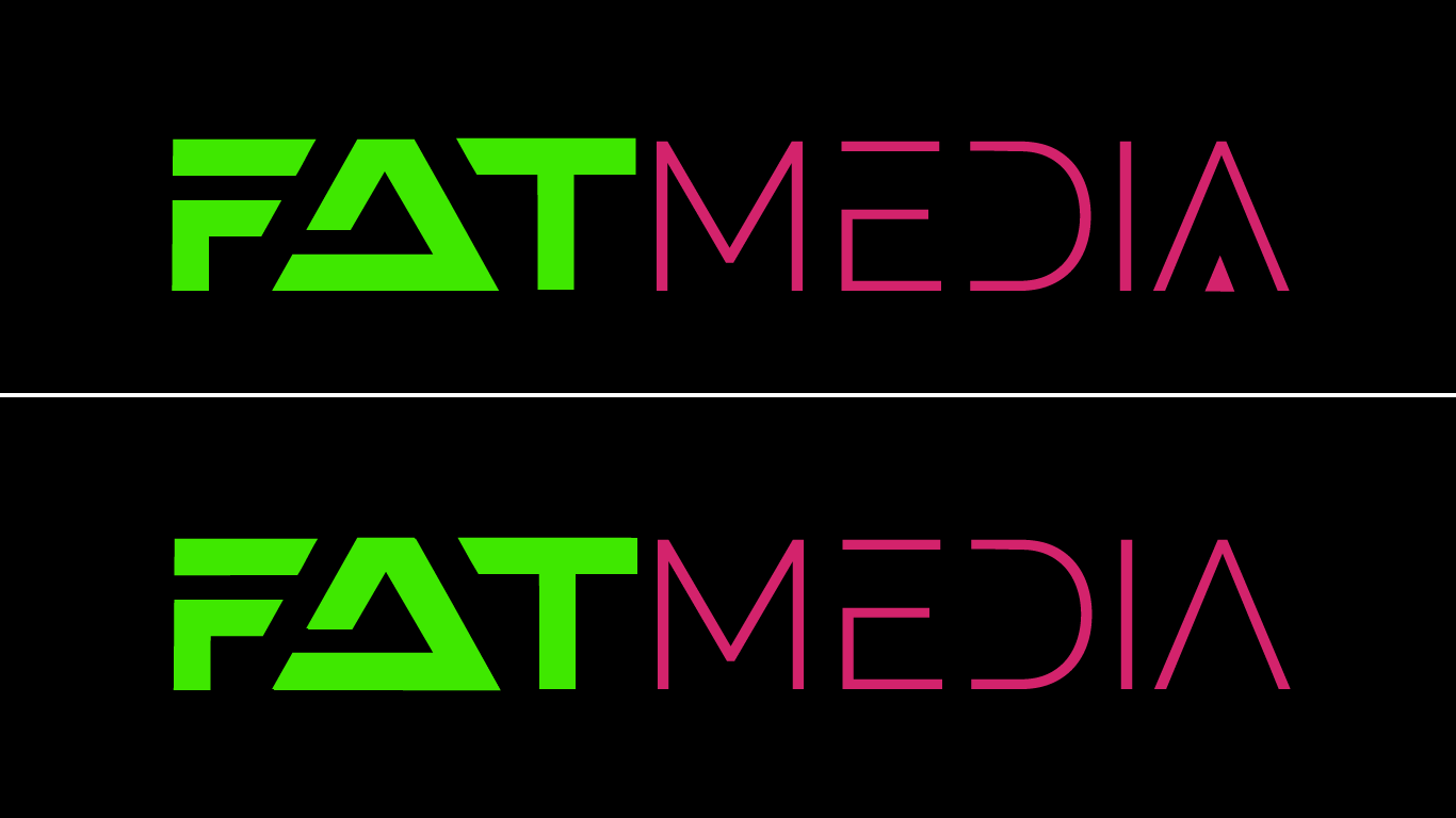
New logo for fatmedia.io

¿Quieres ganar un trabajo como este?
Este cliente recibió 46 diseños de logo de 26 diseñadores. Eligieron este diseño de logo de Digital-Sweetspot como el diseño ganador.
Únete gratis Encuentra trabajos de diseñoResumen de Diseño de Logo
Fatmedia is a technology service provider that offers online shops and digital service providers the opportunity to address potential new customers with intelligently displayed advertising banners.
the basic ideas for the existing logo:
a German version of the website is available at www.de.fatmedia.io
- the first part "FAT" is written in bold because of the word itself
- the dashed design should be reminiscent of a fingerprint - fingerprinting / user and customer profile creation is an essential part of Fatmedia technology
- The deliberate fine-tuning of the "Media" part was intended as a contrast to the bold first part
In principle, we are open to any type of input - the original ideas do not have to be adopted.
It is important to have a connection to the company's content.
It can be a pure word logo, but also a graphic or a combination of both that can be associated with the following "buzzwords":
- technology
- Media
- Acquisition of new customers
- traffic
- increase in sales
- Range
- pretargeting
- Prospecting
- AI
- AI
- algorithm
In the case of a word logo, we also like an abstract implementation that is still legible.
The following 2 examples:
https://images.gamespress.com/Content/Artwork/NickNack/Square-Enix/artwork/2021/03/08205721-958b3998-857c-44c7-a193-eda102808157/OutridersLogo_K_R.png?w=730&mode=max&otf=y&quality= 80 & format = png & bgcolor = transparent & ex = 2021-06-01 + 03% 3A00% 3A00 & sky = 96356b30da4a21d35e9ab2832ef3c4d0444d96bc4bb11ce6a815b0e87f895e1d
https://cdn.shopify.com/s/files/1/0536/6009/0564/files/logo-activat3d-typo-big. png? height = 628 & pad_color = 0b0b0b & v = 1613643736 & width = 250
Colours:
We made a conscious decision to work with neon colors and to work with dark backgrounds as a contrast. The pink and green should be retained and can also be used in the logo. A large part of the competition relies on "classic blue", here alone we want to stand out directly and not use a run-of-the-mill color scheme.
We are aware that the website also needs an overhaul. We also toyed with the idea of advertising this as a competition at the same time, but we first want to find a logo that we like and, if necessary, incorporate new style elements from this future logo into the new web design.
Basically, the color scheme, as it can currently be seen on the website, should be retained and in this regard this should already serve as a guide.
In terms of design, however, we would also like to have a little more “depth” in the future design, the current design is too flat / two-dimensional for us.
Texto del logo
FATMEDIA