NAUTEAK - LOGO DESIGN FOR BOAT SUPPLY COMPANY
¿Quieres ganar un trabajo como este?
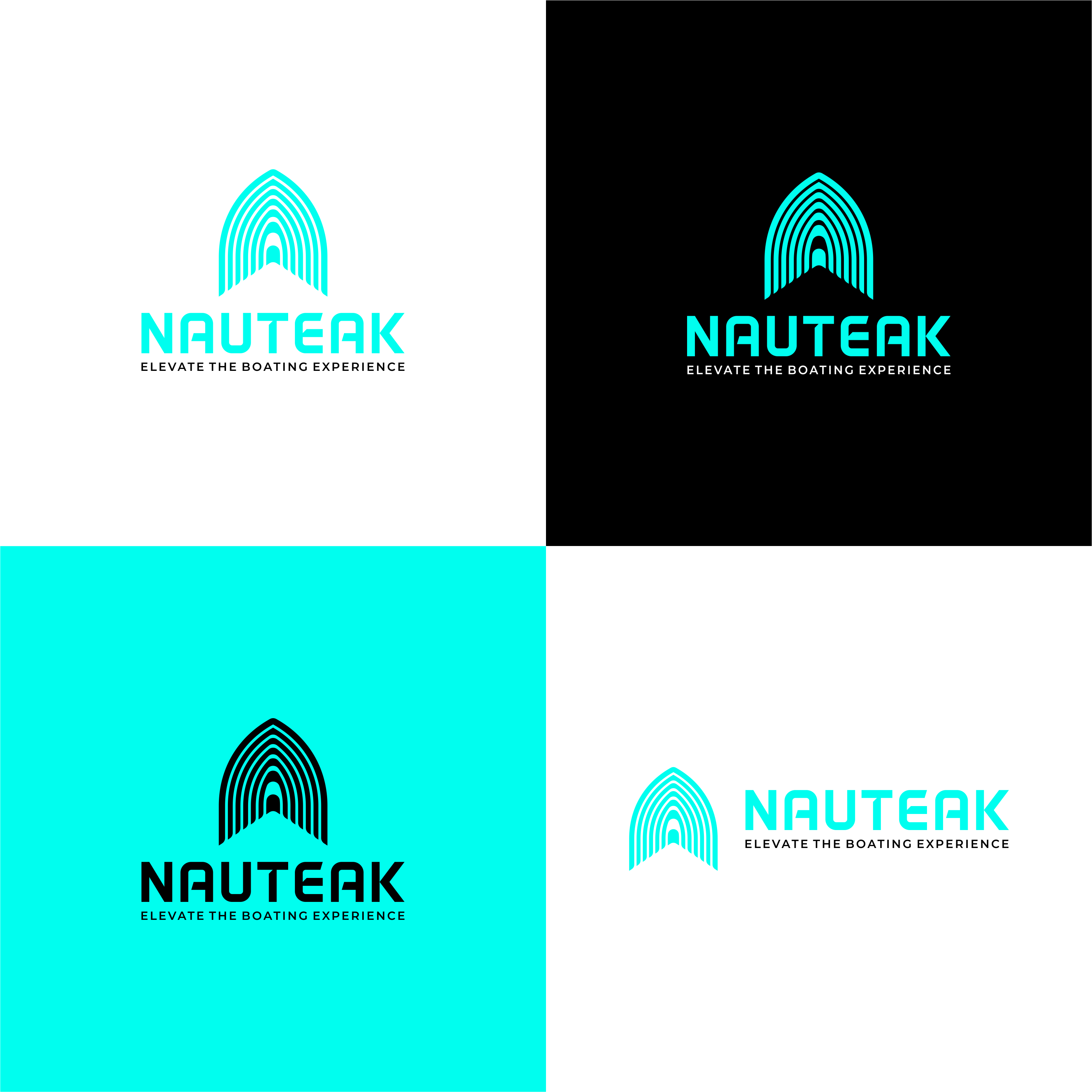
Este cliente recibió 210 diseños de logo de 105 diseñadores. Eligieron este diseño de logo de HARIQ como el diseño ganador.
Únete gratis Encuentra trabajos de diseño- Garantía
-
 US$150
-
 210 diseños
-
 105 diseñadores
Resumen de Diseño de Logo
I am looking for a modern look for this new company called NAUTEAK. Nauteak is a faux teak boat flooring company. The product is new to the market for only a few years and is made from foam with a design to look like teak. This company is new and needs a captivating logo. I have attached samples of what the product looks like on the boat incase that draws inspiration for the logo in some way using the teak lines. I have also attached some logo design styles I think will work for this product. They are not necessarily in the industry, just some direction on style for the logo. Logo should work well if used as 1/color but don't shy away from color. I like black or dark gray for the base colors and for the accents I am thinking teal, light blue, sea-foam green. I also attached some photos of comptetors logos. I like Marine Mat and Deckit style. Seadeck and Aquatraction are not my favorite and feel juvenile or dated. The Brand goal is to convey the following:
1. Modern
2. Confidence
3. Young
4. knowledge
5. Playful
6. technology driven
I included samples of the actual product, logo inspiration, competitors logos for comparison.
Objetivo del mercado(s)
Boaters, fisherman, wakeboarder, cocktail cruiser boaters
Tipo de industria / entidad
Marine
Texto del logo
NAUTEAK - Elevate the boating experience
Estilos de fuente para usar
Colores
Colores seleccionados por el cliente para ser utilizados en el diseño del logotipo:
Mira y siente
Cada control deslizante ilustra las características de la marca del cliente y el estilo que debe comunicar el diseño de tu logotipo.
Elegante
Atrevido
Juguetón
Serio
Tradicional
Moderno
Atractivo
Profesional
Femenino
Masculino
Vistoso
Conservador
Económico
De Alta Gama
Requisitos
Debes tener
- An icon style feel to the logo. Must look good as a 1 color logo but would like to see colors used. I attached an image with accent color choices to choose. They should be paired with a black or dark grey color.
Agradable de tener
- A logo that utilizes a clever negative space concept. Simple design and more icon style than an image.
No debería tener
- A dated feel or not work for 1/color printing.