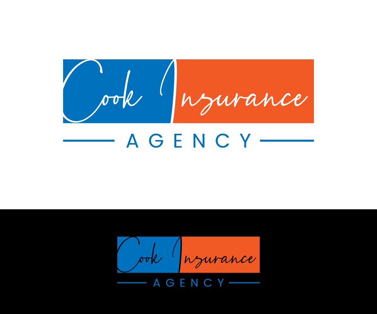
Logo Redesign - Cook Insurance
¿Quieres ganar un trabajo como este?
Este cliente recibió 366 diseños de logo de 87 diseñadores. Eligieron este diseño de logo de rimu como el diseño ganador.
Únete gratis Encuentra trabajos de diseño-
 US$300
-
 366 diseños
-
 87 diseñadores
Resumen de Diseño de Logo
Hello, this is what I am trying to accomplish. I would like to refresh our logo and make it bolder and more eye catching. I don’t like that the logo and company name on our current logo are separated by a vertical line. I would like to have our company name and logo to be incorporated into one easy to read image. I am not particular on what color or colors are used but I need to limit the design to 3 or less colors so we can have them printed on promotional items like hats, golf balls, t-shirts, business cards, or billboards, monument sign, storefront awning. It would also be fine with me to eliminate the logo all together and write our agency name out in a neat professional way. Our company name can be Cook Insurance, Cook Insurance Agency or Cook Insurance Agency Inc. I would like the design to be able to fit in a circle, square, rectangle, and elongated rectangle without leaving a lot of white space. I have attached our current logo below. I have also attached many other logo ideas from other companies to try and help give you some inspiration and show you can see what I am after. The last few images I have attached are our current logos and ads and you can see how terrible they look compared to everyone else.
Objetivo del mercado(s)
I'm trying to fill up the space available when we pay for an ad. I need something that's bolder and more eye catching than our current logo.
Tipo de industria / entidad
Insurance Broker
Texto del logo
Cook Insurance, Cook Insurance Agency, Cook Insurance Agency Inc
Estilos de logo de interés
Logo con emblema
Logo contenido dentro una forma / figura
Logo pictórico / combinado
Un objeto del mundo real (texto opcional)
Logo con personaje
Logo con ilustración o personaje
Logo de marca de nombre
Logotipo basado en palabra o nombre (solo texto)
Estilos de fuente para usar
Mira y siente
Cada control deslizante ilustra las características de la marca del cliente y el estilo que debe comunicar el diseño de tu logotipo.
Elegante
Atrevido
Juguetón
Serio
Tradicional
Moderno
Atractivo
Profesional
Femenino
Masculino
Vistoso
Conservador
Económico
De Alta Gama
Requisitos
Debes tener
- I would like to combine our company name and our logo into one image. Right now I feel like our logo is separate from our company name.
Agradable de tener
- The logo doesn't even have to have a separate logo. It can just be Cook Insurance written out in a neat way.
No debería tener
- The logo should be simple and not too busy. The logo cant have too many colors 3 or less. The logo should not relate to food or cooking. The logo should not have too much empty white space