3 Logos for Multi-Branded Aussie Start-Up
¿Quieres ganar un trabajo como este?
Este cliente recibió 26 diseños de ícono de 12 diseñadores. Eligieron este diseño con ícono de Alternactive como el diseño ganador.
Únete gratis Encuentra trabajos de diseño- Garantía
-
 A$400
A$400
-
 26 diseños
-
 12 diseñadores
Resumen de Diseño Con Ícono
Bridge Systems Pty Ltd is an innovative Australian start-up that makes life's important information easier to manage. In particular, we make paper easier to manage by getting rid of it. We do this through several channels/businesses:
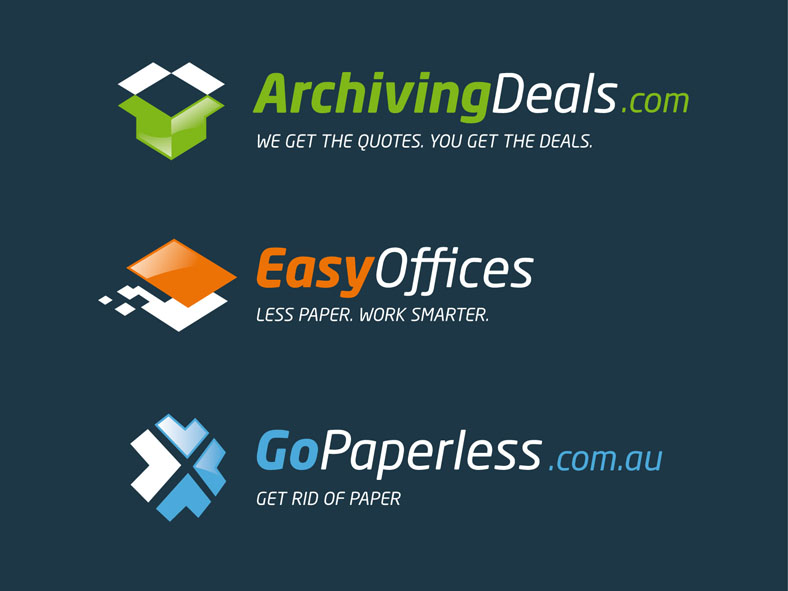
EasyOffices "Less Paper. Work Smarter."
Remove paper processes from business workflows using electronic document management, scanning, digital signatures, customer relationship management, enterprise resource planning & good ol' fashioned change management. ****new businesses launching this month****
ArchivingDeals.com "We Get the Quotes. You Get the Deals."
An online brokerage service that provides pricing & quotes for offsite document storage - we help businesses that need to store archive boxes find the best, most modern providers for their needs.
GoPaperless.com.au "Get Rid of Paper"
Innovative products that help individuals better manage their important information & reduce their paper use. ***New service about to be offered next month to scan your receipts for tax time***
BridgeSystems "Power Through Information"
As well as managing the above 3, Bridge Systems also sells software & provides performance services for commercial record centres (document warehouses) and offers strategic "info-centric" consulting services.
Bridge Systems is in a growth phase and would like individual logos for ArchivingDeals.com, EasyOffices & GoPaperless.com.au. We have a Company Logo that we love already and are looking for logos that complement it, using our colours and fonts. Essentially we want 3 logos that are strong & useful as standalones but are clearly part of the family when seen together. Each business helps us in our mission to "Make Life's Important Information Easier to Manage".
Each business has taglines that reflect exactly what the business does. The current logos, contexts and uses can be seen at http://www.bridgesystems.com.au/our-businesses.html. Please note that we are updating the BridgeSystems.com.au site and that some content is missing... we know we know.
Ideally each logo should have a unique "icon" associated or integrated with a wordmark and tagline. The icon should be clean and clearly understandable. For ArchivingDeals.com the icon MUST be an Archive Box. For the EasyOffices it should give the impression of paper disappearing and for GoPaperless.com.au it should be very modern.
Objetivo del mercado(s)
ArchivingDeals.com is aimed at small businesses, mostly female secretaries, between 20 and 40.
EasyOffices is targeted at office managers, mostly females, aged between 30 - 45.
GoPaperless.com.au is aimed at consumers aged 25-35, users of Apple products in particular, mostly female. May also be aimed at married women with young children aged 38 - 35.
Tipo de industria / entidad
Business
Texto del logo
EasyOffices, ArchivingDeals.com & GoPaperless.com.au
Estilos de logo de interés
Logo pictórico / combinado
Un objeto del mundo real (texto opcional)
Mira y siente
Cada control deslizante ilustra las características de la marca del cliente y el estilo que debe comunicar el diseño de tu logotipo.
Elegante
Atrevido
Juguetón
Serio
Tradicional
Moderno
Atractivo
Profesional
Femenino
Masculino
Vistoso
Conservador
Económico
De Alta Gama
Requisitos
Debes tener
- The designs must have a consistent element of colours and fonts. The icon must be convertible into a favicon and webicon. The final formats will be for both print & web use, so we'll need .png, .jpg and .eps .ai etc as well. They should be in multiple colour ways to use on various background.
Agradable de tener
- It would be cool if there was some parity between the icons.
No debería tener
- No flowery designs.