Digital Duke - New logo for an creative digital agency in The Netherlands
¿Quieres ganar un trabajo como este?
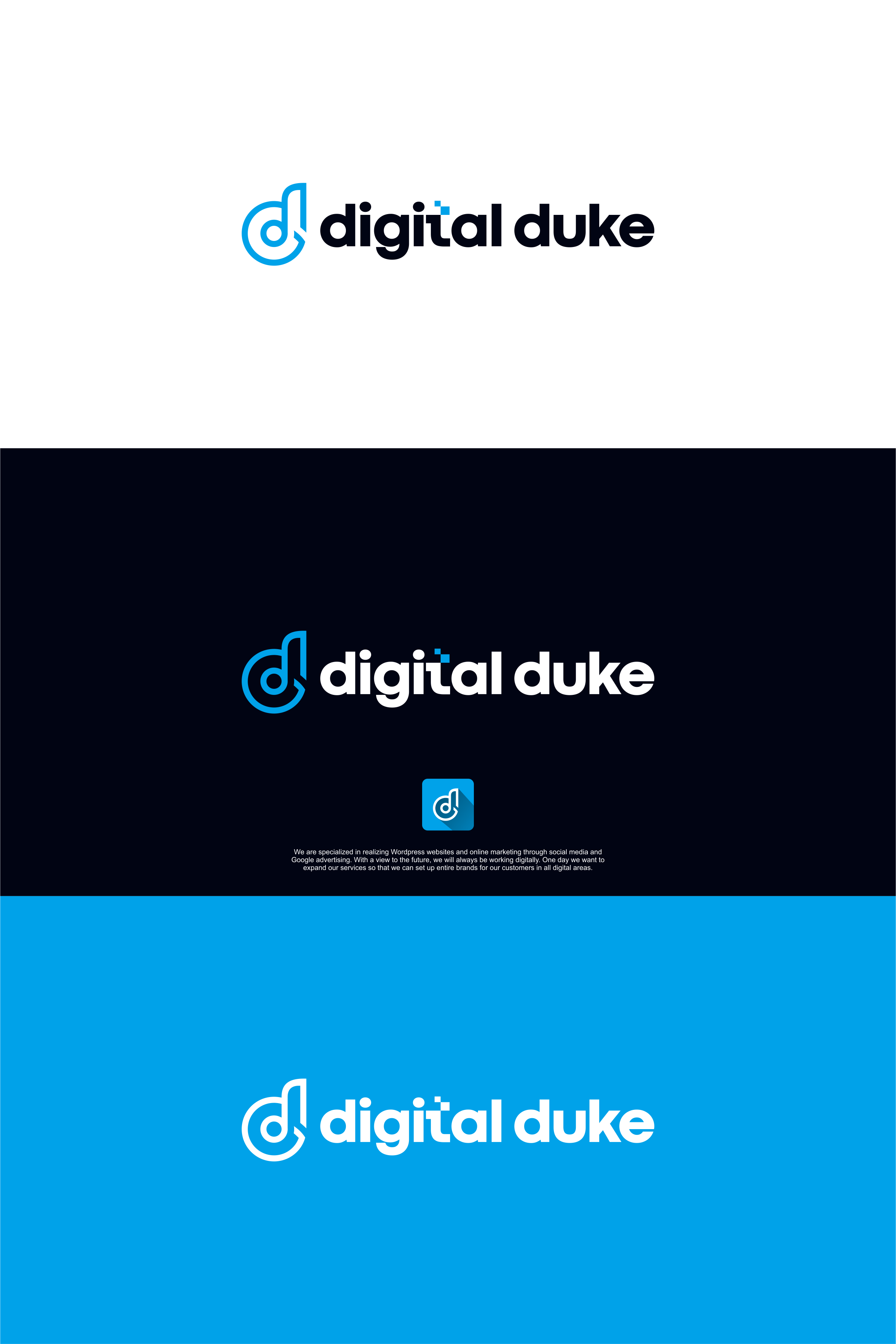
Este cliente recibió 167 diseños de logo de 54 diseñadores. Eligieron este diseño de logo de achil78 como el diseño ganador.
Únete gratis Encuentra trabajos de diseño- Garantía
-
 €110
€110
-
 167 diseños
-
 54 diseñadores
Resumen de Diseño de Logo
Update 2:
First of all, we would like to thank everyone for submitting different designs. We are new to this platform so also apologies to the designers that we accidentally gave a 1-star rating, this was certainly not our intention. Hopefully we got rid of all the reviews and eliminate the designs that not suit us.
For now we've seen enough designs with a D or double D. Some were good and some were
a bit less, there is 1 person who is on the right track but still we miss the wow-factor:
https://dcassetcdn.com/design_img/3976848/499405/27377158/w4v0068hqd6gs1wkaa5w0xetac_image.png
The use of the fonts is still very standard. The word digital duke is normally spelled out in a font without anything special touch being done with it. font.
In this link https://we.tl/t-jR8V5TAJtf we have added a couple examples with fonts that we like. Please use your creativity to make your subtle adjustment to the word Digital Duke in a particular The examples are still pretty standard but with but with a small adjustment it’s a very creative and clean logo. We want to keep the simplicity well, but with a small adjustment.
In the first briefing we said that we want to use the color blue as a subtle color. All logos made entirely in blue are immediately eliminated, this is not what we are looking for.
___________________________________________________________________________________________
Update 1:
For our renewal of our corporate identity, we are looking for a new logo that better reflects our company.
As a creative person you are the most difficult customer for yourself, that's why we want to outsource this to you.
We are a creative internet agency based in Den Bosch, The Netherlands. The name Den Bosch comes from the word Duke in English, hence the name Digital Duke. We are a group of young creatives, each with their own specialism. We approach our customers in an informal way and prefer to wear a hoodie and a pair of sneakers than a tailor-made suit ;)
We are specialized in realizing Wordpress websites and online marketing through social media and Google advertising. With a view to the future, we will always be working digitally. One day we want to expand our services so that we can set up entire brands for our customers in all digital areas.
We are looking for a minimalist letter logo with preferably 1 color or a light accent color such as the color blue that we also use now. The logo should fit easily on a white or black background. In the new logo we want to show that we are a digital agency, but with a playful touch that makes it a bit more informal and creative.
We are open for ideas with a minimalistic figurative mark for the logo. We don't have any concrete ideas for this ourselves.
In attachment we have some screenshots from other logo's we like, maybe it's helpful for more inspiration. You don't have to put too much value on it. It's more to give an impression. Also you can check a Pinterest board we created https://pin.it/kfkSIQ6
If you have any questions, you can always contact us, we are happy to help you to come up with the perfect logo! Our website is digitalduke.nl if you want to read more about us.
Actualizaciones
Hi all, thanks for all the logo's so far. We have come to the conclusion that capital letters do not suit us. Please only use lowercase for a minimalist look.
Added Friday, September 17, 2021
Objetivo del mercado(s)
Website development | Online marketing
Tipo de industria / entidad
Digital agency
Texto del logo
Digital Duke
Estilos de logo de interés
Logo abstracto
Conceptual / simbólico (texto opcional)
Logo de marca de nombre
Logotipo basado en palabra o nombre (solo texto)
Logo con siglas
Acrónimo o logo tipográfico (solo texto)
Estilos de fuente para usar
Mira y siente
Cada control deslizante ilustra las características de la marca del cliente y el estilo que debe comunicar el diseño de tu logotipo.
Elegante
Atrevido
Juguetón
Serio
Tradicional
Moderno
Atractivo
Profesional
Femenino
Masculino
Vistoso
Conservador
Económico
De Alta Gama
Requisitos
No debería tener
- Multiple colors