Lean Forward Logo (teams go after cost savings and streamlining processes)
¿Quieres ganar un trabajo como este?
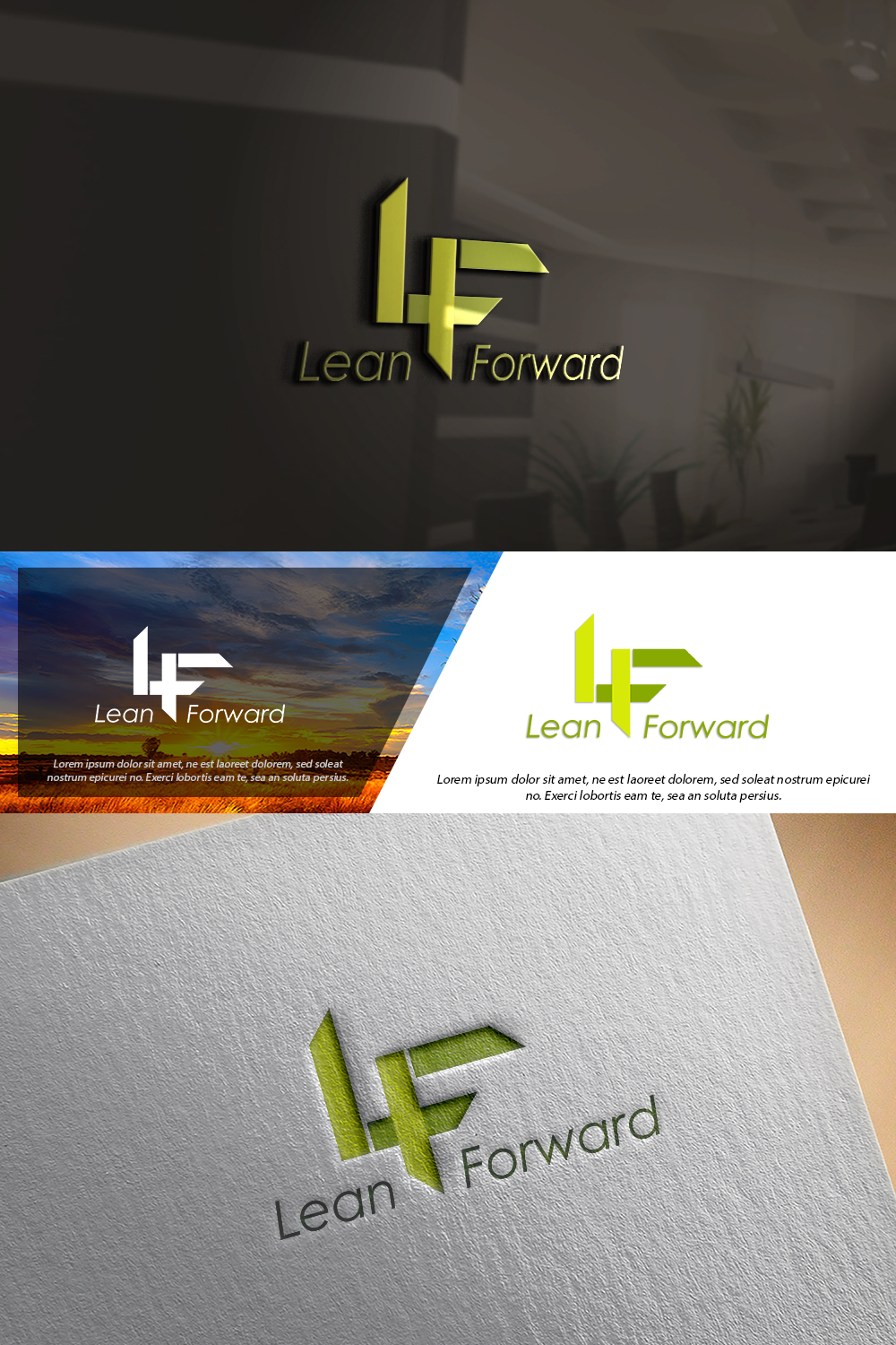
Este cliente recibió 50 diseños de logo de 32 diseñadores. Eligieron este diseño de logo de damian como el diseño ganador.
Únete gratis Encuentra trabajos de diseño- Garantía
-
 US$150
-
 50 diseños
-
 32 diseñadores
Resumen de Diseño de Logo
Hello - We are launching a new initiative at Bellisio Foods manufacturing location. We are calling it Lean Forward. It is based on Continuous Improvement and Lean manufacturing concepts.
I would like a logo that we will use to brand the initiative and put on post it notes, t-shirts, hats, etc . This is a nimble food manufacturing company with these values:
1. Fast fish eat slow fish (we move fast and get it done),
2. come as you are and speak up and 3. Do the right thing. .
We will use the logo on white backgrounds and black backgrounds. The logo should imply that we are moving forward. I want it to be eye-catching. There are some food product changes happening this year too so I am sending a piece of that new branding. It would be cool to use some of the spackling effect that the new packaging graphics will have.
We are energized with this new initiative and want the logo to be energizing. I will use the words Lean Forward and would like LF as a piece of the branding as well. I would like the colors to match the green in the letters (not the dull green in the Michelina's logo). We can also use white, black, the yellow I have attached and a complimentary orange if needed.
Objetivo del mercado(s)
Corporate and Plant employees. All of the employees are driven to execute - - they work hard to get 'er done. The factory is located in Jackson, Ohio. The corporate office is in Minneapolis, MN
Tipo de industria / entidad
Food manufacturing.
Texto del logo
Lean Forward
Estilos de logo de interés
Logo pictórico / combinado
Un objeto del mundo real (texto opcional)
Logo abstracto
Conceptual / simbólico (texto opcional)
Logo de marca de nombre
Logotipo basado en palabra o nombre (solo texto)
Logo con siglas
Acrónimo o logo tipográfico (solo texto)
Colores
Colores seleccionados por el cliente para ser utilizados en el diseño del logotipo:
Mira y siente
Cada control deslizante ilustra las características de la marca del cliente y el estilo que debe comunicar el diseño de tu logotipo.
Elegante
Atrevido
Juguetón
Serio
Tradicional
Moderno
Atractivo
Profesional
Femenino
Masculino
Vistoso
Conservador
Económico
De Alta Gama
Requisitos
Debes tener
- Energize us! Must look new and fresh - not dated.
Agradable de tener
- This is about cost savings but it's also about zero defects. If savings or zero can be woven in, that could be good too.
No debería tener
- please don't be trite