Calorie counting app icon/logo, simple and flexible design
¿Quieres ganar un trabajo como este?
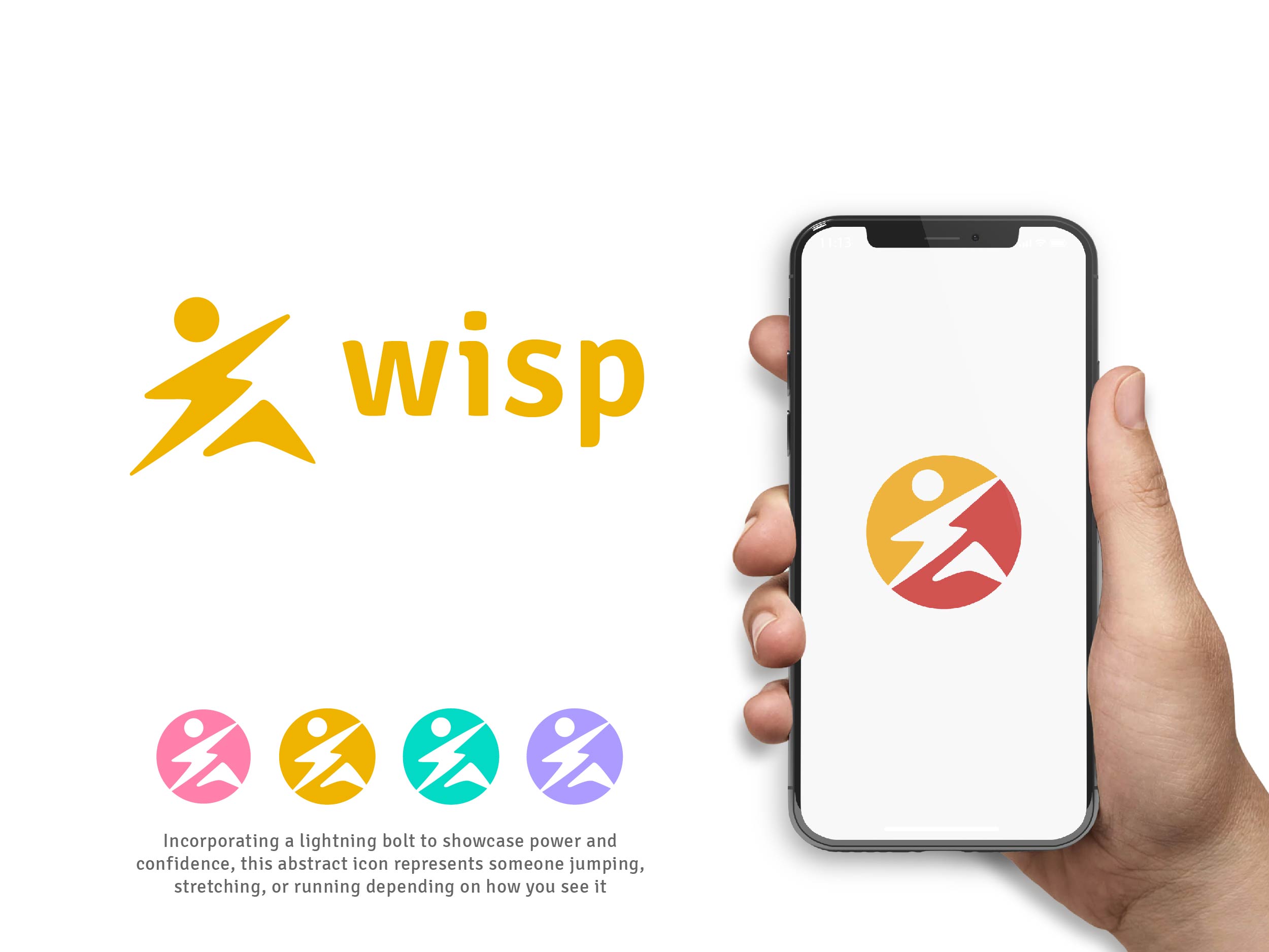
Este cliente recibió 112 diseños de logo de 56 diseñadores. Eligieron este diseño de logo de allynien como el diseño ganador.
Únete gratis Encuentra trabajos de diseño- Garantía
-
 £110
£110
-
 112 diseños
-
 56 diseñadores
Resumen de Diseño de Logo
Edit #2: I'm adding this to the top, as a lot of people are missing it further down. The app is just released a few days ago, and the existing "W" logo was only a temporary logo that was needed during development. Please don't base your submissions on the current logo.
I need a logo for my app, Wisp (https://play.google.com/store/apps/details?id=app.minibytes.wisp). Wisp is a calorie counter which focuses on a common-sense interface, and unlike much of the competition allows the user to drill down into the detail of their diet, and at the same time summarizes the detail using simple shapes and colors.
The logo must be suitable for display in both a square frame (e.g., Google Play Store), a round frame (e.g., Twitter), or on its own. It needs to look good at both typical sizes (e.g., 512 px), and as an icon on a phone's home screen.
It should jump out of the page, to attract a user’s eye among search results. The colors I've used in the app to represent the macro-nutrients are #FF80AB (carbs), #EFB300 (fat), and #03DAC5 (protein). In addition, #AD9BFF is used to represent energy (calories/kilojoules). #D15450 was used for the “favorite nutrient” icon. These colors don't need to be used, but if you want to match the app colors then these are the values I use. If you prefer to slightly alter the exact values, I'm open to suggestions.
Apples, or pieces of fruit with measuring-tapes around them, won't be chosen as these are already over-used in the app category. Also, it should not look like My Fitness Pal, or Lose It.
Including text (“Wisp”) is optional, but if included then should be entirely separate from the logo itself (so that it can be removed when necessary), or clear and legible at smaller sizes (e.g., on the mobile home screen).
Edit #1
======
The app is very newly released, and the current "W" logo was temporary during development, and shouldn't influence your design. I want to move away from a single letter (as they are often used for temporary designs).
The logo should say something about the app's intentions. Whether it's dynamism of exercise and competition, the healthier lifestyle, slimming (though stay away from cliches), controlled diet. It needs to be something more than just a generic logo which could be used in any industry.
Texto del logo
Wisp (optional, see task description)
Estilos de logo de interés
Logo pictórico / combinado
Un objeto del mundo real (texto opcional)
Logo abstracto
Conceptual / simbólico (texto opcional)
Mira y siente
Cada control deslizante ilustra las características de la marca del cliente y el estilo que debe comunicar el diseño de tu logotipo.
Elegante
Atrevido
Juguetón
Serio
Tradicional
Moderno
Atractivo
Profesional
Femenino
Masculino
Vistoso
Conservador
Económico
De Alta Gama
Requisitos
Debes tener
- Must be as usable as a logo in the Google Play Store, as it is a logo on a mobile phone screen.
No debería tener
- No apples, or pieces of fruit with a tape measure. No just "W" logos.