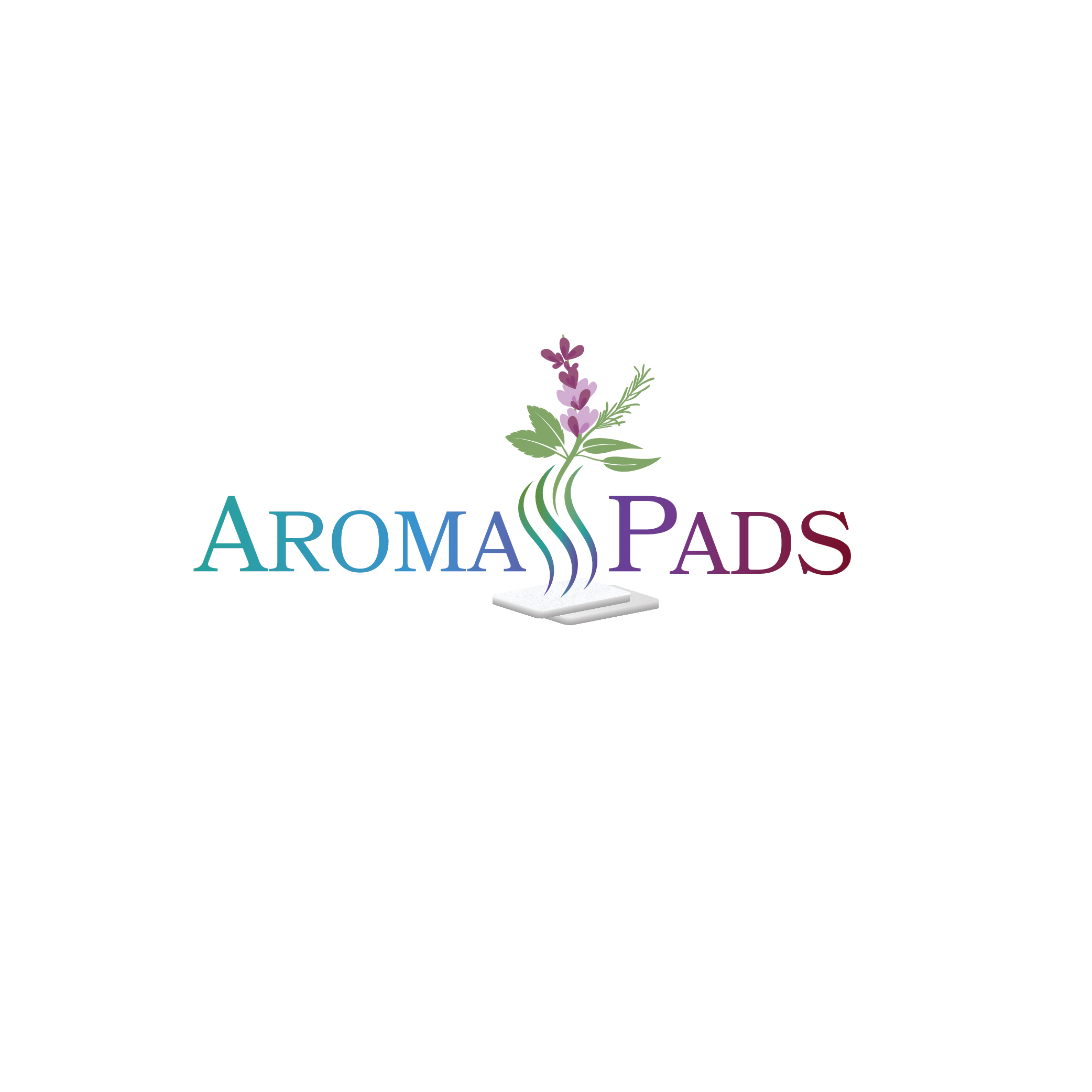
Essential Oil Aroma Pads needs a Logo Design

¿Quieres ganar un trabajo como este?
Este cliente recibió 188 diseños de logo de 47 diseñadores. Eligieron este diseño de logo de SARA BA como el diseño ganador.
Únete gratis Encuentra trabajos de diseño- Garantía
Resumen de Diseño de Logo
update on 13Jan - due to an excellent entry, I will be closing the contest on 16Jan. if you still interested in making a design please do so before that date. thank you!
__
Aroma Pads manufacturers mixtures of pure essential oil fragrances in Canada that are on cotton white Aromatherepy pads for use in humidifiers and diffusers, for personal wellness, comfort, energizing and - just making your home smell great!
Our products are made with all sorts of different essential oils such as peppermint, lavender, eucalyptus, sage, bergamot, rosemary, thyme, lemon, etc. With scents that are described as woody, spicy, floral, citrus, and earthy.
The logo needs to have aroma vapour coming from the Aroma Pads logo with a white rectangular pad somewhere (not too much / overpowering though) in the logo so it’s clear what the customer is getting, and should be able to have a colour scheme that gives the different emotions people would feel when using our different types of products, such as soothing /comforting / relaxing / relieving, and uplifting / warm / stimulating, that blend together, with green floral / herbs in the logo to mark all our products roots in nature.
This blending should be in the "Aroma Pads" text (or will let designer perhaps design a pictoral / emblem that shows this kind of blending, or the blending can be in the vapor)
Logo should definitely be very colorful; to clarify, this color should reflect the soothing and also uplifting element of the aromatherapy products.
Hi everyone, thank you everyone so far for your submissions, general comments that will be included in the brief are:
1. Text / aroma from the pad should be colorful and focus on the warming and soothing feelings from the aromatherapy. Please do not put too much of one color in the logo, needs to have many different colors (but also not be a rainbow of color) - try to have the colors blend.
2. Please try to have the green in your design in the form of leafy plants / leaves of a plant that is listed above (eg. eucalyptus, peppermint, lavender).
3. Colorful vapor coming out of the pad is very good. Colorful is a must, yet focusing on the soothing and uplifting
4. Aroma pad can also be placed on the bottom of the logo (not mandatory) with the vapor going through the text and above the text in a colorful manner.
5. Try not to have the aroma pad too large since it distracts from the text.
6. Aroma should always be moving upwards - not sideways.
7. Please keep the aroma pad a rectangle.
Actualizaciones
Need extra days to review
Objetivo del mercado(s)
Upscale spas, direct sales to consumer homes
Tipo de industria / entidad
Aromatherepy
Texto del logo
Aroma Pads
Estilos de logo de interés
Logo con emblema
Logo contenido dentro una forma / figura
Logo pictórico / combinado
Un objeto del mundo real (texto opcional)
Estilos de fuente para usar
Gustan otros estilos de fuente:
- designer's choice
Mira y siente
Cada control deslizante ilustra las características de la marca del cliente y el estilo que debe comunicar el diseño de tu logotipo.
Elegante
Atrevido
Juguetón
Serio
Tradicional
Moderno
Atractivo
Profesional
Femenino
Masculino
Vistoso
Conservador
Económico
De Alta Gama
Requisitos
Debes tener
- The logo needs to have aroma vapour coming from the Aroma Pads logo with a white - rounded corner - rectangular pad somewhere in the logo so it’s clear what the customer is getting, and should be able to have a colour scheme that gives the different emotions people would feel when using our different types of products, such as soothing / comforting / relaxing / relieving, and uplifting / warm / stimulating, that blend together. This blending should be in the "Aroma Pads" text (or will let designer perhaps design a pictoral / emblem that shows this kind of blending) . with green floral / herbs in the logo to mark all our products roots in nature.
No debería tener
- Do not abbreviate aroma pads with AP. White Aroma Pad should not be "overpowering" or take up too much space. Focus is on blended color and aroma.