

 Refresh
SHOW ME COOL TRIANGLES!
¿Quieres ganar un trabajo como este?
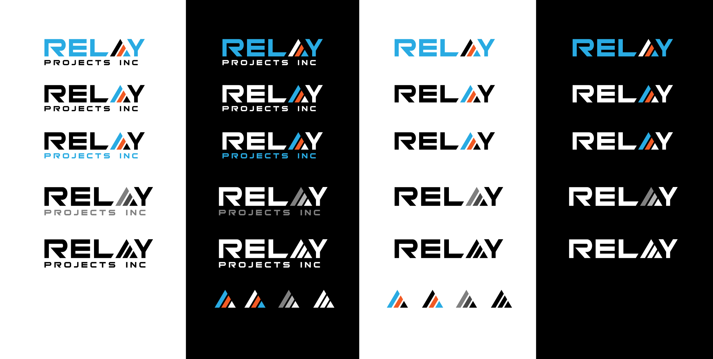
Este cliente recibió 223 diseños de logo de 65 diseñadores. Eligieron este diseño de logo de sol design2 como el diseño ganador.
Únete gratis Encuentra trabajos de diseño
- Garantía
-
 C$200
C$200
-
 223 diseños
-
 65 diseñadores
Resumen de Diseño de Logo
THE COMPANY
Relay Projects Inc is a new construction management firm in BC, Canada. We use emerging methodologies and a fresh perspective to deliver results.
THE LOGO
- needs to represent a relay race in some way
- should be crisp, clean, sharp, efficient
- can be a wordmark, or abstract/conceptual style
BACK STORY
Construction that is well managed should be something like a relay race, because it should run multiple concurrent “lanes” of tasks and activities, with each trade handing off smoothly to the next trade, to get to the finish line.
Objetivo del mercado(s)
Land owners and developers who need a professional construction company to build subdivisions and communities with mid-market, quality homes... also homebuyers looking for a well built home built efficiently
Tipo de industria / entidad
Construction
Texto del logo
RELAY PROJECTS INC
Estilos de logo de interés
Logo pictórico / combinado
Un objeto del mundo real (texto opcional)



Logo abstracto
Conceptual / simbólico (texto opcional)



Logo de marca de nombre
Logotipo basado en palabra o nombre (solo texto)


Estilos de fuente para usar

Gustan otros estilos de fuente:
- Bitsumishi, Xolonium, or choose your own?
Colores
Colores seleccionados por el cliente para ser utilizados en el diseño del logotipo:
Mira y siente
Cada control deslizante ilustra las características de la marca del cliente y el estilo que debe comunicar el diseño de tu logotipo.
Elegante
Atrevido
Juguetón
Serio
Tradicional
Moderno
Atractivo
Profesional
Femenino
Masculino
Vistoso
Conservador
Económico
De Alta Gama
Requisitos
Debes tener
- A graphic element (abstract or wordmark style) that represents a relay race (ie: 3 or more “lanes”), or the handing of the baton from one runner to the next • Must work on a BLACK, WHITE, or MEDIUM GREY background (some colours can be reversed to make it work) • All text in all caps • IMPORTANT: Font for the R in “RELAY” must be the R from the font “BITSUMISHI” but … I don’t like the shape of the A or Y in this font. I’d prefer to either find or design alternate letters of EQUAL SIZE AND WEIGHT so they appear to all be in the same font. • I like E’s with the vertical line, and I like A’s and Y’s that are sharp and angular, not square/rounded as they are in Bitsumishi • Colour codes - Blue: RGB 41-171-226 Orange: RGB241-90-36
No debería tener
- • No acronyms - no "RP" or "RPI" logos. • No stick figure running people or obvious "construction" related graphics - no houses, roof lines, hammers, nails, etc. • No Serif fonts • No outlines around the logo • The three parallel lines in the letter E cannot represent the 3 lanes of the relay runners, but this concept COULD be used in the letter A (ie: turning the “lanes” on an angle, or moving straight upwards at varying lengths)