Camp Fred & Mimi // Brain Cancer Logo
¿Quieres ganar un trabajo como este?
Este cliente recibió 32 diseños de camiseta de 10 diseñadores. Eligieron este diseño de camiseta de abella design como el diseño ganador.
Únete gratis Encuentra trabajos de diseño- Garantía
-
 US$190
-
 32 diseños
-
 10 diseñadores
Resumen de Diseño de Camiseta
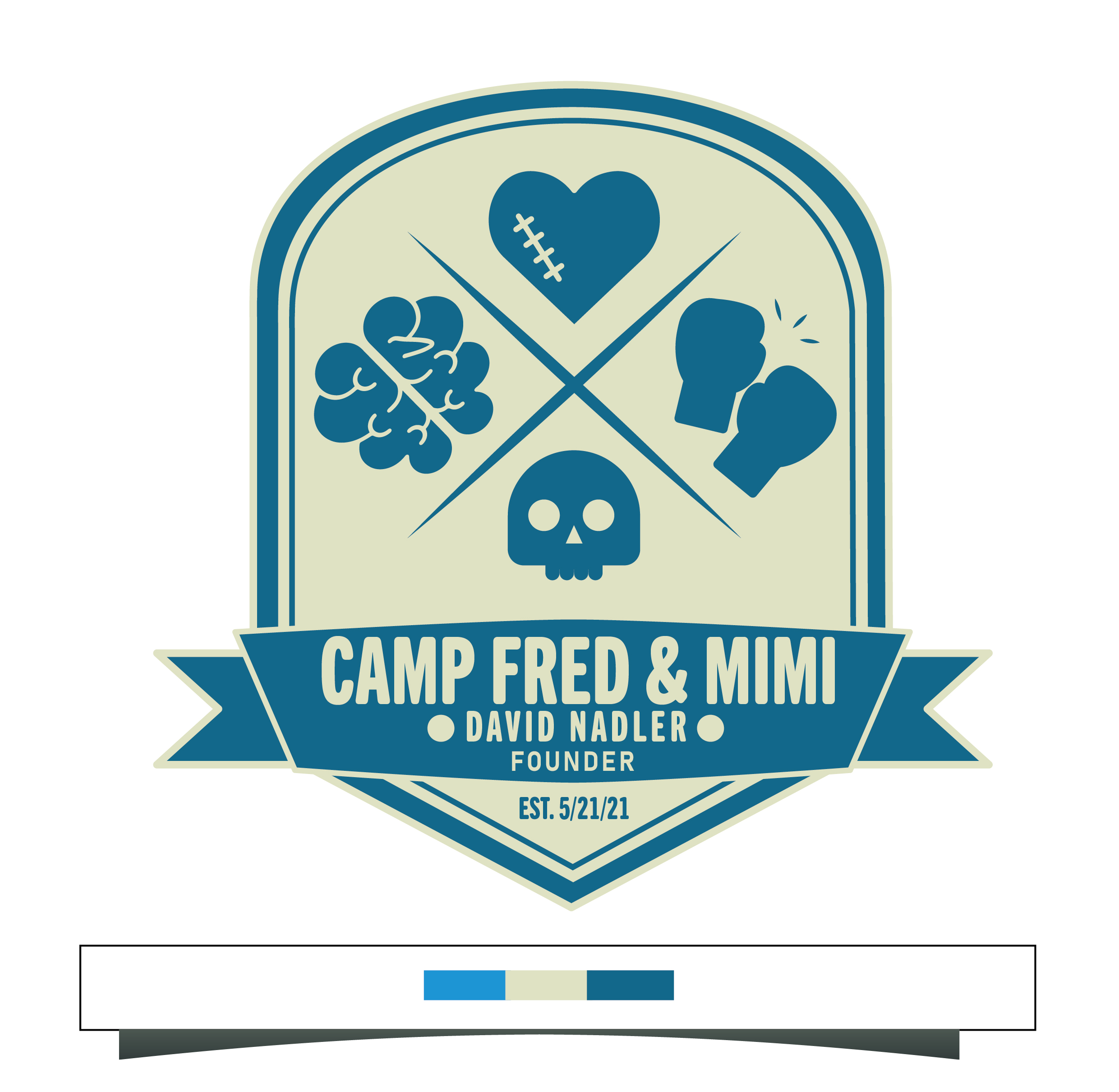
My 49 year old husband is hours away from dying of braincancer. At his memorial service we want to create swag because we are going to start a walk-in his honor to help feel people find resources to cope while they are chasing hope. We have blogged and referred to this mind f*ck experience as "Camp Fred & Mimi"...
My daughter named the tumors Fred and Mimi to help us work through the science of the brain cancer and find a way to name and blame what's happening to her dad to help manage the grieving and intensity of this process.
Below is a link to our go fund me for background.
https://gofund.me/96527d1d
A friend started to comp something up for me but we are running out of time. Most likely we will be hosting his memorial service on 2/20. This event is meant to a Farewell Festival/Early 50th not funeral. He wants taco trucks and a Grateful Dead coverband.
I want it the logo to feel modern, cool, chic and gender neutral. Our hope was to give out the swag and put it on beanies, long-sleeve t-s and hoodies, cozy sleep pants. Right now what you see below is FPO and too clip arty. I am not married to any of this, I just want you to see our starting point and for it to feel simple and clean. I am open to color.
Icons that are important to this project are an image of a brain, some kind of boxing gloves and edgy skull image. My husband likes old school heavy metal/rock (Metallica, ACDC, Iron Maiden, Pixies, Zepplin, Lyrnd Skynrd and old school rap (Biggie, Tupac, 50, WuTang Clan). This should feel like you picked this up on vacation while at some ski town like Vail, Park City, Alta, Lake Tahoe, Whistler, etc...). It should feel like a cool summer camp logo NOT cancer logo. See attached icons for fodder inspiration.
Actualizaciones
If you're on FB, here is a link to our FB page to give you more back story and the context for Camp Fred and Mimi.
https://www.facebook.com/DaveNadlerFund/?ref=pages_you_manage
Added Tuesday, February 8, 2022
Objetivo del mercado(s)
Friends, family, people who want to advocate for hope and ways to cope
Estilos de fuente para usar
Colores
Colores seleccionados por el cliente para ser utilizados en el diseño del logotipo:
Mira y siente
Cada control deslizante ilustra las características de la marca del cliente y el estilo que debe comunicar el diseño de tu logotipo.
Elegante
Atrevido
Juguetón
Serio
Tradicional
Moderno
Atractivo
Profesional
Femenino
Masculino
Vistoso
Conservador
Económico
De Alta Gama
Requisitos
Debes tener
- Husband Name - David Nadler (founder), brain, gloves, skull, diagnosis date of 5/21/21, masculine/gender neutral feel, font is easy to read, clean, modern, simple
Agradable de tener
- 3 colors in the logo
No debería tener
- Should not feel feminine, not feel like tombstone, modern and edgy feel, not feel like it's a cancer logo.