New Logo for Fishing Apparel brand
¿Quieres ganar un trabajo como este?
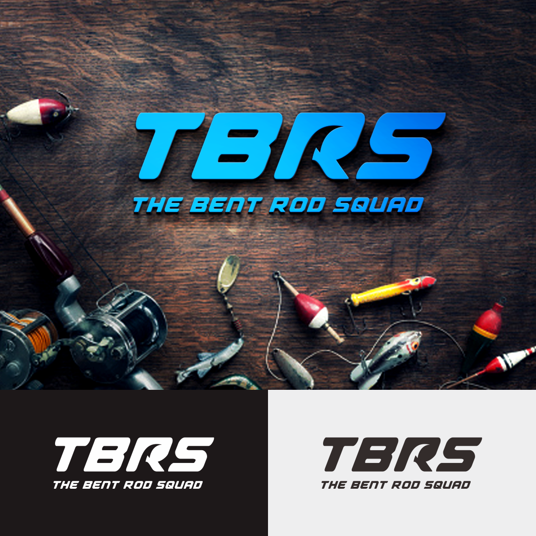
Este cliente recibió 45 diseños de logo de 28 diseñadores. Eligieron este diseño de logo de Donan Rockezz como el diseño ganador.
Únete gratis Encuentra trabajos de diseño-
 A$150
A$150
-
 45 diseños
-
 28 diseñadores
Resumen de Diseño de Logo
The Bent Rod Squad Branding Brief
Background:
The Bent Rod Squad (TBRS) was a group created by the average fisherman with a huge passion for fishing. It started with five mates on Whatsapp in 2016 and quickly grew to 6500k followers on Instagram and 3500k on Facebook. Since then it has slowly declined, after being inactive for so long.
The plan in 2022 is to rebrand TBRS, launching premium fishing apparel that still has the sense of belonging that it once gave fishos everytime they donned their apparel.
The original apparel created a sense of community and opportunity to easily spark up a conversation; as fishermen can be very secretive and unapproachable. People loved wearing TBRS apparel and loved meeting people who were also wearing it.
I want to take TBRS from just another community fishing group, to a reputable brand that is well recognised, especially within the fishing community.
To start, I will need to rebrand. Out with the old logo design and in with the new.
In my research, fishing gear that stands out is quite often popular as people want to “look the part”. To give you an idea, a brand that is currently doing really well is Salty Crew - more on that below.
Initially I would like to redesign the main brand logo for the TBRS and then look into a few different designs that I would use for limited apparel or merch drops. There is potential that for this to be ongoing design work, as in the lead up to a particular fishing season I’m looking to drop limited specific apparel, i.e. snapper season, cod season or even fishing lingo apparel i.e “what a catch”.
Below I’ve attached some do’s and don’t of some brands that I’m liking, which could also provide some inspiration for you. I’ve also shared our old logo. Our old logo was a hit so if you think you can tweak that also give it a go!
Brands I take Inspiration from:
Lo-Cab International: https://www.lo-cab.com/
Love this brand and look, and their different font variations.
I like the contrast of the minimal / fun fonts with a more traditional fish illustration.
Missing at Sea: https://missingatsea.com.au/
They are a fishing brand but more focused on their tackle and rods than apparel but they are a leading established brand in the fishing community
I also like that their logo and symbol work together and separately.
I liked that it is a text logo but would be interested to see some different variations of text in what you would propose.
Birds of Condor: https://birdsofcondor.com/
This is a golf brand but they are pretty much the golf version of what the vision I have for TBRS. Reputable but still fun; as a brand they don't look like they take anything too serious.
I like their logo and symbol, as it works well together and separately.
Above I mentioned about potentially having other drops with different designs. Below is an example of a Birds of Condor hat, you can see a fun illustration on front, with their logo sitting on the side, the goal for TBRS is similar in the sense I would life the TBRS brand logo to work with other illustrations like this: https://birdsofcondor.com/products/bobby-bones-skeleton-black-nylon-golf-hat
Salty Crew: https://www.salty-crew.com.au/
Leading the market in fishing apparel only. As a brand they are very similar to what I want to do, but less commercial, and more effortlessly cool.
Salty Crew is a very commercial fishing apparel brand that's readily available to the average fisherman. I don’t necessarily like there logo/logos (there seems to be a lot of versions) but I wanted to share as they would be the most popular, on-trend fishing brand.
They have big bold logos and I see heaps of people in their gear because when you're wearing it, it's obvious that it's fishing gear.
The mad Hueys: https://themadhueys.com/
Not a huge fan of the brand’s apparel or designs but including as they have a large following.
The font in their logo is too simple for what I’m after.
Brands i dislike in this industry:
Reel Brand: https://reelbrand.com.au
Not a fan of their logo or branding. I don’t like fishing rods crossed over. I find the logo very outdated and a bit busy. I’m personally after something more minimal.
Old logo:
The old logo was great but the problem was the word “the” and the word “squad” were too small so people called it “bent rod” (and it shitted me to tears. See pic below) equal sizing is important this time around.
New logo: I’m very open to your creative ideas, below is a couple of things that might help you understand my creative vision a little clearer:
The version for TBRS new branding is boutique, on trend and simply cool.
The new logo needs to be recognisable but simple.
It needs to be scalable. For example, I need to work as an Instagram profile pic or a large printed boat sticker, and everything in between.
I would like it to be a text and a symbol / illustration, and ideally would like it to work just as well separately as it would together.
Texto del logo
The Bent Rod Squad