Straighten Up and Fly Right with a ‘30’s vibe aero identity
¿Quieres ganar un trabajo como este?
Este cliente recibió 25 diseños de logo de 8 diseñadores. Eligieron este diseño de logo de ThiagoB como el diseño ganador.
Únete gratis Encuentra trabajos de diseño- Garantía
-
 C$120
C$120
-
 25 diseños
-
 8 diseñadores
Resumen de Diseño de Logo
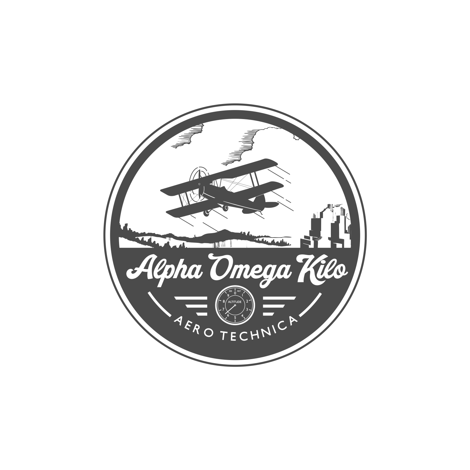
PAlpha Omega Kilo - A-OK in phonetic Alphabet - sells vintage aeronautic illustrations.
First, look at the supplied illustrations and colour palette for baseline. Then think of the excitement around flight in those early times - and the height of technology employed to launch adventurous men and women into the sky in sturdy biplanes, and super fast monoplanes soaring high in the open skies. Imagine the thrill.
Then think of the amazing array of graphical elements that can inform your design - the curves of wings, ailerons, flaps, and propellers. The highly stylized fuselages designed to slip through the air in ‘30’s air streamed style. Imagine the deafening sound of straight piped rotary engines as they roar to life in a puff of smoky oil and rattling valves, until they start to smoothly hum as they propel you aloft.
Think of the farmland, the bustling metropolis’s spreading beneath these able airmen and women; think of the sun, the wind, the weather, the forces at play that had never met man before.
Think of the aerodromes filled with flying club members, pouring through books, learning their craft, eager to fly, and astonished at the technology that will send them skyward.
Pilots in theses early days were brave, smart, competent and in love with the promise of air flight in their lives and profession.
These are the illustrations that educated and inspires them.
The logo you create needs to capture that spirit. With humour and respect.
These illustrations were drawn between 1930 and 1940, so the logo or wordmark need to have a vintage typographic feel, and a colour palette from that time as well.
The illustrations have plenty of character, I have included a few for reference, as well as a color palette from that time.
While it's a lot of words, the "Alpha Omega Kilo" needs to have the first letter of each word in upper case, so it scans "A-OK" as the viewer reads it.
The descriptor, "Areo Technica" should be relatively more legible.
Logo use will be online - website for sure but needs to read well on Instagram.
Looking for both horizontal and stacked versions.
Don't really care if the identity is a logo or logotype.
This is a fun and playful brand, and it needs to instantly locate the product offering as nostalgic, but authentic/authoritative, as the technical aspects of flight haven't changed, so the authority and science remains...
Actualizaciones
Need a couple of days before selecting a winner
Objetivo del mercado(s)
Pilots, families and friends of Pilots, flight school instructors, aviation aficionados
Tipo de industria / entidad
Aeronautics, flight,
Texto del logo
Alpha Omega Kilo Aero Technica
Estilos de logo de interés
Logo con emblema
Logo contenido dentro una forma / figura
Logo pictórico / combinado
Un objeto del mundo real (texto opcional)
Logo abstracto
Conceptual / simbólico (texto opcional)
Logo con personaje
Logo con ilustración o personaje
Logo de marca de nombre
Logotipo basado en palabra o nombre (solo texto)
Estilos de fuente para usar
Gustan otros estilos de fuente:
- Any font popular in the late 1930's
Mira y siente
Cada control deslizante ilustra las características de la marca del cliente y el estilo que debe comunicar el diseño de tu logotipo.
Elegante
Atrevido
Juguetón
Serio
Tradicional
Moderno
Atractivo
Profesional
Femenino
Masculino
Vistoso
Conservador
Económico
De Alta Gama
Requisitos
Debes tener
- A OK must "pop" out of the phonetic alphabet - must feel like it's from the late 1930's and very early 1940's, must be easy to read or scan on istagram, please see colour pallette as attached
Agradable de tener
- Simple, easy to read