Design a Single YouTube Thumbnail image (16:9)
¿Quieres ganar un trabajo como este?
Este cliente recibió 50 diseños de señalización de 9 diseñadores. Eligieron este diseño de señalética de Mikai!13 como el diseño ganador.
Únete gratis Encuentra trabajos de diseño- Garantía
-
 US$110
-
 50 diseños
-
 9 diseñadores
Resumen de Diseño de Señalética
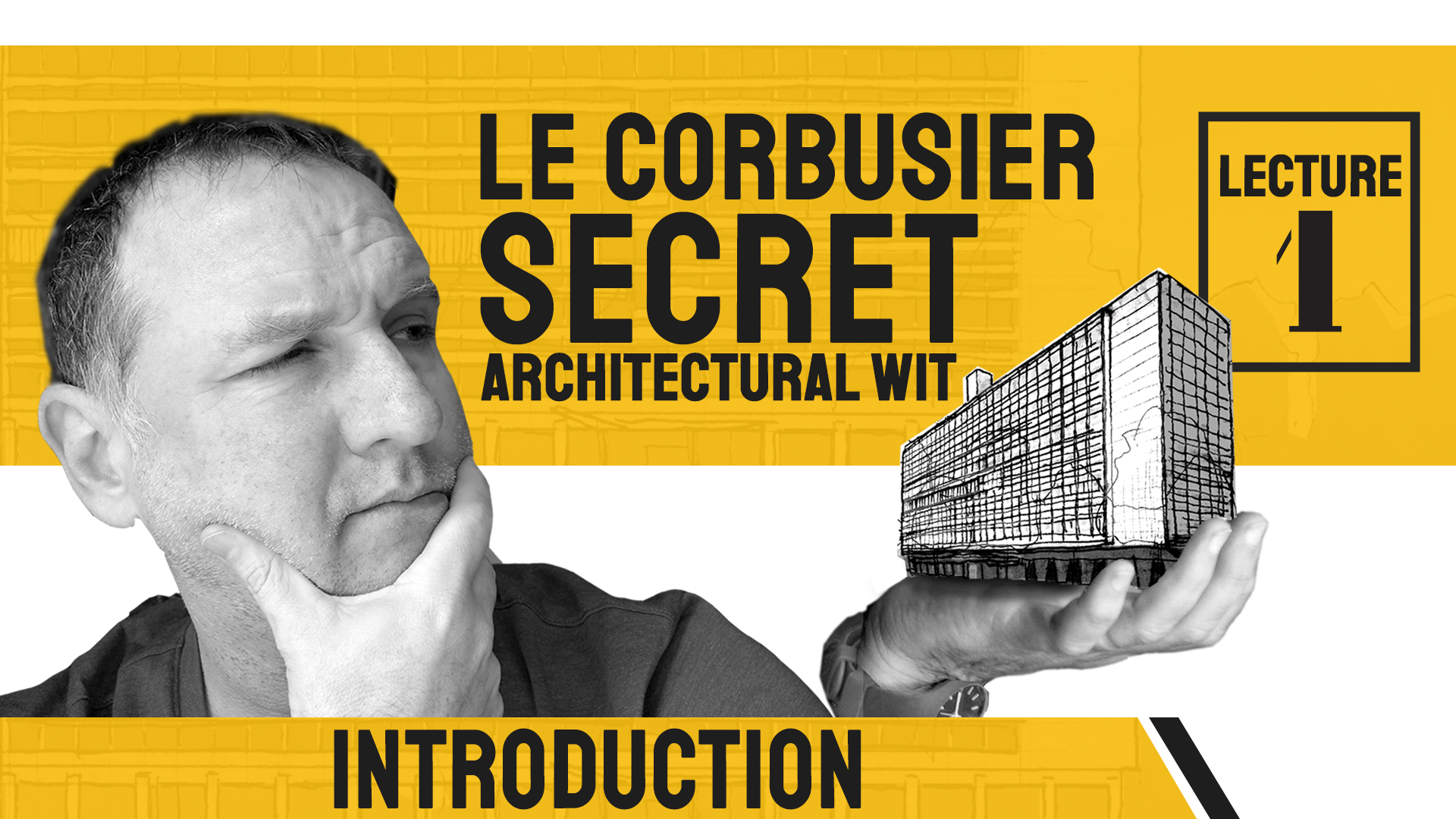
This project is for a single image, perhaps saved as .psd or .tiff. The proportions of Youtube's thumbnail images is 16:9. Take my file of the face and hand (holding the building) and re-layout the words and fonts to be professional and attractive-looking. You're welcome to try different fonts, layouts, colors, etc. I don't know which letters should be upper or lower case. You can flip the imafe, resize, reposition etc. I tend to prefer minimal designs, that have a touch of professionalism, but still are interesting enough to have you click on it. It is the Introduction image for a YouTube historical lecture series. The overall title of the lectures is, "Le Corbusier's Secret Architectural Wit" or "Le Corbusier Secret Architectural Wit." And this particular video is "Lecture 1: Introduction."
I want it to not look too cute because I would want to keep my dignity in front of my friends, family and colleagues who will eventually see it on YouTube. My target audience are architect, architecture students, history buffs, and those who love art and art history. My daughter's idea to have the thought bubble looking at the face in the architecture...
Objetivo del mercado(s)
architects, architecture students, history buffs, college-educated
Tipo de industria / entidad
Architecture/Architectural History/Historian
Estilos de fuente para usar
Gustan otros estilos de fuente:
- maybe a seriffed font, but I doubt it...
Mira y siente
Cada control deslizante ilustra las características de la marca del cliente y el estilo que debe comunicar el diseño de tu logotipo.
Elegante
Atrevido
Juguetón
Serio
Tradicional
Moderno
Atractivo
Profesional
Femenino
Masculino
Vistoso
Conservador
Económico
De Alta Gama
Requisitos
Debes tener
- Two sets of texts. Person (me) looking at building (studying it for its wit)
Agradable de tener
- There is a second image file that can be substituted for the blocky building. The image doesn't necessarily have to be in the hand... ***ADDITION TO ORIGINAL BRIEF**** Le Corbusier is associated with a very specific (though not particularly nice) color pallete. I include it in the files below. I'm not saying they need to be included in the design, but sometimes, publications on the architect that are glaringly different from these colors, can feel a bit "off."
No debería tener
- I'm not fond of "artistic filters" over the photo of the person. Also, black and white image of the person is likely better than the color one.