real estate agency logo haute couture transaction property concierge with a soul
¿Quieres ganar un trabajo como este?
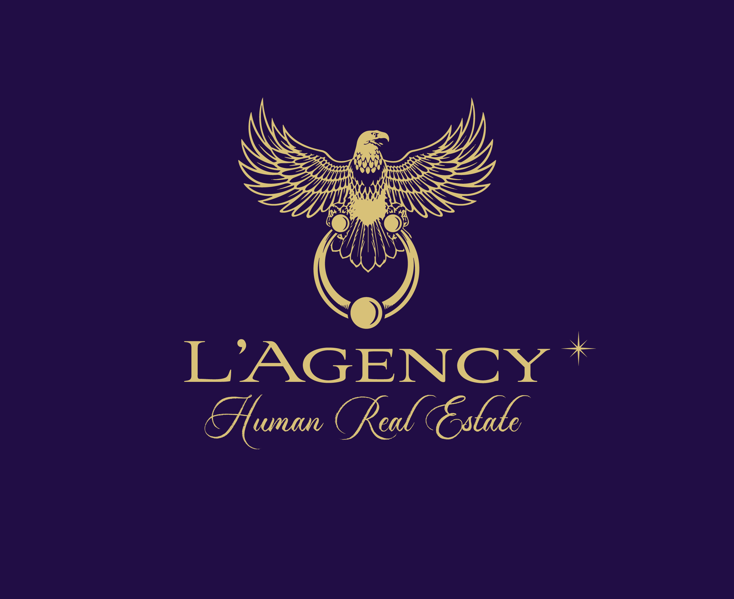
Este cliente recibió 184 diseños de logo de 33 diseñadores. Eligieron este diseño de logo de k1m como el diseño ganador.
Únete gratis Encuentra trabajos de diseño- Garantía
-
 €190
€190
-
 184 diseños
-
 33 diseñadores
Resumen de Diseño de Logo
hello my real estate and concierge agency is called the agency
an original and classy topography at the same time
I would like something very classy, very fine with an atypical and pronounced character that reveals the strong identity of my agency with unique human values and above all very different from other classic standard agencies.
To try to answer to help you what I don't like anymore in my logo:
The logo is not recognizable enough, it does not have enough personality, it is too masculine it is not suitable enough for social networks (too elongated) it is too elongated too rigid too severe.
I would like a really atypical graphic charter in purple gold and black colors.
The spearhead of the agency is creative emotions, a singular independent agency.
Its values: Authenticity proximity to customers personalized support human singularity empathy adaptation rigor constant expertise
Its target search mandate very important work of buyers international and national local sales estimation expertise transaction sales concierge seasonal rental Home staging decoration support for works asset management real estate brokerage investors
Its messages: creator of emotions, an agency that breaks codes, haute couture transaction, scale reduced from 3% this point is very important and is not valued enough in my communication.
My competitors: Barnes vintage Loft Et Associes Crazy Home Emile Garcin Made easy clef keeweeks Homies holidays
Signs that I don't like Donibane Gonzague ORPI Human Century 21 Land of Agencies with Basque identities and all groups with formatted or American methods in general
What I like as a logo: Millesime Yves Saint-Laurent Audi Chanel Mercedes (old vintage cars) Apple the Laughing Cow…
A refined logo that marks the spirits with small arrows and ethnic symbols and flowers
Objetivo del mercado(s)
real estate
Texto del logo
L'AGENCY human real estate
Estilos de fuente para usar
Mira y siente
Cada control deslizante ilustra las características de la marca del cliente y el estilo que debe comunicar el diseño de tu logotipo.
Elegante
Atrevido
Juguetón
Serio
Tradicional
Moderno
Atractivo
Profesional
Femenino
Masculino
Vistoso
Conservador
Económico
De Alta Gama
Requisitos
Debes tener
- art deco flowers fine arrows, spectrum..... I would like something much more classy, very fine with an atypical and pronounced character that reveals the strong identity of my agency with unique human values and above all very different from other classic standard agencies . To try to answer to help you what I no longer like in my logo: The logo is not recognizable enough, it does not have enough personality, it is too masculine it is not suitable enough for social networks ( too elongated) it is too elongated too rigid too severe. I would like a really atypical graphic charter in purple gold and black colors. The spearhead of the agency is creative emotions, a singular independent agency. Its values: Authenticity proximity to customers personalized support human singularity empathy adaptation rigor constant expertise Its target research mandate very important work of buyers international and national sales local estimation expertise transaction sales concierge seasonal rental Home staging decoration support for works asset management brokerage real estate investors Its messages: creator of emotions, an agency that breaks the codes, haute couture transaction, scale reduced from 3% this point is very important and is not valued enough in my communication. My competitors: Barnes millésime Loft Et Associes Crazy Home Emile Garcin Made easy clef keeweeks Homies holidays Signs that I don't like Donibane Gonzague ORPI Human Century 21 Terrain des Agences with Basque identities and all groups with formatted or American methods in general What I like as a logo: Millesime Yves Saint-Laurent Audi Chanel Mercedes (classic vintage cars) Apple the Laughing Cow… A sleek logo that makes an impression
Agradable de tener
- I would like something much more classy, very fine with an atypical and pronounced character that reveals the strong identity of my agency with unique human values and above all very different from other classic standard agencies. To try to answer to help you what I no longer like in my logo: The logo is not recognizable enough, it does not have enough personality, it is too masculine it is not suitable enough for social networks ( too elongated) it is too elongated too rigid too severe. I would like a really atypical graphic charter in purple gold and black colors. The spearhead of the agency is creative emotions, a singular independent agency. Its values: Authenticity proximity to customers personalized support human singularity empathy adaptation rigor constant expertise Its target research mandate very important work of buyers international and national sales local estimation expertise transaction sales concierge seasonal rental Home staging decoration support for works asset management brokerage real estate investors Its messages: creator of emotions, an agency that breaks the codes, haute couture transaction, scale reduced from 3% this point is very important and is not valued enough in my communication. My competitors: Barnes millésime Loft Et Associes Crazy Home Emile Garcin Made easy clef keeweeks Homies holidays Signs that I don't like Donibane Gonzague ORPI Human Century 21 Terrain des Agences with Basque identities and all groups with formatted or American methods in general What I like as a logo: Millesime Yves Saint-Laurent Audi Chanel Mercedes (classic vintage cars) Apple the Laughing Cow… A sleek logo that makes an impression
No debería tener
- vulgar simple basic