Company Logo for a non-profit organisation
¿Quieres ganar un trabajo como este?
Este cliente recibió 92 diseños de logo de 49 diseñadores. Eligieron este diseño de logo de GambarSERU como el diseño ganador.
Únete gratis Encuentra trabajos de diseño-
 S$150
S$150
-
 92 diseños
-
 49 diseñadores
Resumen de Diseño de Logo
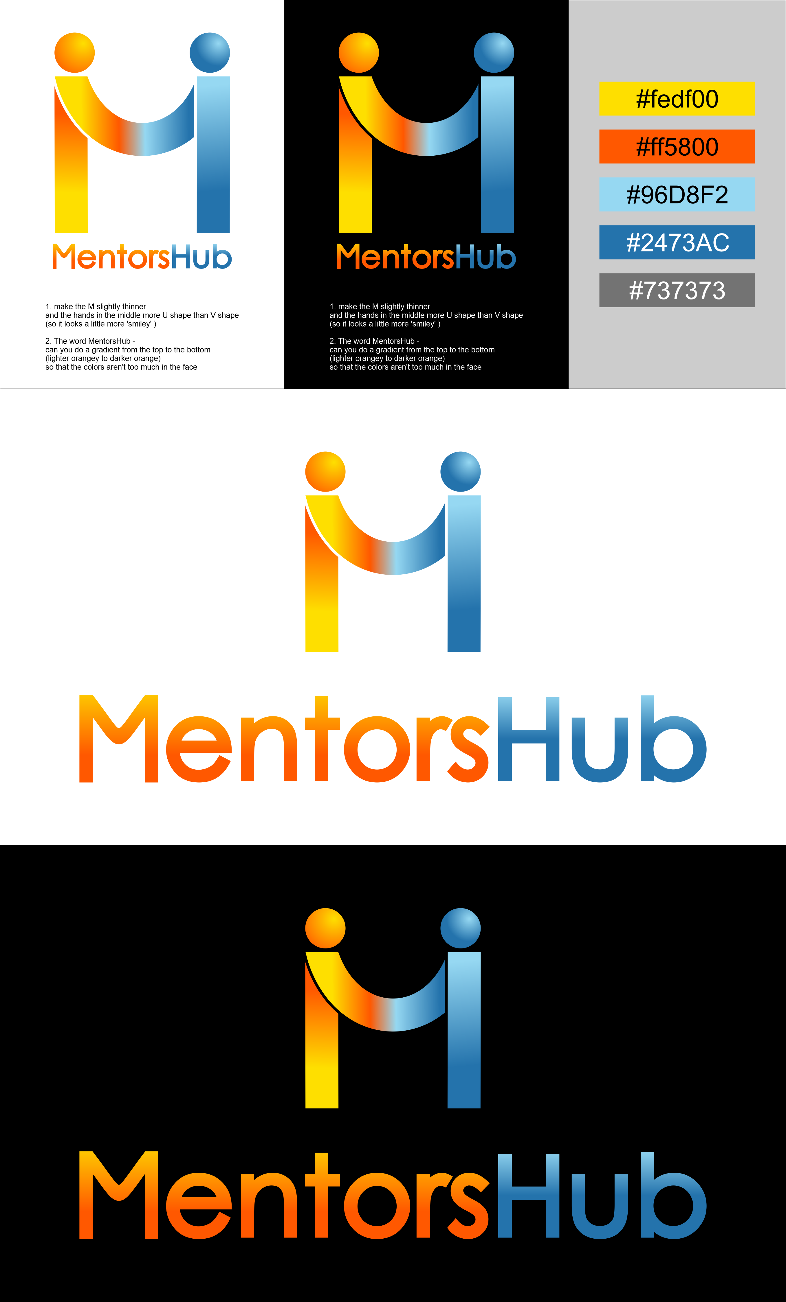
MentorsHub is a non-profit organisation providing pro bono mentorships to underserved young adults in Singapore. We have an existing logo that was designed 8 years ago: The 'M' signifies Mentoring, Mentor, Mentee; the 2 dots represent 2 individuals, as our mentorship is 1to1, personal and relational. The joining and crossing of hands (M), and blue & orange are meant to imply knowledge transfer from one to the other, and life's transformation (with a 3rd color or stronger color tone). The slogan for the logo is: Inspiring Young Adults from Good to Great.
We are revamping our dated website (www.mentorshub.sg) currently and would like to make the logo more contemporary to appeal to Gen Z by keeping the essence intact. Not looking for a drastic overhaul or entirely new logo as a lot of digital asset and goodwill have accumulated over the years. The new slogan is: Inspiring a Life of Purpose and Significance. Because we take a holistic and strategic approach to engineering breakthroughs in the young people (21-26) we mentor. The mentorship is open to all young people who have limited access to professional guidance but we prioritise the underserved.
The new logo should encapsulate the spirit behind the cause, exudes credibility, confidence, character.
Texto del logo
MentorsHub (capital M & H, one word, not 2 separate words)