Logo design for healthy takeaway - SERVZ
¿Quieres ganar un trabajo como este?
Este cliente recibió 258 diseños de logo de 105 diseñadores. Eligieron este diseño de logo de ammar_ed como el diseño ganador.
Únete gratis Encuentra trabajos de diseño- Garantía
-
 A$300
A$300
-
 258 diseños
-
 105 diseñadores
Resumen de Diseño de Logo
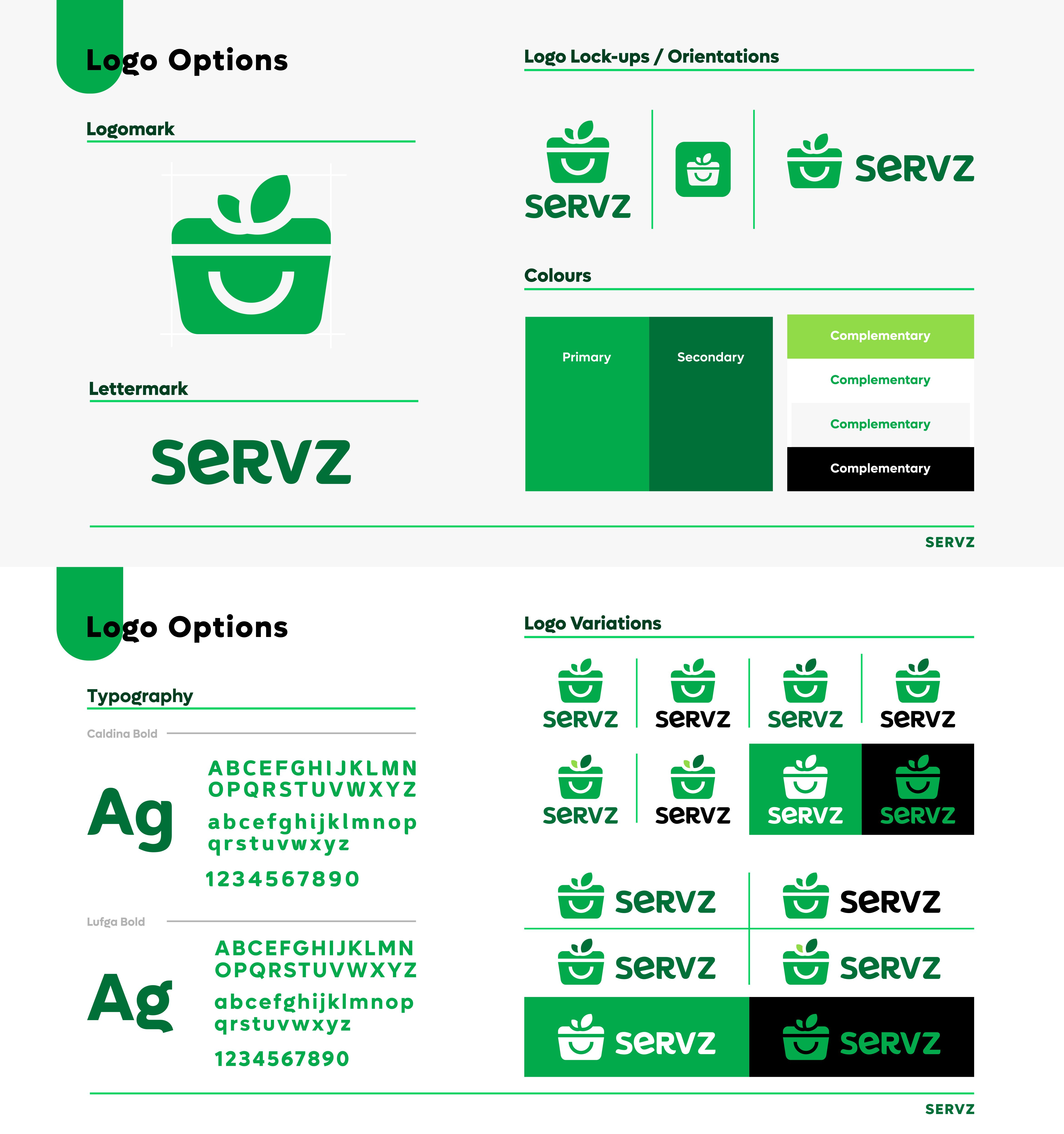
We are looking for a simple, distinctive logo (both logotype and logomark) for our healthy takeaway business.
The name SERVZ has two key connotations:
1) Getting your serves (as in the recommended daily serves of food groups, specifically vegetables, as per the dietary guidelines).
2) Being served/serving food up instead of needing to cook.
The tone of SERVZ is informative, simple, and fun.
Product:
Servz is the reimagination of takeaway food for a healthy lifestyle. We deliver fresh, nutritionally balanced, and sustainably packaged takeaway dinners to the customer’s door. Meals are made up of food group “serves” – carbs, veg, protein, etc. The meals are designed for the everyday healthy lifestyle, not just weight management (it is not a “diet” product).
Design (please see attachment):
• We prefer not to have obvious cutlery or cooking utensils in the design.
• We would like green in the design to represent health and sustainability.
• It should look good even when used in only one colour (i.e., a black version).
• The logo mark and text should be separable so that there can be many variations of the logo (identifiable by text alone, mark alone or text and mark together).
• The logo mark should be easy to recognise and simple enough for someone to draw after seeing it. It can be pictorial or abstract.
• The design should be bold, simple and fun. Designs should not be too angular or "sporty" looking - the health aspect of the brand is about lifestyle not performance.
Actualizaciones
Gathering more feedback
Objetivo del mercado(s)
The brand speaks to health-orientated urbanites without the time, inclination, and/or resources to cook a healthy dinner every night. SERVZ customers feel they have more to offer the world than their time in the kitchen. Customers are typically career-focused millennials and parents of young children.
Tipo de industria / entidad
Food service - takeaway and delivery
Texto del logo
SERVZ
Estilos de logo de interés
Logo pictórico / combinado
Un objeto del mundo real (texto opcional)
Logo abstracto
Conceptual / simbólico (texto opcional)
Logo de marca de nombre
Logotipo basado en palabra o nombre (solo texto)
Estilos de fuente para usar
Colores
Diseñador para elegir los colores que se utilizarán en el diseño.
Mira y siente
Cada control deslizante ilustra las características de la marca del cliente y el estilo que debe comunicar el diseño de tu logotipo.
Elegante
Atrevido
Juguetón
Serio
Tradicional
Moderno
Atractivo
Profesional
Femenino
Masculino
Vistoso
Conservador
Económico
De Alta Gama
Requisitos
Debes tener
- Logotype and logomark (that can be used together or separately). Green as primary colour.
Agradable de tener
- Please see the attached design brief.
No debería tener
- Obvious cutlery or cooking utensils in the design, would like to differentiate from the generic restaurant/takeaway logo