Simplistic Logo Design for financial app
¿Quieres ganar un trabajo como este?
Este cliente recibió 12 diseños de logo de 4 diseñadores. Eligieron este diseño de logo de JohnnyCactus como el diseño ganador.
Únete gratis Encuentra trabajos de diseño-
 US$110
-
 12 diseños
-
 4 diseñadores
Resumen de Diseño de Logo
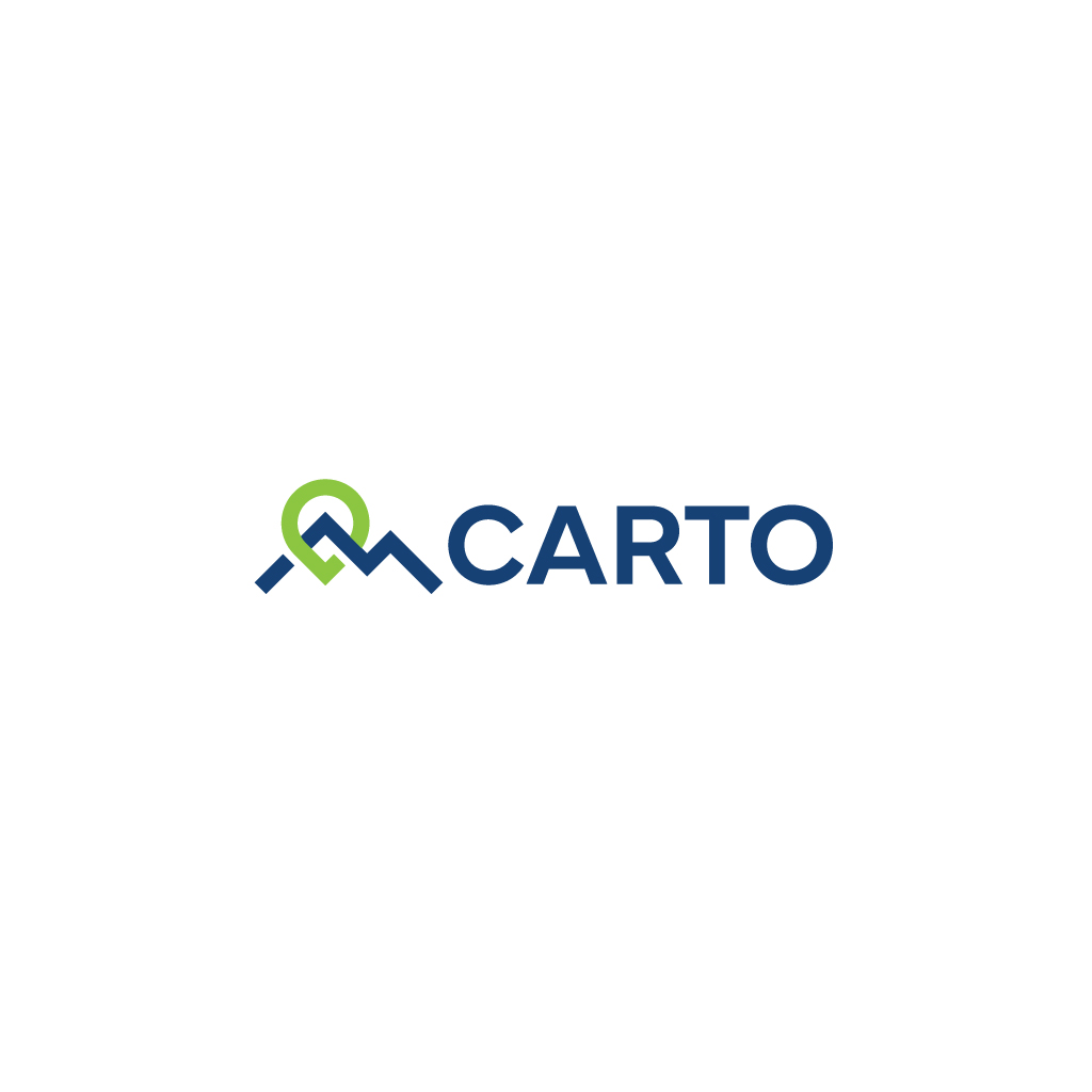
I need to have a logo created for a small financial software app. I know the general look I am aiming for and have provided visual example, however I do not want to copy someone else's logo so I would like to have a unique one created that is inspired by the example. This could be changing the colors or changing the lines slightly, or it could be entirely different.
The name of the app is called Carto Financial, which is a short word related to mapping (cartography). The visual example provided has an element of a pin drop point (eg. knowing where you are on a map), and an element of a mountain (eg. the terrain that sometimes requires a map to navigate). The software helps manage certain financial functions and is named after the idea of a map being the resource someone uses to find their way or keep track of a course or direction.
I would like the style to be similar, but tweaked enough that I can call it my own. The logo needs to have the ability to have a colored version (for white backgrounds) or solid white version (for use on dark backgrounds), and it needs to be able to stand alone with no words or to be paired with the words "Carto" or "Carto Financial". Text needs to be contemporary, clean, and simple...some sort of Sans Serif style. Probably all Caps. Perhaps with a focus on the word Carto, and the word financial being secondary or even omitted altogether. For colors, I like blues, greens, grays. More earthy or rich than bright and loud (ex. indigo blue instead of bright royal blue)
Objetivo del mercado(s)
Business owners, high net worth individuals
Tipo de industria / entidad
financial software
Texto del logo
CARTO
Estilos de logo de interés
Logo abstracto
Conceptual / simbólico (texto opcional)
Estilos de fuente para usar
Colores
Colores seleccionados por el cliente para ser utilizados en el diseño del logotipo:
Mira y siente
Cada control deslizante ilustra las características de la marca del cliente y el estilo que debe comunicar el diseño de tu logotipo.
Elegante
Atrevido
Juguetón
Serio
Tradicional
Moderno
Atractivo
Profesional
Femenino
Masculino
Vistoso
Conservador
Económico
De Alta Gama
Requisitos
Debes tener
- horizontal orientation
No debería tener
- red, vertical orientation