NewHope Equestrian logo refinement
¿Quieres ganar un trabajo como este?
Este cliente recibió 62 diseños de logo de 17 diseñadores. Eligieron este diseño de logo de BE design como el diseño ganador.
Únete gratis Encuentra trabajos de diseño-
 A$150
A$150
-
 62 diseños
-
 17 diseñadores
Resumen de Diseño de Logo
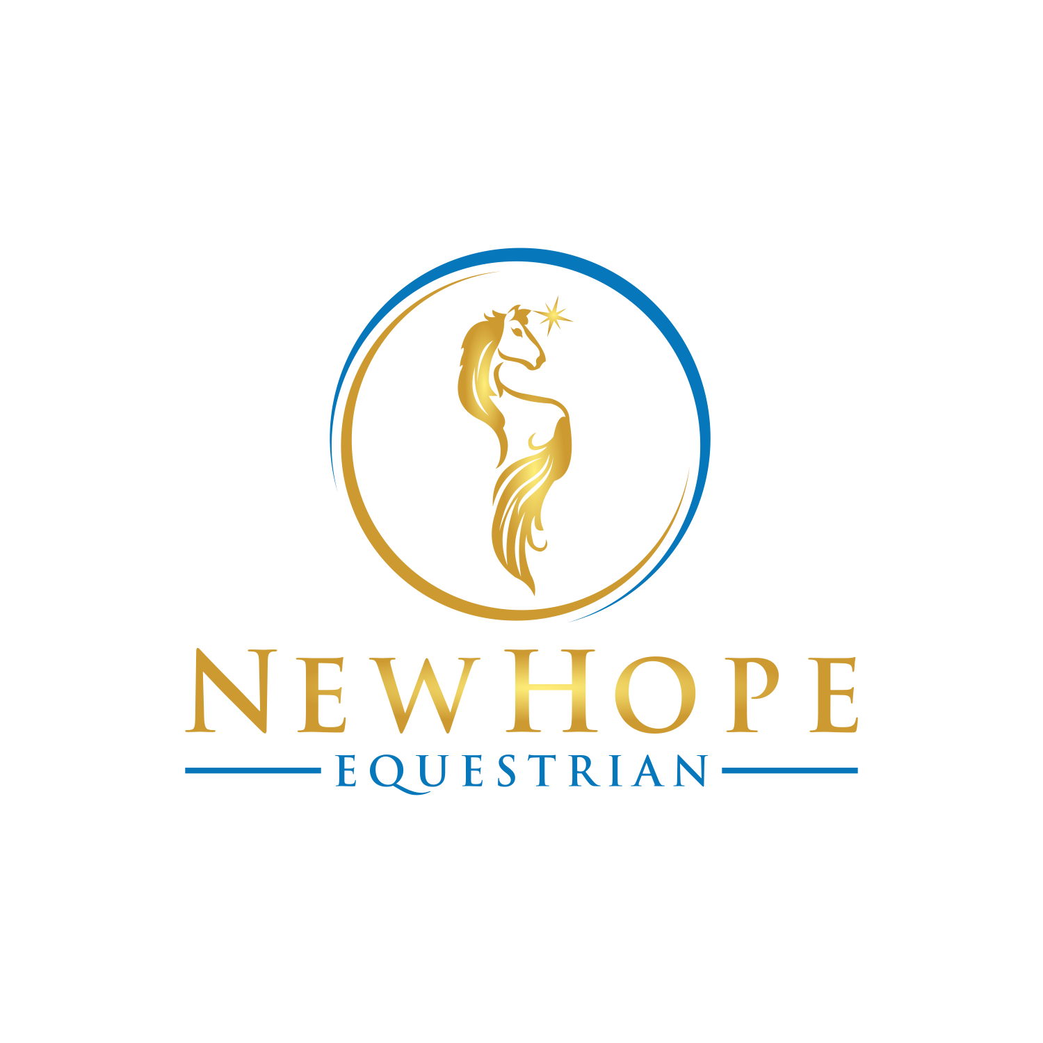
A refinement of the Logo with the words;
“New Hope Equestrian” integrated.
I don’t mind if NewHope is put together as 1 word or separated into 2 words.
I have supplied the icon (horse) to be used (makes your job easier!!). The star near the horse head is not necessarily required. This picture is from a tattoo so the lines will need to be tidied up & defined so it’s a clearer image. There’s 2 styles I’ve played with attached too but that’s the limit of my imagination- the text can be curving around the horse or placed anywhere - please send through any creative placement you like!
Colours we use are Dark Teal & Gold, and shades of Blue / silver / grey or any highlight colours are fine. Think shimmering metallic look. Try teal background with gold & black logo perhaps.
In terms of style, I like ‘flowing’ pretty logos but the text needs to be in a strong enough font that is very clear to read, so a bold yet pretty stylish text would work.
*Please note there is no suitable dark teal colour in the grid selection below so you’ll need to search for one - I’ll try to attach a picture of the colour too.
Good luck & thanks!
Tipo de industria / entidad
Equine
Texto del logo
NewHope Equestrian
Estilos de logo de interés
Logo pictórico / combinado
Un objeto del mundo real (texto opcional)
Logo con personaje
Logo con ilustración o personaje
Estilos de fuente para usar
Colores
Colores seleccionados por el cliente para ser utilizados en el diseño del logotipo:
Mira y siente
Cada control deslizante ilustra las características de la marca del cliente y el estilo que debe comunicar el diseño de tu logotipo.
Elegante
Atrevido
Juguetón
Serio
Tradicional
Moderno
Atractivo
Profesional
Femenino
Masculino
Vistoso
Conservador
Económico
De Alta Gama
Requisitos
Debes tener
- A strong resemblance to the icon / horse picture supplied and the text “NewHope Equestrian” (New Hope can be 1 word or 2 words but always with a capital H)
Agradable de tener
- Metallic gold highlights.
No debería tener
- Different icons. (Adjustments are ok just not entirely different ones).