New Company Brochure/One pager for PR Agency
¿Quieres ganar un trabajo como este?
Este cliente recibió 44 diseños de brochure de 19 diseñadores. Eligieron este diseño de brochure de creativemood438 como el diseño ganador.
Únete gratis Encuentra trabajos de diseño- Garantía
-
 US$150
-
 44 diseños
-
 19 diseñadores
Resumen de Diseño de Brochure
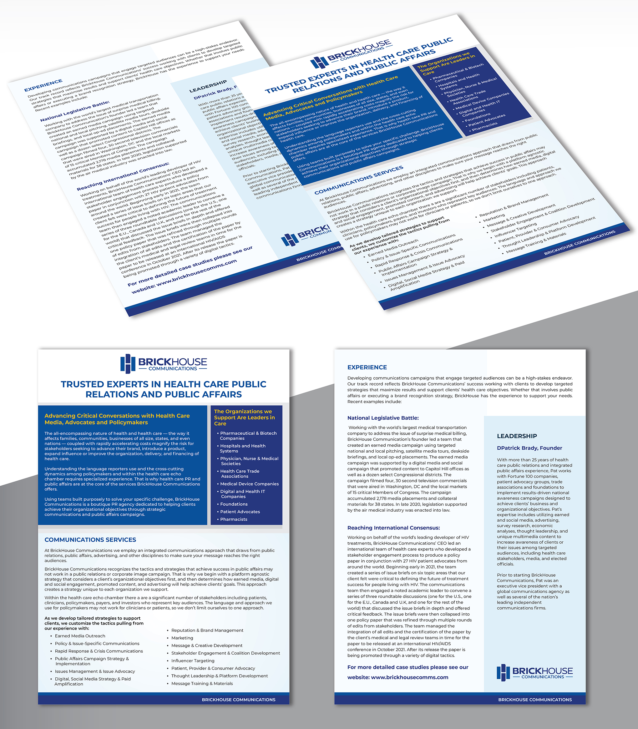
Need a brochure/one pager describing my new company and services. I recently started a public relations and public affairs communications agency that is solely focused on health care. My targeted audiences for clients are: pharmaceutical and biotechnology companies, companies in medical technology and digital health, health care trade associations, professional medical societies representing physicians, pharmacists, nurses, foundations and patient advocacy organizations for diseases like cancer, Alzheimer's, kidney disease, etc..
In the attached files, I uploaded a powerpoint file that has the document with the appropriate fonts for the headlines and body copy. It also has a logo with name locked up and just a logo on page 2. The language is final. I also uploaded another powerpoint file that has my color scheme in it. You can google my website based on the company name, but you will see a pretty basic website so you can be more creative with the one pager.
I'm happy to answer specific questions
Objetivo del mercado(s)
Target Market is communications leaders in health care companies, associations. More detail in project description
Mira y siente
Cada control deslizante ilustra las características de la marca del cliente y el estilo que debe comunicar el diseño de tu logotipo.
Elegante
Atrevido
Juguetón
Serio
Tradicional
Moderno
Atractivo
Profesional
Femenino
Masculino
Vistoso
Conservador
Económico
De Alta Gama
Requisitos
Debes tener
- I have several different variations of my logo, but I'd like to see the use of the primary logo, which is multicolor on a white background somewhere prominently displayed.
Agradable de tener
- The attached files give you more info on the logo, color scheme and fonts
No debería tener
- After review a handful of design options, the inclusion of health care pictures is problematic. Stock photos are too generic and since my clients represent so many different parts of health care, the photos can't be specific to them all. It's probably better to use shapes consistent with my logo and then colors and textured backgrounds to add visually interesting details. I'm still going back and forth on whether or not to include the header image from my website that several designers have used.