Film/TV Prep Company seeks Logo
¿Quieres ganar un trabajo como este?
Este cliente recibió 20 diseños gráficos de 9 diseñadores. Eligieron este diseño gráfico de simple mind como el diseño ganador.
Únete gratis Encuentra trabajos de diseño- Garantía
-
 US$210
-
 20 diseños
-
 9 diseñadores
Resumen de Diseño Gráfico
After years in the TV/Film industry, we are changing the landscape and hoping to niche down our work. This company is focusing on ONLY the pre-production for film/TV projects. We're trying to fix it in pre! not post. ;) Paperwork/research heavy, computer, remote-driven work is our company. We will take on a concierge-type business sense in that companies can hire us to complete specific tasks, so they can put their time to other parts of the project.
We have a couple slogan options:
"When time is running out, we join in."
"Empower your process."
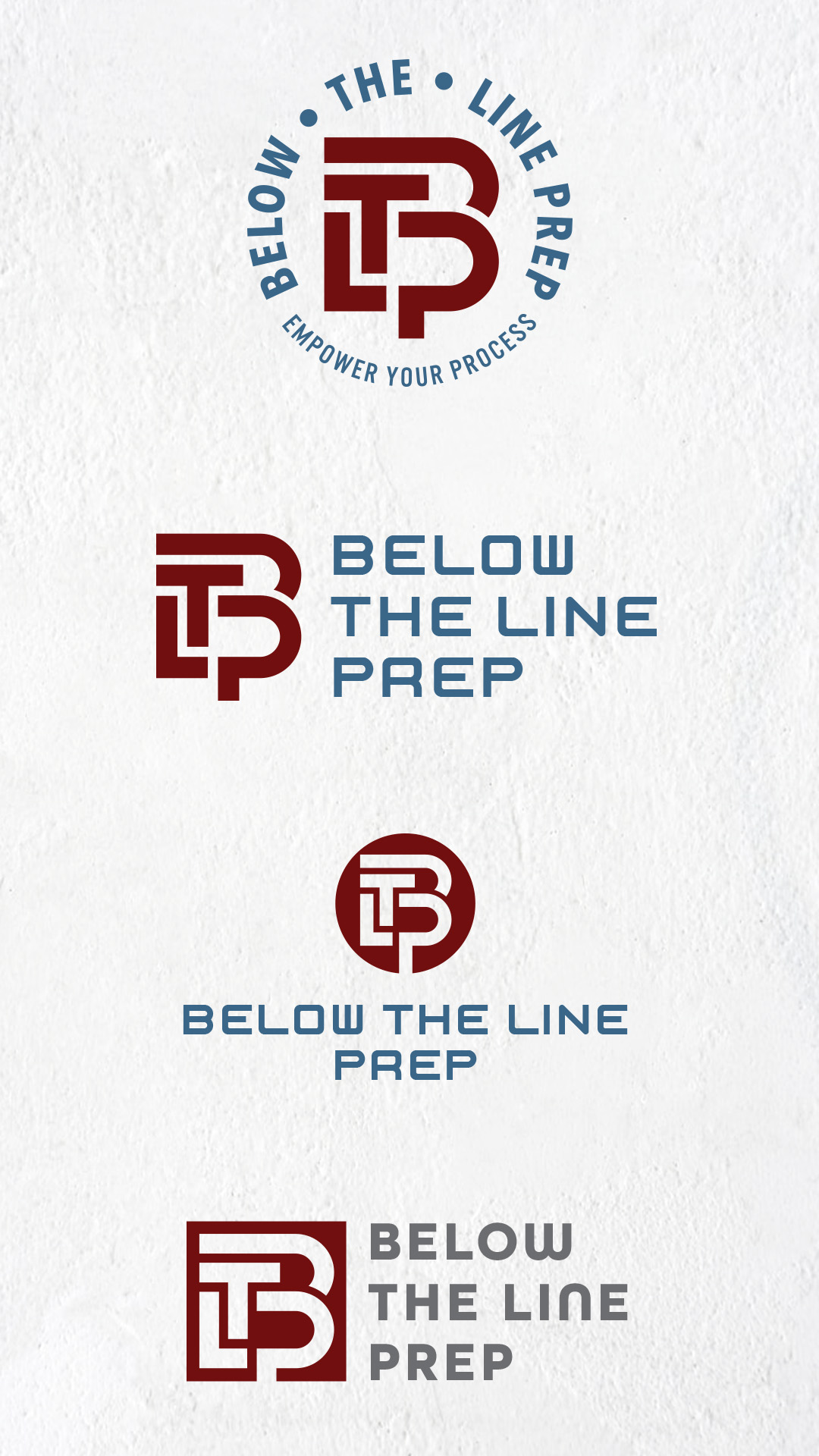
Our company will be called "Below-The-Line Prep" or for short "BTL Prep". When creating a film or TV show, you have an Above-The-Line budget & everything else is BTL. We'll focus on all prep tasks remotely for the BTL of the show. Schedule, budget, location permits, onboarding/hiring crew, travel booking needs, and more.
I want the company logo to feel simplistic & modern. The files attached are ideas I've been toying with:
• Trial 5 - Was a simple letter-based logo, but it looks possibly too block & I got feedback that it looked "busy".
• Simplified Logo - Was trying to go more unique and ambiguous of a logo stamp/image look vs the straight forward lettering.
• Clock_Keyboard - was my fun unique take, replace a laptop screen with an alarm clock, but I'd like the numbers of the clock to be budget codes (attached as Chart of Accounts) & the hand of the clock to be a checkmark (as in task done).
Colors - Fall colors. Deep reds, blues, purples, greens, etc. are ideal for this company. My other company uses pastels - so trying to keep separation.
As you can see, instead of hyphens I used dots in Trial 5. "Below • The • Line" vs "Below-The-Line" - felt cleaner for the image. You can take luxury with in between punctuation as well.
Thank you for taking the time to submit it if you do! I need your professional eyes to show me the opportunities I'm missing.
Actualizaciones
I didn't finish this brief & when I posted it today, it's still showing the dates from back in January. So, I need new dates started today through next week.
Mira y siente
Cada control deslizante ilustra las características de la marca del cliente y el estilo que debe comunicar el diseño de tu logotipo.
Elegante
Atrevido
Juguetón
Serio
Tradicional
Moderno
Atractivo
Profesional
Femenino
Masculino
Vistoso
Conservador
Económico
De Alta Gama
Requisitos
Debes tener
- Fall, deep, rich colors. I use pastels for another company, need separation.
Agradable de tener
- Slogan, but not needed. Focus should be logo.
No debería tener
- Does not need TV/Film icons as we may expand to events.