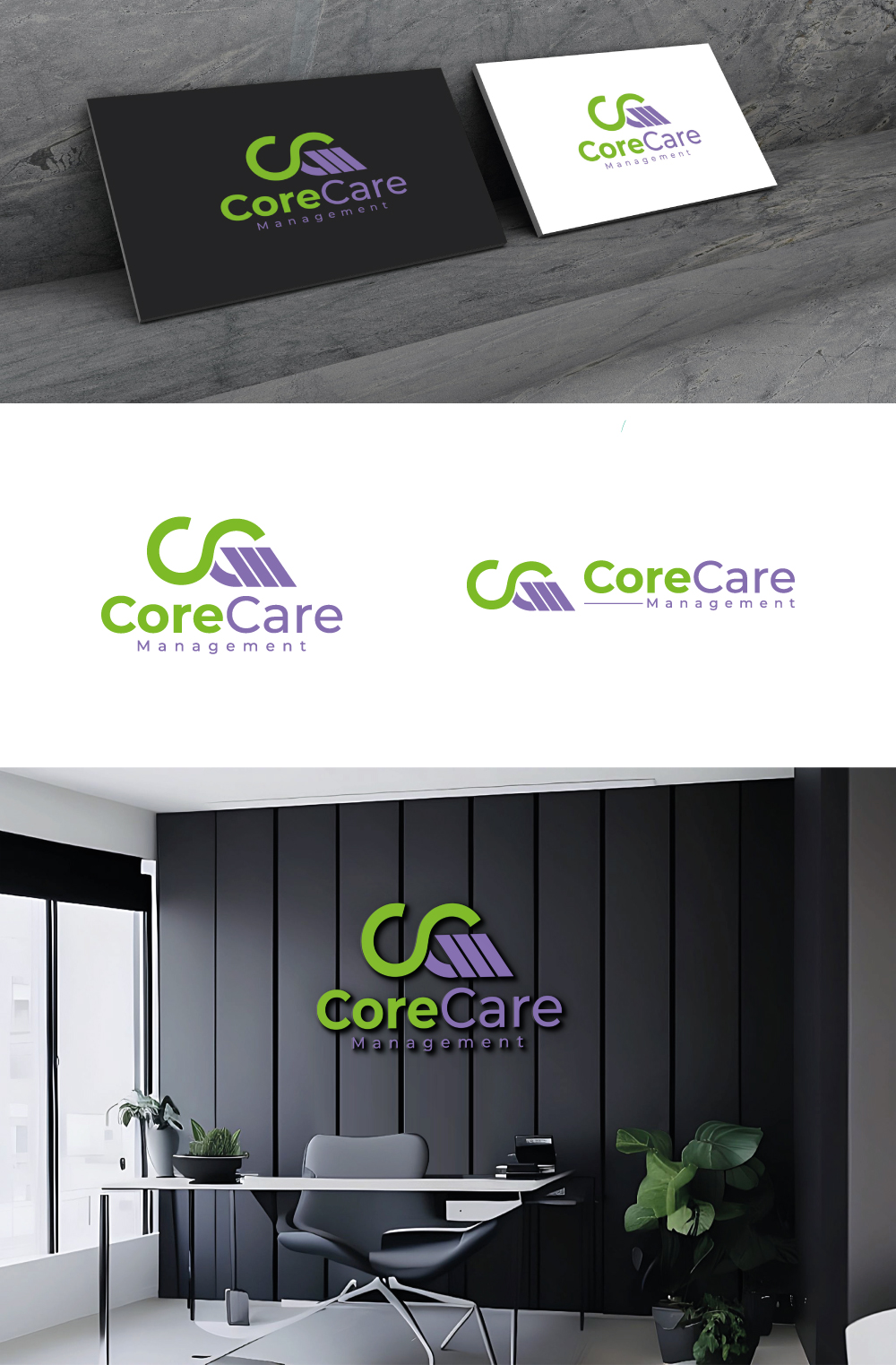
Logo Design for CoreCare Management - medical and vocational case management
¿Quieres ganar un trabajo como este?
Este cliente recibió 239 diseños de logo de 116 diseñadores. Eligieron este diseño de logo de Visionarydexiner como el diseño ganador.
Únete gratis Encuentra trabajos de diseño- Garantía
-
 US$150
-
 239 diseños
-
 116 diseñadores
Resumen de Diseño de Logo
I would like to completely eliminate the “man” which is done in one of them and if the M cannot fit into the CC or maybe we could “stack the CCM or link the CCM in front of CoreCare Management. Playing off of the CCM as this is a national certification for our industry. Honestly, the attached logo is not something I want to keep and the colors are too harsh.
The color codes I would like to use are a combination of Greens (like Chartreuse or Lime) and Purple/Lilac. I want to completely eliminate the gold from our logo.
Also we are not committed to keep the Logo part of the logo if the M cannot fit smoothly and incorporate with the double Cs we have to pivot. You can also adjust the font and size it that makes the M fit seamlessly into the CC-I am looking for a change.
We would need to dress this up a bit but something like this may work as well
C C M (with CoreCare Management) superimposed over the CCM centered as below but with capitalization on the C C M and the rest in lowercase.
I am open to suggestions, we just need a new Logo as I really do not like the current one.
Texto del logo
CoreCare Management