NETWORKERS
¿Quieres ganar un trabajo como este?
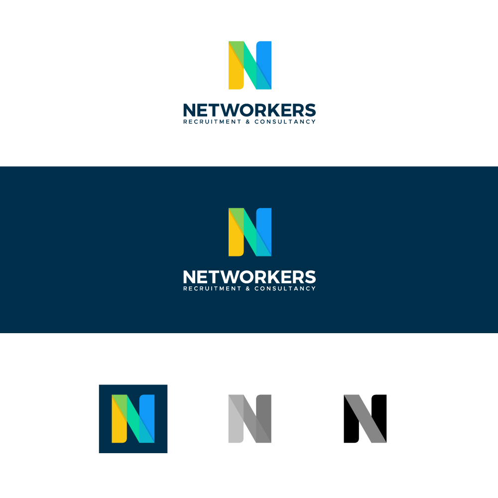
Este cliente recibió 186 diseños de logo de 80 diseñadores. Eligieron este diseño de logo de AAZ_Studio como el diseño ganador.
Únete gratis Encuentra trabajos de diseño-
 €190
€190
-
 186 diseños
-
 80 diseñadores
Resumen de Diseño de Logo
Our company is a recruitment and consultancy agency (placement of consultants).
www.networkers.be (site under construction)...
We have decided to redo a makeover/rebranding of its activity... The current company operates under the name of www.d-network.be and will become www.networkers.be... Our activity is strongly linked to networking, with many contacts (clients & candidates)... We are specialized in 6x domains and each domain has its own site... The idea is to group all these domains into a single name/branding
- ICT (ICT-network.be)
- RealEstate (realestate-network.be)
- Digital/Marketing/Communication (digimarcom-network.be
- Sales (sales-network.be)
- HR & Admin (hradmin-network.be)
- Finance (www.finance-network.be)
Here are the criteria that correspond to us: Pep, Proactivity, Energy, Dynamism, Agility, ...
Objetivo del mercado(s)
Director of Human Resources, Head of Departments
Tipo de industria / entidad
Services / Recrutement / Chasseurs de Têtes
Texto del logo
NETWORKERS
Estilos de fuente para usar
Mira y siente
Cada control deslizante ilustra las características de la marca del cliente y el estilo que debe comunicar el diseño de tu logotipo.
Elegante
Atrevido
Juguetón
Serio
Tradicional
Moderno
Atractivo
Profesional
Femenino
Masculino
Vistoso
Conservador
Económico
De Alta Gama
Requisitos
Debes tener
- The logo must hit!
Agradable de tener
- A capital N as an acronym. A logo that people can remember. I like the N of Netflix,... A bit in the same style without obviously plagiarizing. Personally I like black it would give a style, class, pro and hard-hitting but I'm not against having other ideas. colors