

 Refresh
Accountancy practice needs a wordpress website redesign for growth
¿Quieres ganar un trabajo como este?
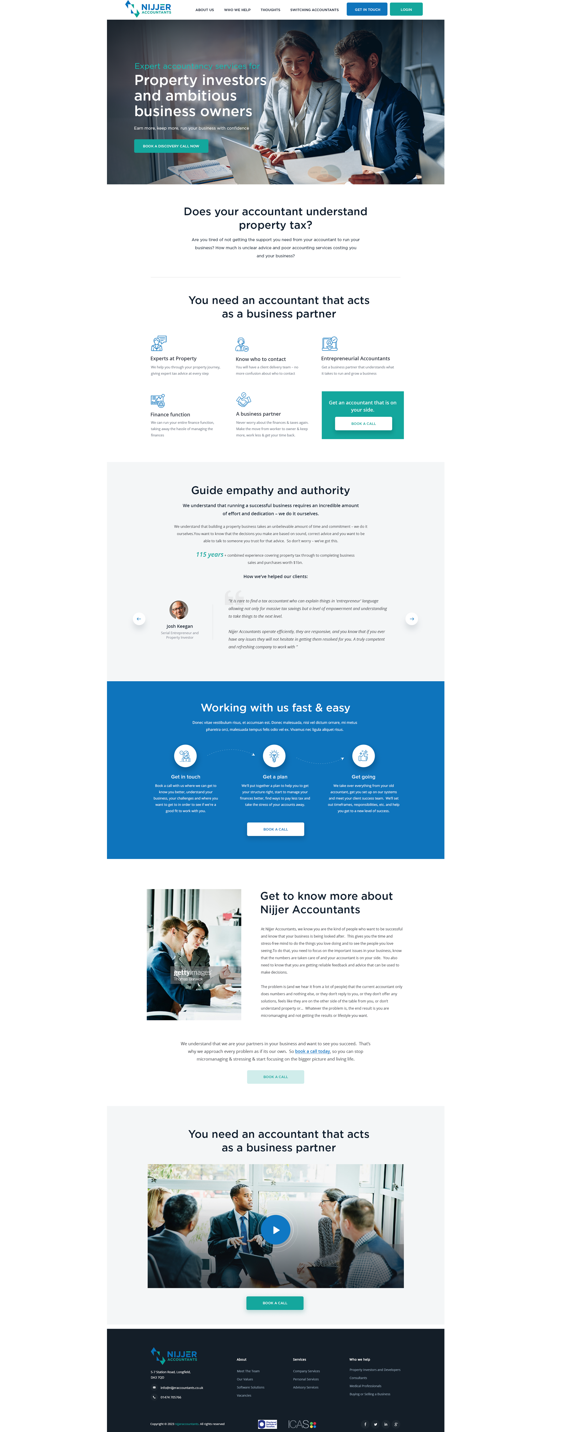
Este cliente recibió 95 diseños web de 16 diseñadores. Eligieron este diseño web de OGMA CONCEPTIONS como el diseño ganador.
Únete gratis Encuentra trabajos de diseño
- Garantía
-
 £340
£340
-
 95 diseños
-
 16 diseñadores
Resumen de Diseño Web
We are a growing accountancy practice - headcount and revenues have doubled in the last 2 years. We are continuing to grow. We only had a website made around 12 months ago but the company we used offered very little in terms of creativity and ideas of how to make it look modern and eye-catching. We want to redesign the website to make it look premium and professional because we are starting to launch more marketing and drive more traffic to the site.
The current website is www.nijjeraccountants.co.uk. The website was built in wordpress.
The logo has been uploaded. The main 2 colour hex codes are: 0E74BC and 14A79D.
We are open to changing the fonts in the website and welcome suggestions for this too.
Following on from this we will launch a project to design brochures and one-page flyers that we can fill with useful information about what we do and also create lead-generators to download from the website. So the design of the website will influence the overall brand and feel of all of the marketing collateral.
Objetivo del mercado(s)
Property businesses and entrepreneurial, growth mindset clients
Tipo de industria / entidad
Accountancy
Número de páginas requeridas
3 page
Estilos de fuente para usar

Colores
Diseñador para elegir los colores que se utilizarán en el diseño.
Mira y siente
Cada control deslizante ilustra las características de la marca del cliente y el estilo que debe comunicar el diseño de tu logotipo.
Elegante
Atrevido
Juguetón
Serio
Tradicional
Moderno
Atractivo
Profesional
Femenino
Masculino
Vistoso
Conservador
Económico
De Alta Gama
Requisitos
Debes tener
- A modern and professional feel. 3 fonts - most websites seem to use 3 different fonts now and I like this. We have our green and blue colours but I do not want too much of this all over the site, stick to blacks, whites and greys with the blue and green used for emphasis and accents.
Agradable de tener
- The coloured spaces should have some "depth" to them, eg a small pattern in the white spaces so its not just a solid whie background.


