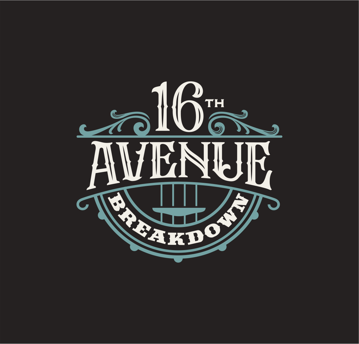
16th Avenue Breakdown
¿Quieres ganar un trabajo como este?
Este cliente recibió 67 diseños de logo de 19 diseñadores. Eligieron este diseño de logo de design.picnic como el diseño ganador.
Únete gratis Encuentra trabajos de diseño-
 US$150
-
 67 diseños
-
 19 diseñadores
Resumen de Diseño de Logo
We need a band logo to use on products and social media. The band is an Americana band based in Nashville. We're more t-shirts and comfortable jeans, NOT boots and cowboy hats. We have a look closer to The Band or Jason Isbel than traditional country groups. I'll upload some files of the design and colors looks we like from other sources as a starting point. We need something without a lot of small design elements that would get lost in print media or B&W versions. We're a Nashville veterans with a sense of humor and big songwriting chops. The music uses pedal steel, mandoling and banjo even when we do arrangements of heavy metal songs. Can use "Ave." instead of "Avenue" in design if it helps with balance. Would be great to have something that worked in square or slightly-taller-than-wide rectangle shape. We like old trucks and dive bars. Examples keep the focus on the works while adding a little atmosphere through the shape and the font. Here are some fonts we like:
https://www.fonts.com/font/typodermic/scrubby
Also
Last, but not least, we love the colors in the attached osprey pic. Doesn't have to be this look, but the colors are both rich and not quite like all the other Americana bands at the moment, though similar enough to be in the Americana lane. Hope this helps. No eagles, flags, patriotic anything. The first example attached is more about putting some kind of visual interest around the text, NOT about the bird image. Old fashioned 5-point stars work, too. Thanks!
Objetivo del mercado(s)
Music industry decison-makers, Americana music fans
Tipo de industria / entidad
Americana music
Texto del logo
16th Avenue Breakdown
Estilos de logo de interés
Logo con emblema
Logo contenido dentro una forma / figura
Logo pictórico / combinado
Un objeto del mundo real (texto opcional)
Estilos de fuente para usar
Gustan otros estilos de fuente:
- See possible font list in description section
Colores
Colores seleccionados por el cliente para ser utilizados en el diseño del logotipo:
Mira y siente
Cada control deslizante ilustra las características de la marca del cliente y el estilo que debe comunicar el diseño de tu logotipo.
Elegante
Atrevido
Juguetón
Serio
Tradicional
Moderno
Atractivo
Profesional
Femenino
Masculino
Vistoso
Conservador
Económico
De Alta Gama
Requisitos
Debes tener
- Interesting text layout, some visual interest beyond the font itself. Either emphasize "16th Avenue" together or "Breakdown" if you want to do a design with emphasis on one part of the name.
Agradable de tener
- Americana band based in Nashville. We're more t-shirts and comfortable jeans, NOT boots and cowboy hats. We have a look closer to The Band or Jason Isbel than traditional country groups. I'll upload some files of the design and colors looks we like from other sources as a starting point. We need something without a lot of small design elements that would get lost in print media or B&W versions. We're a Nashville veterans with a sense of humor and big songwriting chops. The music uses pedal steel, mandoling and banjo even when we do arrangements of heavy metal songs. Can use "Ave." instead of "Avenue" in design if it helps with balance. Would be great to have something that worked in square or slightly-taller-than-wide rectangle shape. We like old trucks and dive bars. Examples keep the focus on the works while adding a little atmosphere through the shape and the font.
No debería tener
- No cowboy hats, boots, flags, eagles, other patriotic symbols