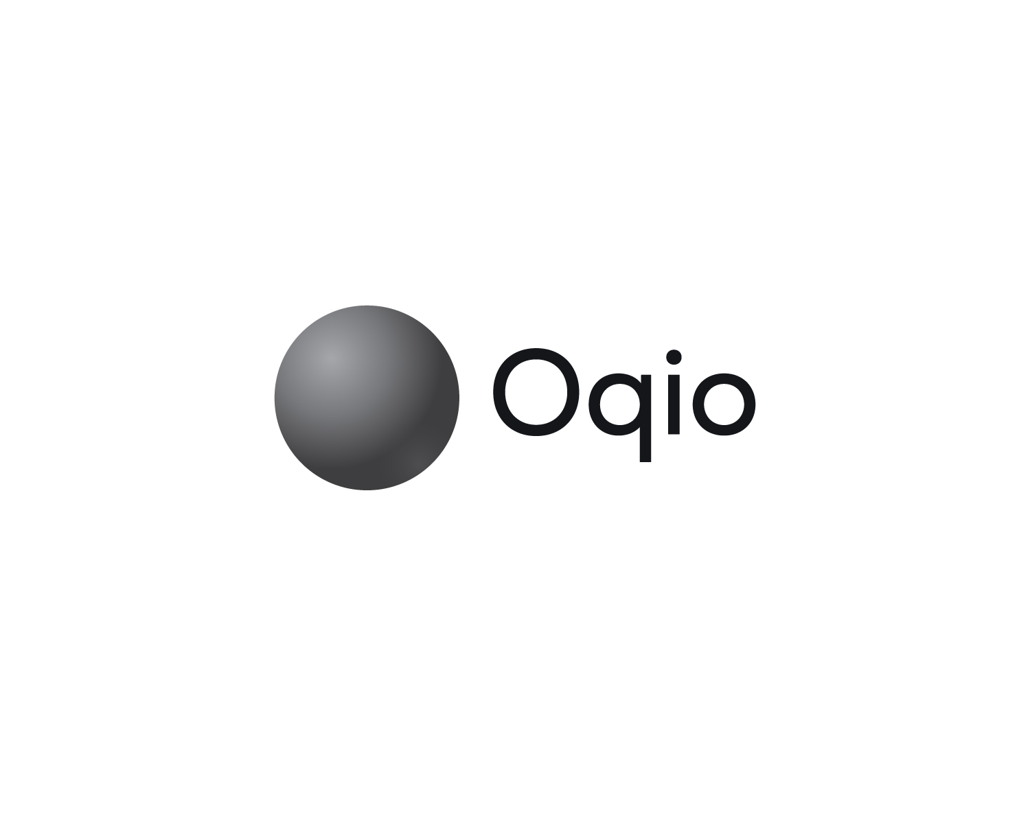
Oqio Orb
¿Quieres ganar un trabajo como este?
Este cliente recibió 143 diseños de logo de 51 diseñadores. Eligieron este diseño de logo de anonrotide como el diseño ganador.
Únete gratis Encuentra trabajos de diseño- Garantía
-
 US$300
-
 143 diseños
-
 51 diseñadores
Resumen de Diseño de Logo
Oqio Orb Logo Design Guidelines
Introduction
The Oqio Orb logo should embody the core principles of Oqio: innovation, intelligence, and limitless possibilities. Below are the specific design elements and aesthetic guidelines to be considered.
Design Elements
1. The Orb:
The central symbol of our logo, the Oqio Orb, is envisioned as a gradient black circle. The exact manner in which the gradient transition occurs is open to creative interpretation. The circle is to be unshaded on the inside, representing an open canvas for human imagination.
2. Typography:
The text "Oqio," in black, should be placed to the right of the Orb symbol. The font should be a modern sans-serif typeface, akin to the typeface used for Facebook Meta's "Meta" logo.
Design Aesthetics
1. Minimalism:
The design should be simple yet profound, effectively communicating the essence of Oqio without unnecessary embellishments.
2. Versatility:
The logo must be adaptive, able to be displayed in a variety of formats and sizes without losing its integrity.
3. Dynamic Quality:
Though primarily 2D, the logo should hint at the possibility of existing in 3D spaces, allowing for future interactive experiences.
4. Color Palette:
The main color for the circle's outline should be a gradient black, and the text "Oqio" should be in black. The unshaded interior offers a canvas that could be modified in future variations.
Conceptual Depth
The Oqio Orb is meant to be more than just a visual element; it represents the core ethos of the company. The unshaded interior symbolizes the untapped potential and boundless possibilities that Oqio aims to explore. The gradient black circle encapsulates both a sense of mystery and the infinite, aligning with Oqio’s mission.
Conclusion
The logo is only complete when both the Orb and the accompanying text "Oqio" are present. This serves to create a harmonious balance between symbol and text, each amplifying the impact of the other.
Actualizaciones
Low design quality
Texto del logo
Oqio