E-Commerce startup needs a Shopify store front
¿Quieres ganar un trabajo como este?
Este cliente recibió 24 diseños de Shopify de 5 diseñadores. Eligieron este diseño de Shopify de pb como el diseño ganador.
Únete gratis Encuentra trabajos de diseño- Garantía
-
 £120
£120
-
 24 diseños
-
 5 diseñadores
Resumen de Diseño de Shopify
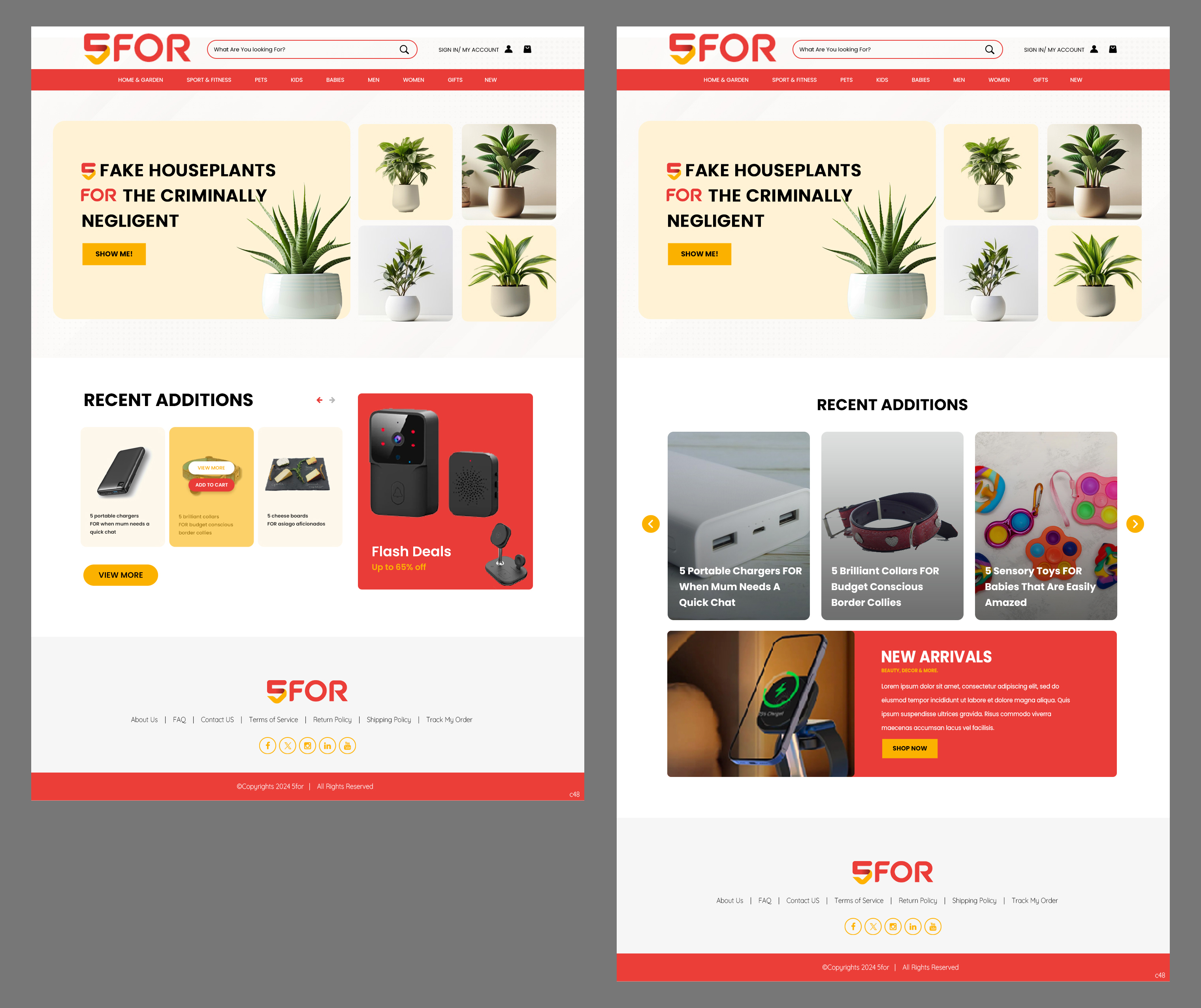
5For are looking for help designing and building a Shopify store front.
So what do we need?
A simple, user-friendly home page to display menu options and collections of products.
It’s got to be clean. Uncluttered.
No screaming starbursts! No sale countdown timers.
Clean.
Functional. Clean.
Looks great in mobile. Clean.
Clean but not cold. Needs personality. Design should cue trust and quality.
How it will work is this: every update cycle, we’ll add 5 new products to the site. 5 umbrellas, 5 travel mugs, 5 candle holders, etc. We will need a key frame that will hold an image and a headline. We want these frames to feel consistent from one product to the next. It’s important to note that the headlines are key to personality of the site and their treatment should not be overlooked.
Consistent headline style
Consistent background type (solo product or product in-situ)
Consistent branding cues
While these product frames will be the meat of the site, there are other considerations, as well.
When we click on a product key frame, it will take us to a page with that product collection. There will be the 5 products with supporting copy (product details/specs) and images for each. What should this page look like?
What should the header/navigation look like?
What about the footer?
How about the feature image on home/landing page?
How should we handle copy heavy pages (About us, Shipping policy, returns, etc)
Guidelines:
Colour palette to be based on logo but can expand from there.
San-serif fonts
Needs to work across popular devices (mobile/desktop/tablet) and operating systems. With flexibility to expand into an app in the future.
Some multi-category sites we like:
Target.com – Clean header, design and colours feel warm, friendly
Walmart.com – The rounded feature boxes are cheerful, inviting
Next.co.uk – Large images, nice photography, stylish consistent
Some sites we don’t love the look of
Ebay.co.uk – Products photos are too inconsistent in size, shape and style. Looks messy.
Temu.com – Too many sale offers, pop ups, deals, deals, deals. Feels cheap and desperate.
Costco.co.uk – Feels like an overwhelming amount of information and boxes.
Please feel free to contact us with questions.
Thank you for your designs and expertise. Looking forward to seeing your work.