Redesign one screen in a mobile app
¿Quieres ganar un trabajo como este?
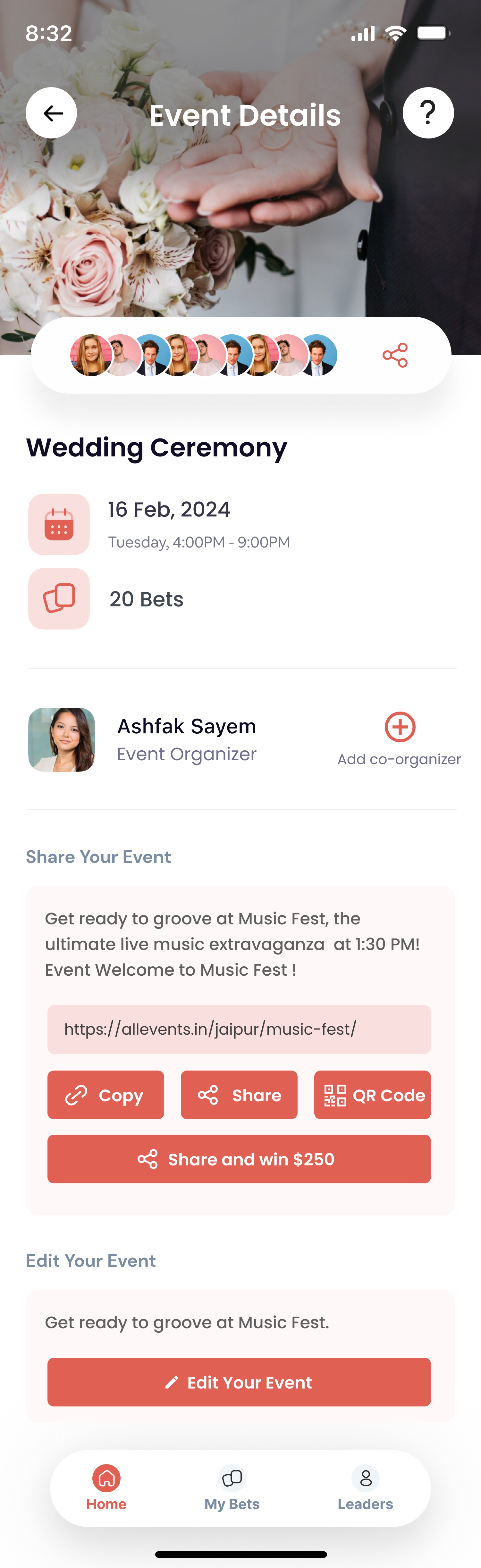
Este cliente recibió 65 diseños de app de 16 diseñadores. Eligieron este diseño de aplicación (App) de Anup UI/UX como el diseño ganador.
Únete gratis Encuentra trabajos de diseño- Garantía
-
 US$150
-
 65 diseños
-
 16 diseñadores
Resumen de Diseño de aplicación (App)
I have an app called Betting on the Wedding (available on iOS and Android). This app allows wedding guests to bet on things that happen during a wedding they are attending (think: will the groom cry when the bride walks down the aisle...). The event is set up by someone called the "event leader", typically this is the bride or the groom.
Once event details, bets, and $ values of the bets are entered, the event leader publishes the event and gets to the event detail homescreen, where they can manage their event. The three main things they can do are:
1.) Share the event with other guests to join in the betting.
2.) Edit the event -- add, change, or delete bets.
3.) Add a co-organizer. If you are the bride or the groom, you want someone else managing the event on your wedding day.
I'd like to redesign this page, make it simpler, and *focus attention on sharing the event.* The biggest goal of this page is getting event leaders to share the event. We want them to invite as many wedding guests as possible.
To that end, I would like to also introducing "sharing tiers" to entice more sharing and I'd like this to be something event leaders can easily see once they hit the event homescreen. Tiers are as follows:
Share with 1 guest, unlock co-organizer feature.
Share with 5 guests, unlock physical placard with custom QR code.
Share with 10 guests, we split our proceeds with the bride and groom.
Share with 20 guests, you are entered into $250 monthly raffle.
Some additional requests:
+ Please do not use current fonts. We want new fonts that are cleaner.
+ Share options should stay the same (copy, share, QR code)
+ Need to keep "help" question mark on page as well.
+ Maintain colors generally. Red button color must be kept as is because it's used throughout app. Slight variations to other colors OK.
+ Navigation at bottom must remain.
+ Feel free to add moving elements as well, like gifs.
+ Final design delivered in Figma.
Actualizaciones
Submissions need to be app designs. Not webpages.
The current actions shown on the page need to remain - share event, edit event, add a Co-Organizer. But the goal of the design is to make the page simpler, not more complicated.
Sharing tiers can be a separate screen, linked from the event home screen. This information does not need to live on the same page!
Added Monday, 12 February 2024
Gathering more feedback
Objetivo del mercado(s)
25-40 year olds
Tipo de industria / entidad
Mobile Apps - Betting
Estilos de fuente para usar
Gustan otros estilos de fuente:
- I like poppins, but open to other options.
Mira y siente
Cada control deslizante ilustra las características de la marca del cliente y el estilo que debe comunicar el diseño de tu logotipo.
Elegante
Atrevido
Juguetón
Serio
Tradicional
Moderno
Atractivo
Profesional
Femenino
Masculino
Vistoso
Conservador
Económico
De Alta Gama
Requisitos
Debes tener
- Fun design that focuses on sharing an event. Design delievered in Figma.