Crane & Rigging company needs a logo design that is similar to our other group of companies ...
¿Quieres ganar un trabajo como este?
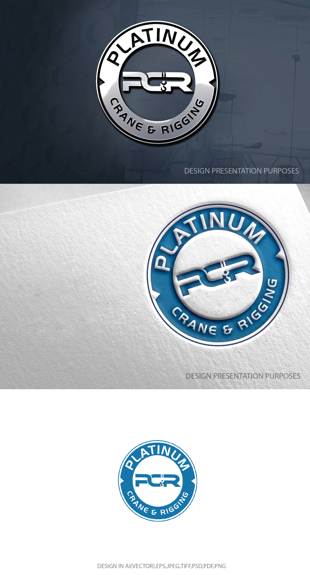
Este cliente recibió 162 diseños de logo de 102 diseñadores. Eligieron este diseño de logo de zebronicgraphic como el diseño ganador.
Únete gratis Encuentra trabajos de diseño- Garantía
-
 C$150
C$150
-
 162 diseños
-
 102 diseñadores
Resumen de Diseño de Logo
We have started on a logo design for our new Crane & Rigging company. This is a new company that is joining our other two current companies. We would like the logo to be similar but different.
The company name is Platinum Crane & Rigging. We want the logo to be encompassed in the circle like our other two companies. We like the format for the name inside the circle but we are not totally sold on the font. We like the crane hook coming off the logo and want to keep that similar design moving forward, however we would be open to other options completely. The thing we are not totally sold on is the overall design of PCR inside the circle. We are open to using some unique design of PCR, or changing it completely. It would be nice to keep some sort of crane image associated with the logo that why the "hook" is in the logo.
Our other 2 companies are called Prime Movers Rigging & Industrial Services (This logo is a P and an M but looks more like a transformer logo which is cool)
PRISM Industrial Services just has a unique image of a PRISM in the logo. I have attached both images for reference. I have also attached the PDF of the two we are working on just so you know our direction. The company colors of Platinum Crane and Rigging are Blue and Silver/Chrome.
Texto del logo
Platinum Crane & Rigging