Smart Signs Logo Refresh for 10 yr Anniversary
¿Quieres ganar un trabajo como este?
Este cliente recibió 88 diseños de logo de 41 diseñadores. Eligieron este diseño de logo de Kavth como el diseño ganador.
Únete gratis Encuentra trabajos de diseño- Garantía
-
 US$150
-
 88 diseños
-
 41 diseñadores
Resumen de Diseño de Logo
Our company has just turned 10 years old this year! We are looking to refresh our brand before we update our website, apparel, etc. Smart Signs is a sign company that focuses on LED digital displays for both indoor and outdoor applications. We have a fun and creative team that designs and fabricates badass custom sign designs using unique lighting techniques that draw the eye. We've recently entered the sports market as well providing multi-functional digital scoreboard screens like you would see at a professional sports arena. This division is called Smart Signs Sports.
Since the develepment of our company and original logo the technology has changed a bit. The 3 colored dots represented the RGB diodes that make up a DIP type LED pixel. Today, DIP has become almost obsolete and has been replaced with SMD pixels which still have the RGB diodes but they are hidden behind a small square white lens. You can google RGB DIP vs SMD LED for a visual of this. All that said, I'm not sure if we should drop the RGB color dots or not, our brand has definitely gained recognition over the years so there is a concern in losing that.
When the brand was developed orginally we wanted a "corporate or franchise feel" to separate us from the industry which has been successful.
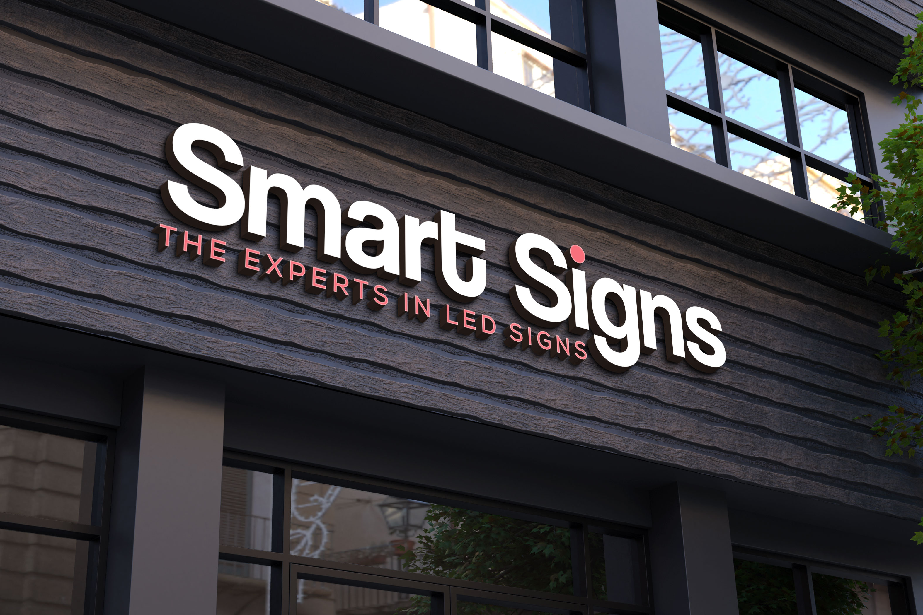
One thing that has been difficult is choosing a color scheme for our brand becuase using red, green and blue never looked appealing, so we've often just used red. We're open to using a different color scheme that will set our brand apart and keep our brand consistent and recognizable. We have all white trucks but are considering wrapping them once the brand is solidified so something with a primary color that will catch the eye while keeping with the franchise feel would be awesome. You can check out our website www.getsmartsigns.com for an idea of what we do. Our current tagline is "The Experts in LED Signs" but we are open to changing this as well. We've also used a light grey dot matrix graphic element in our branding as well.
Thank you for your consideration, we look forward to your designs!
Objetivo del mercado(s)
Churches, schools, banks, small businesses and franchise chains.
Tipo de industria / entidad
Sign Industry
Texto del logo
Smart Signs
Estilos de logo de interés
Logo abstracto
Conceptual / simbólico (texto opcional)
Logo con personaje
Logo con ilustración o personaje
Logo de marca de nombre
Logotipo basado en palabra o nombre (solo texto)
Estilos de fuente para usar
Colores
Colores seleccionados por el cliente para ser utilizados en el diseño del logotipo:
Mira y siente
Cada control deslizante ilustra las características de la marca del cliente y el estilo que debe comunicar el diseño de tu logotipo.
Elegante
Atrevido
Juguetón
Serio
Tradicional
Moderno
Atractivo
Profesional
Femenino
Masculino
Vistoso
Conservador
Económico
De Alta Gama
Requisitos
Debes tener
- Bold easy to read font and secondary color for brand recognition. A symbol that is recognized.
Agradable de tener
- Originially I considered adding a Albert Einstein type character to our brand but couldn't find the right fit. The right character might be a good fit here.
No debería tener
- Thin hard to read fonts or a rainbow of color.