

 Refresh
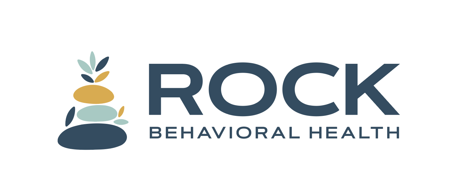
Logo for an outpatient psychiatric clinic
¿Quieres ganar un trabajo como este?
Este cliente recibió 294 diseños de logo de 93 diseñadores. Eligieron este diseño de logo de GLDesigns como el diseño ganador.
Únete gratis Encuentra trabajos de diseño
- Garantía
-
 US$340
-
 294 diseños
-
 93 diseñadores
Resumen de Diseño de Logo
I own an outpatient psychiatric practice, Rock Behavioral Health. I'm looking for a logo that conveys a dual meaning. 1. Rock in a somewhat literal sense in that it provides a solid foundation for growth, allowing hope to flourish. 2. The logo conveys a connection to the city my practice is named after, Little Rock, AR. It's often referred to as rock city. Or instead of linking the logo to the city, link it to my state, Arkansas, called the Natural State. It has beautiful outdoor scenery, which can tie into the rock.
UPDATE: Please do not place the words in this manner:
Rock Behavioral
Health
The focus should be on the word "Rock" with "behavioral" and "health" having equal weight, like this:
Rock (should have larger font)
Behavioral Health
The following are also acceptable formats, with each word being about the same font size:
Rock
Behavioral
Health
Rock Behavioral Health
Also, please do not make a symbol with an "R." That's redundant and doesn't have any meaning. Be creative. Use nature elements and or/elements that tie it to the city of Little Rock or Arkansas, and a rock that serves as a foundation to grow, maybe with a plant growing from the rock.

Actualizaciones
Low design quality
Tipo de industria / entidad
Behavioral Health
Texto del logo
Rock Behavioral Health
Estilos de logo de interés
Logo con emblema
Logo contenido dentro una forma / figura



Logo abstracto
Conceptual / simbólico (texto opcional)



Estilos de fuente para usar

Mira y siente
Cada control deslizante ilustra las características de la marca del cliente y el estilo que debe comunicar el diseño de tu logotipo.
Elegante
Atrevido
Juguetón
Serio
Tradicional
Moderno
Atractivo
Profesional
Femenino
Masculino
Vistoso
Conservador
Económico
De Alta Gama
Requisitos
Debes tener
- Business name, nature symbols that show growth on a solid foundation
No debería tener
- No not make a logo with only "R" or "RBH, " etc. Would prefer you avoid using the state shape/map, be more creative or symbolic with how you tie in the connection.


